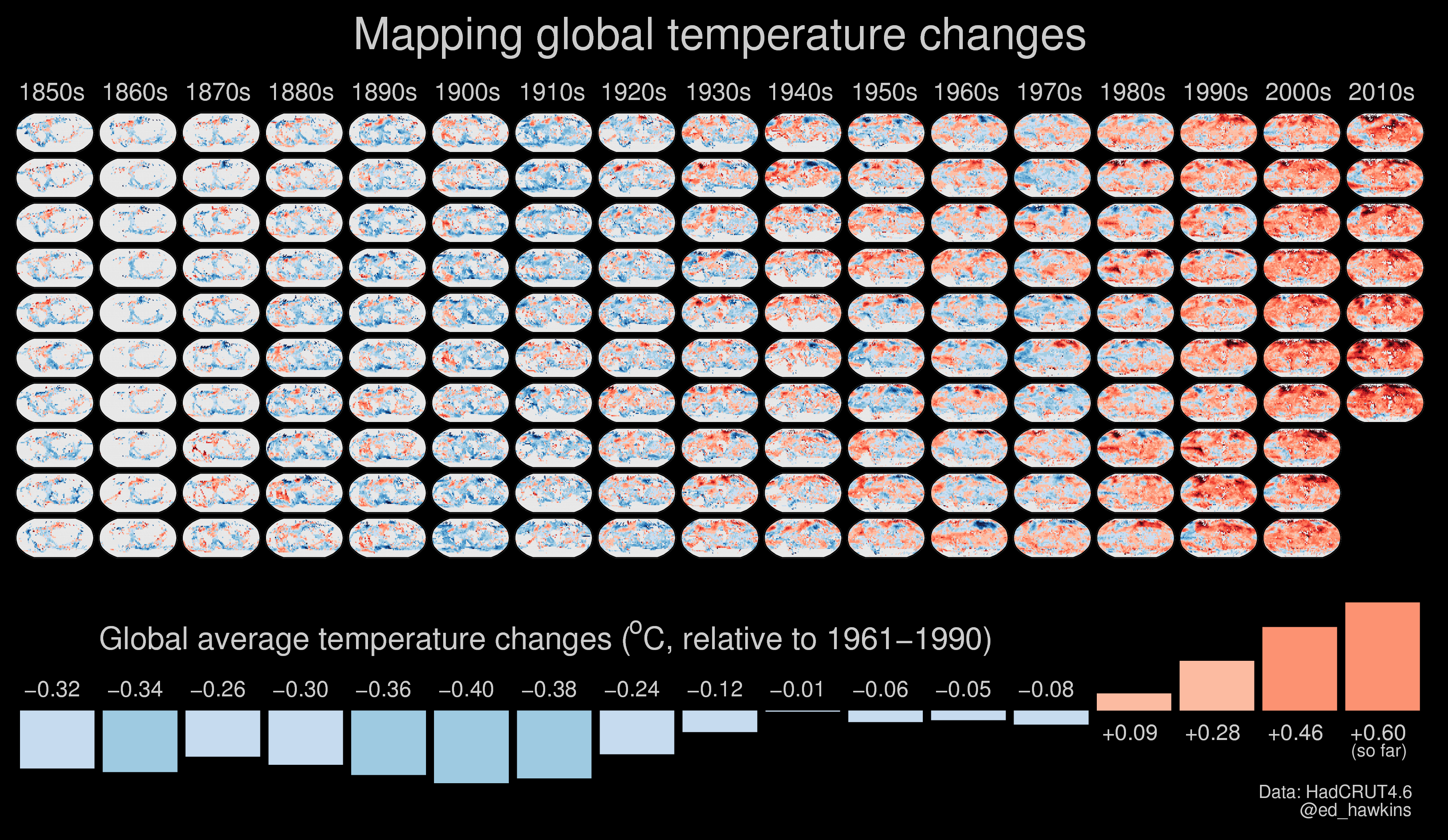
Climate change is a complex global issue, requiring simple communication about its effects at the local scale. This set of visualisations highlight how we have witnessed temperatures change across the globe over the past century or more. The colour of each stripe represents the temperature of a single year, ordered from the earliest available data at each location to now. All other superfluous information is removed so that the changes in temperature are seen simply and undeniably.
Annual global temperatures from 1850-2017

The colour scale represents the change in global temperatures covering 1.35°C [data]
Continue reading Warming stripes