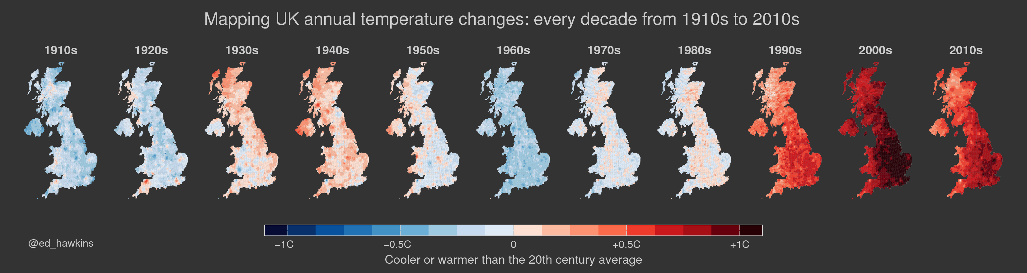
The UK Met Office have published an updated dataset of UK climate data from 1910-2016 on a 5km x 5km grid. The maps above show mean annual temperatures in each decade relative to the long-term average of 1910-99.
The UK has warmed over the past century, but not at the same rate everywhere. The east seems to have warmed more than the west. Nor have temperatures changed evenly though time – the 1930s and 1940s were relatively warm compared to the 1960s for example.
The recent warming stands out, but so far the 2010s are cooler overall than the 2000s. This is partly because 2010 was such a cool year for the UK.
Even more interesting are the seasonal differences. Below are the same maps for summer (top) and winter (bottom).
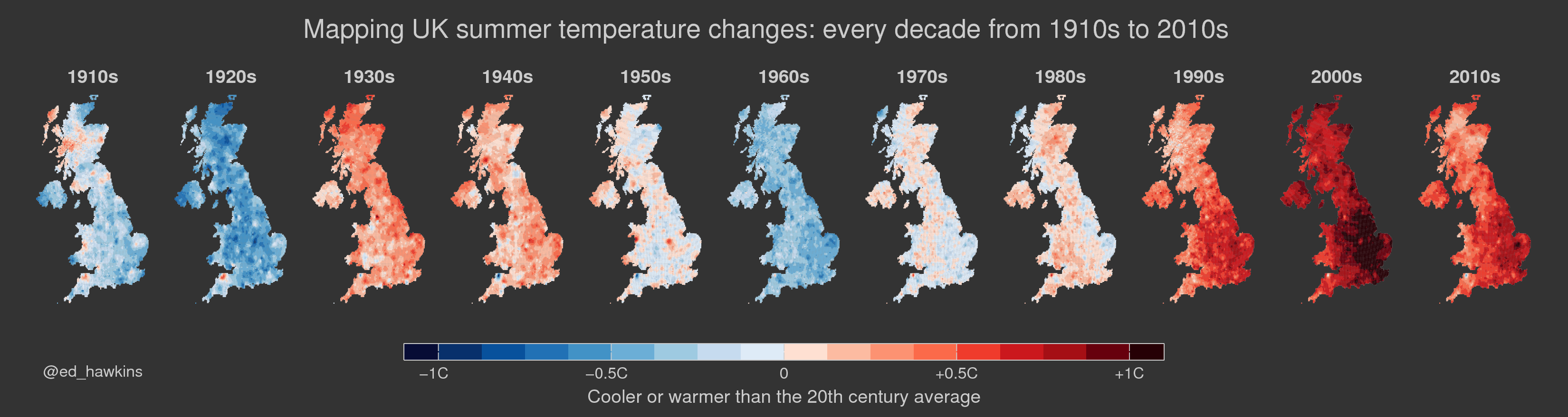
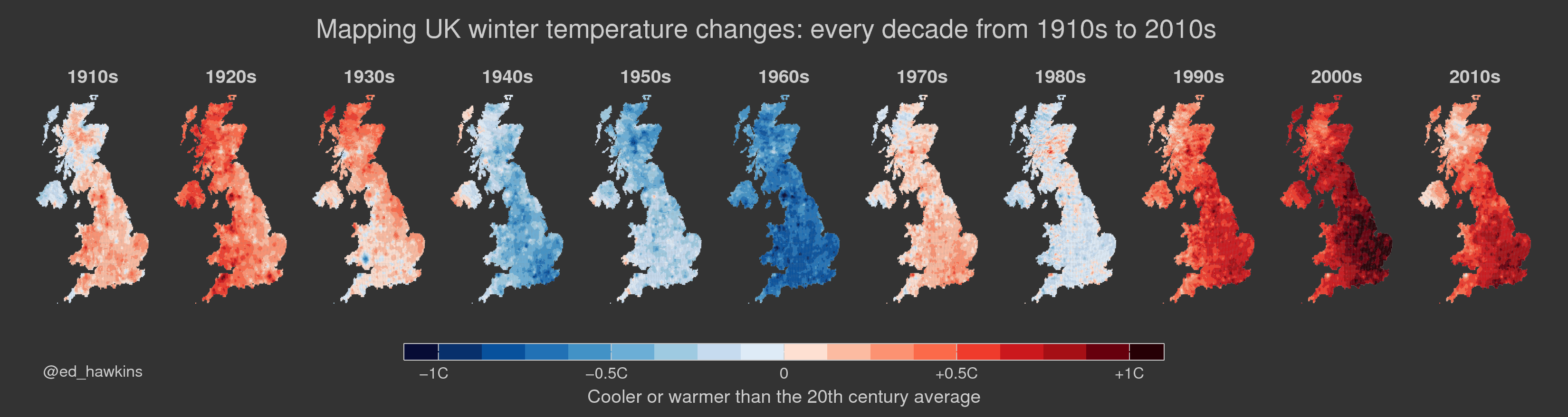
Although both seasons show similar warming in the recent period and cooler 1960s, they show very different changes in earlier decades, with opposite signs of anomalies in the 1920s and 1940s. Winter shows generally larger variations, as expected, due to being more influenced by the atmospheric circulation.
The dataset and description documents are available and the methods summarised.
One thought on “Mapping changes in UK temperature”