2016 has been quite a year for the climate. Warmest year ever recorded. Record low sea ice extents at both poles. It has also seen many amazing climate visualisations and animations. I have collected some of my favourites on this storify page, including graphics for temperature, sea ice, pressure observations and Hurricane Matthew.
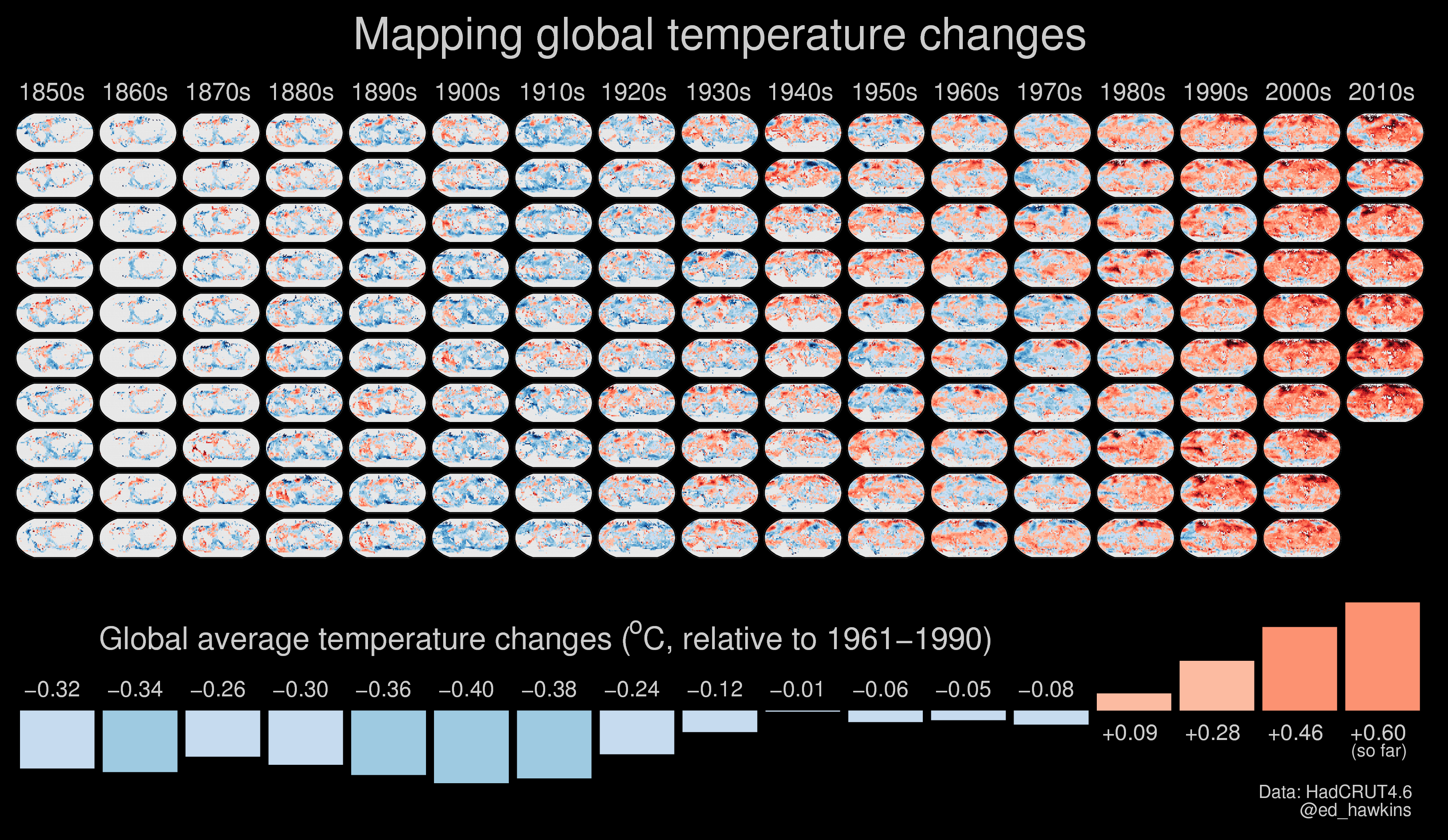
One of the graphics is shown below, mapping temperature changes from 1850-2016, and including the decadal averages of global temperatures. This graphic has been updated from a previous version.