Image Archives

Climate indicators

The recent IPCC AR6 WGI report summarises the state of knowledge of physical climate science, but the final version of the Summary for Policymakers (SPM) did not include a figure showing a range of indicators of our warming planet.

An earlier draft of the SPM included a figure like that below which aimed to put recent changes into a longer context of changes over the past 2000 years, and to show how other climate metrics have changed in recent decades. Many of these time series were shown in disparate places of the report, and have been brought together in this updated graphic which also indicates key milestones and discoveries in climate science.

Indicators (from top to bottom): atmospheric carbon dioxide concentration, ocean heat content, global sea level, global mean surface temperature, global lower tropospheric temperatures, Arctic sea ice amount, Kyoto cherry blossom date, specific humidity over land. Key moments in the history of climate science are indicated: the invention of the efficient steam engine by James Watt in 1790, the identification of the primary greenhouse gases by John Tyndall in 1861, the first estimate of climate sensitivity by Svante Arrhenius in 1896, and the discovery that the world was warming by Guy Callendar in 1938.

Continue reading Climate indicators

Adding observations to IPCC figures

The figures in the IPCC AR6 WGI SPM are a huge improvement over previous reports. However, one minor quibble is with the lack of observations shown. This brief post makes a figure available which is based on IPCC AR6 WGI SPM Figure 8, but with some observations added to show how global surface temperature and Arctic sea ice area have varied, compared to the model simulations. In my view this is a scientific improvement over the original version.
Continue reading Adding observations to IPCC figures

Warming patterns

Global warming does not mean the same amount of warming over the whole globe. There is a distinct spatial pattern to the long-term changes.

The first map below shows the total change in temperature since the early-industrial era, and the second map removes the global average warming to highlight regions of above and below average warming.

The largest warming is seen in the Arctic, and the land regions are clearly warming faster than the ocean. The striking blue area in the North Atlantic is a region of very little warming, and this is due to a decline in the strength of the Atlantic overturning circulation which brings warm water from the tropics to the northern latitudes.

All these features of the warming have been long predicted in climate model simulations, for example in IPCC AR4 and IPCC AR5.


Technical details: spatial pattern of warming uses approach described in Hawkins et al. (2020) using Berkeley Earth dataset, and the changes are relative to 1850-1900.

Arctic surprise

In 2007, IPCC AR4 produced this figure showing projections of changes in Arctic sea ice extent in the summer (July-September). The different colours represent a wide range of different scenarios for future emissions. Observations (1979-2020, added purple line) have decreased far more rapidly than projected in the CMIP3 models used at the time, when plotted on the same scale with the same reference period.

This demonstrates the concept of a climate-related ‘surprise’, or what might have been considered a low-likelihood event at the time.

The original figure is here. Also see Stroeve et al. (2012) for a CMIP5 comparison (Fig. 2a), and Notz et al. (2020) for a CMIP6 comparison (Fig. 2f).

What does a 1°C warmer world look like?

Global average temperature has risen by over 1°C since pre-industrial times, but the size of the change is not the same everywhere. The image below shows the temperature change observed in 5 individual years and for the 20-year average (2000-2019). For all of these examples the global average temperature was almost exactly +1°C warmer than the late 19th century.

In each individual year, the patterns can be quite different, with disparate regions of cooler and warmer temperatures. When averaging over 20-years, the overall pattern of warming is clearer: the Arctic is clearly warming much faster than the global average, and land areas are warming faster than ocean regions.


Continue reading What does a 1°C warmer world look like?

Warming soil temperatures

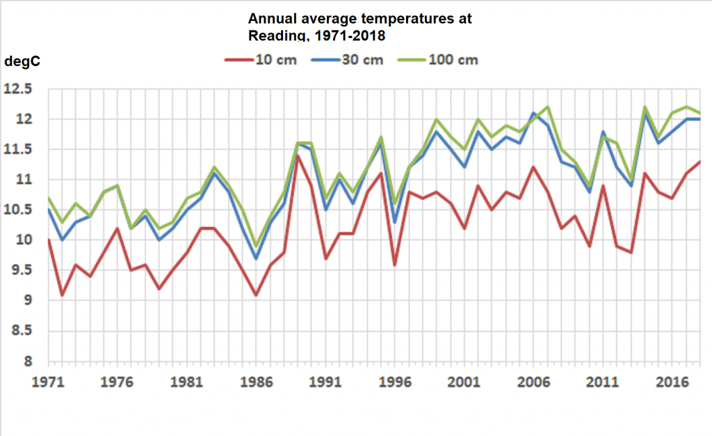
It is not just air and ocean temperatures that are warming through climate change – the soils are warming too. At the University of Reading we have monitored underground temperatures every day since 1971 from 10cm to 100cm depth. There is a clear warming observed at each depth

The time series for 30cm depth can be extended back further to 1941 using observations from nearby sites – Maidenhead, Hurley and an older University campus (London Road*). The variations between overlapping site records are very consistent and more than 1.5°C warming has been observed overall in the last 80 years.

(Added 12th October 2019)
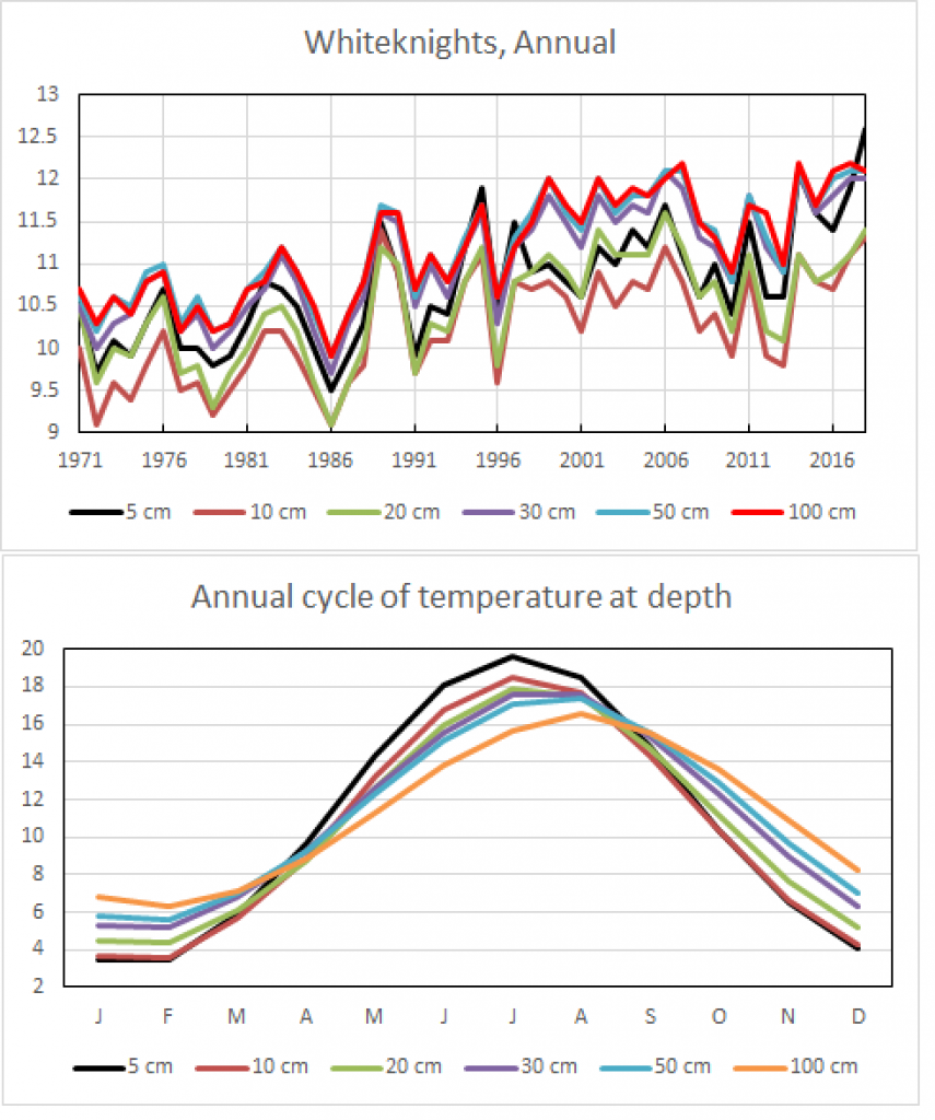
Data for other depths exists also. The seasonal cycle shows how different depths respond to the seasons, with deeper depths being lagged compared to the surface and smaller variations over the year. 10cm depth is coolest in the annual average, with 50-100cm being the warmest.

Graphics and analysis by Roger Brugge, University of Reading.

* Note the London Road campus is about 0.5°C warmer than the other sites, and this difference has been corrected for in the black line.

Atmospheric temperature trends

The lower atmosphere is warming while the upper atmosphere is cooling – a clear fingerprint of the enhanced greenhouse effect from human emissions of carbon dioxide.

The simple explanation is that some of the infrared radiation emitted by the surface, which would have normally reached the upper atmosphere, is absorbed by greenhouse gases in the lower atmosphere. The upper atmosphere therefore receives less energy than before, and so cools. The very warm years (intense reds) in the upper atmosphere are the 1982-83 El Chichón and 1991-92 Pinatubo eruptions respectively.

Changes in global atmospheric temperature at different levels in the atmosphere from 1979 to 2018: surface, TLT, TTT, TMT, TLS. Data from Cowtan & Way, and RSSv4. The colour scale goes from -0.75K to +0.75K, relative to the average of 1981-2010 for each layer separately.