Climate projections have demonstrated the need to adapt to a changing climate, but have been less helpful (so far) in guiding how to effectively adapt. Part of the reason is the ‘cascade of uncertainty’ going from assumptions about future global emissions of greenhouse gases to what that means for the climate to real decisions on a local scale. Each of the steps in the process contains uncertainty, but which step is the most important? And, how might this be visualised?
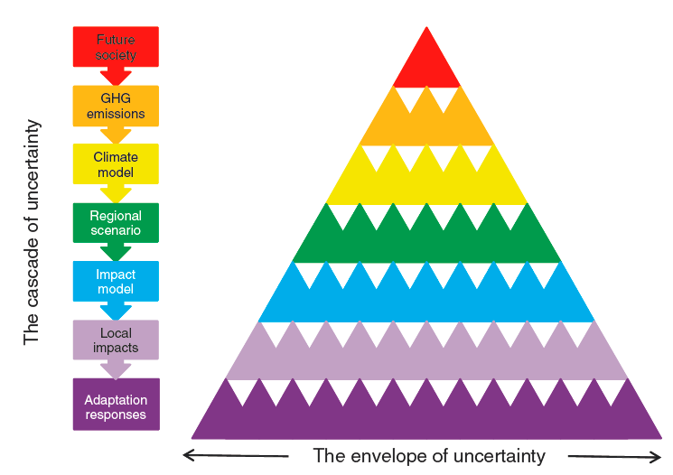
A schematic of this cascade of uncertainty is shown below (taken from Wilby & Dessai, 2010). They illustrate the various steps in a ‘top-down’ assessment of climate risks, going from future society, through greenhouse gas emissions, GCM simulations, regional scenarios, impact models and local impacts to an actual adaptation response. At first sight, this envelope of uncertainty may seem overwhelming, but Wilby & Dessai discuss the benefit of choosing ‘no-regret’ options and instead suggest using a process where the actual impact takes centre stage, in a ‘bottom-up’ assessment. A recent analysis of French maize yields was one example of this type of approach.
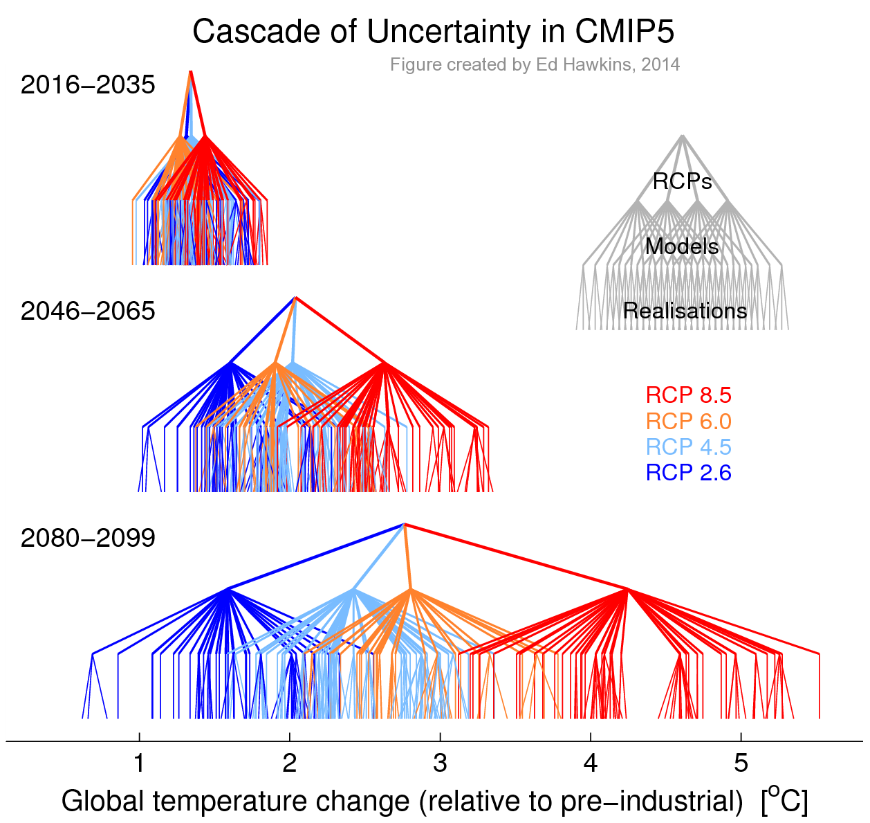
However, to my knowledge, no-one has tried to visualise this cascade using actual data. This is crucial because not all layers of the pyramid are equally important, as the Wilby & Dessai illustration might suggest. The relative importance will depend on timescale, region, impact, relevant climate variables and other potential factors. For some impacts, such as health-related heat stress, the uncertainty might actually reduce when considering multiple variables.
The next figure attempts to visualise the cascade of uncertainty in projections of global mean surface temperature using the CMIP5 simulations. Each colour represents a different future emissions pathway (the Representative Concentration Pathways, RCPs) (top layer), with each model producing a different response to the same forcing (middle layer). The lowest layer of the pyramid illustrates the role of internal climate variability. This is seen as additional uncertainty for those models which have run multiple realisations of the same forcing pathway, but unfortunately many have not.
For the near-term (2016-2035), the relative importance of the RCPs is far smaller than the uncertainty in the model response. However, at the end of the century, the RCP uncertainty tends to dominate more. If each simulation was then used to drive a regional climate model or an impact model then an additional layer could be added to represent the next step in the cascade.
This visualisation is potentially complementary to other approaches to describe the relative importance of difference sources of uncertainty in climate projections. Comments on whether this is useful, and suggestions on how it might be improved are very welcome! For example, it might be interesting to look at other climate variables such as precipitation, and at regional projections where variability will be a larger component.
Interesting visualization.
It seems that if you subject the models to the strongest forcing (RCP8.5) and leave rhem to model to run for long enough (through to 2099) then an interesting pattern emerges. If you thought of you’re visualization as being like a curtain, it looks like somebody has opened them. Is there any case to argue that when it comes to this particular metric there may be two subsets of model type?
What your visualizations neatly show is that this gap is widest at the second level (inter-model comparison??) and is reduced at the third level by the internal variability of some of the models.
Hi HR,
Yes, there is a strong hint of a ‘bimodal’ response in RCP8.5. As you say, this gap is reduced by the variability in the available realisations. Would be nice to have more ensemble members to examine this further though!
cheers,
Ed.
Hi Ed,
I have used the Dessai & Wilby figure a number of times so it is really interesting to see the “real” cascade from the CMIP5 models. As you say, it is unfortunate that many models don’t have multiple realisations but for the global mean temp response clearly the multiple scenarios and models capture most of the spread. Have you tried this at a regional scale and/or for precip yet? I’d be very interested to see the results!
In short, I think this visualisation is great! However the more runs there are available, the less clear the plot would be and overplotting, even in this example, is clearly a limitation (its difficult to see how much spread comes from the multiple relisations in the 2016-2035, much less of a problem later on when the overall spread is larger). It could be interesting to see an interactive version where you can hover over the plot and grey certain areas out. For example, if you hover over one model, it could grey all other models out – you could then see whether a warm/cold model was always a warm/cold model across RCP scenarios. Just a thought…easier to say than do of course!
Also, one can’t help but think about how the cascade would continue down the different levels. Extending to regional projections should be straightforward enough but then to impacts models, local impacts and responses? We soon reach practical and conceptual barriers in how to approach these next steps. Fun to think about though…
Excited to see more of these plots!
Joe
Thanks Joe – have had a quick look at some regional versions – will share when I’ve had more time to digest!
Also wondered about interactive versions – though agree that this could be a bit complicated – perhaps just highlighting a couple of models could be doable….
And, hoping to see impact model projections with the CMIP5 simulations sometime too – this one considers multiple malaria models for example, but only uses 5 GCMs and I think only 1 realisation of each.
cheers,
Ed.
Yes I would assume most impacts studies would only sample a very small number of the available simulations. Some colleagues here have been running some of the CMIP5 simulations through hydrological models for southern Africa so it could be nice to add on that layer – at some stage…
Cheers,
Joe
Excellent visualisation.
A simple definition/link for Representative Concentration Pathways (RCPs), would have helped me follow it more easily.
Thanks Martin – good point. Will edit the post.
Ed.
Excellent visualisation Ed. Thanks! I will be using it to point out the extent of uncertainty in the climate models.
Best,
Yiannis
Hi Ed,
it is really a illustrative visualisation. I am currently writing a paper on how to reduce the cascade of uncertainties in relation to pluvial flooding, and want to refer to your figure, but how should I cite it?
Best,
Per
Hi Ed,
Really nice plot (Fig.2). Is it possible for you to share the code used for generating this plot? I would like to reproduce something like this for my study area.
Cheers
Zilefac