Category Archives: visualisation

Animating global sea ice changes

Scientists can’t do everything by themselves. We need to engage the millions of citizens who are passionate about knowledge to help solve scientific mysteries and improve our understanding of the world around us.

There are many ways that anyone with a computer can help – volunteer to rescue old weather data or loan your computer’s CPU to simulate the climate, for example.

Those with more technical knowledge might also contribute by communicating climate change in novel ways. Recently, Kevin Pluck (a software engineer) created a global sea ice spiral which gained widespread attention on social media – here he tells Climate Lab Book how he did it. Continue reading Animating global sea ice changes

Climate graphics of 2016

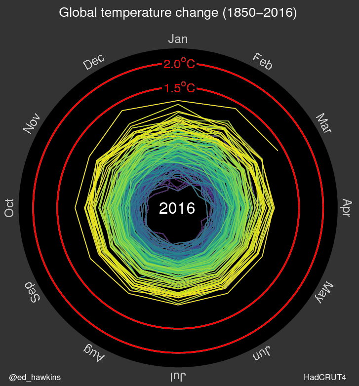
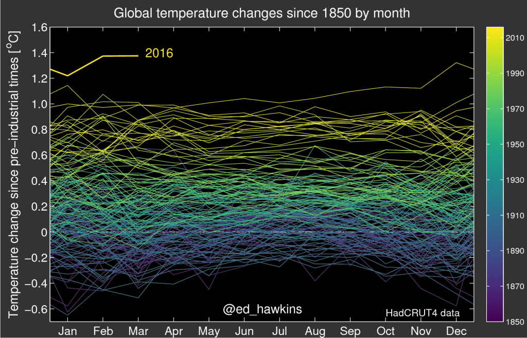
2016 has been quite a year for the climate. Warmest year ever recorded. Record low sea ice extents at both poles. It has also seen many amazing climate visualisations and animations. I have collected some of my favourites on this storify page, including graphics for temperature, sea ice, pressure observations and Hurricane Matthew.

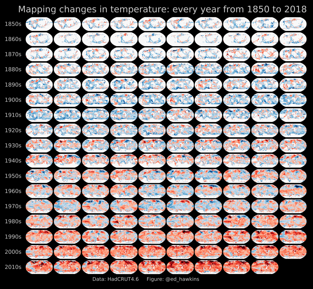
One of the graphics is shown below, mapping temperature changes from 1850-2016, and including the decadal averages of global temperatures. This graphic has been updated from a previous version.

Mapping global temperature changes from 1850-2016. Click for high-resolution version.

Lancashire temperatures, visualised

Temperatures for Lancashire from 1754-2015
Temperatures in Lancashire from 1754-2015. Click the image for a larger version.

This visualisation of temperatures in Lancashire (UK) shows annual mean data from 1754-2015. The long-term warming trend is clear, with variability from year to year, and some temporary cooler periods due to large volcanic eruptions. The average of the 19th century (black line) separates the warm and cold colours.
Continue reading Lancashire temperatures, visualised

Olympic spiral

Screenshot from coverage of Rio Olympics opening ceremony

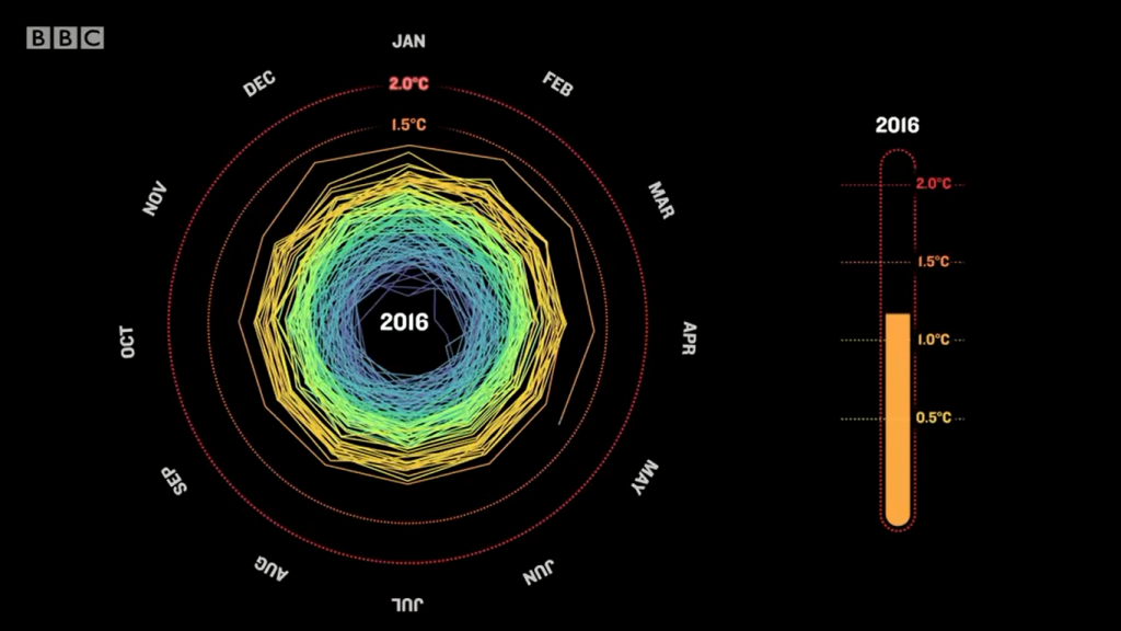
If you watched the opening ceremony of the Olympics, you would have noticed a segment discussing climate change, accompanied by graphics of CO2 emissions, Arctic sea ice melting, sea level rise and a somewhat familiar spiral representation of rising global temperatures (above), a version of which you may have seen somewhere before.

Needless to say, I was rather shocked while watching!