Update (23/10/11): The full article has now been published in Nature Climate Change
Climate projections (such as from the IPCC) usually consider the question of “what will happen to our future climate”. But, this question may be more informative if it is changed to “when will it happen”?
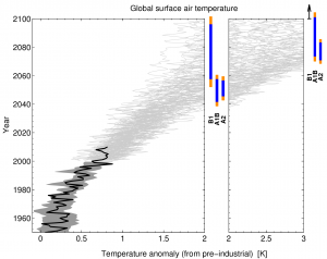
Figure 1 shows a new twist on the usual manner of displaying climate projections. The key point is that we are interested in the likelihood of crossing certain temperature thresholds. The usual United Nations adopted critical threshold is 2°C above pre-industrial temperatures, but we also consider 3°C. Fig. 1 demonstrates that under the A2 and A1B emissions scenarios, the CMIP3 models suggest that the 2°C threshold will likely be crossed during the 2050s, but the lower emissions scenario (B1) delays crossing the key temperature thresholds by around 25 years, giving more time for adaptation to occur.
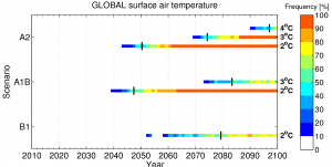
Fig. 2 considers the effects of internal climate variability on when such temperature thresholds may be reached, and shows the proportion of model simulations which are above each threshold in each particular year. Thresholds are crossed earlier than might be expected from just considering the smooth trends, but perhaps only for a year or two at a time.
Comments welcome on whether this way of displaying climate projection information adds value or is better/worse than the more standard ways.
This work has been accepted for publication in Nature Climate Change (Joshi, Hawkins et al.), and includes far more analysis than shown here. In particular we explore how the frequency of temperature crossing changes for particular countries, and when we might expect to experience “2°C” for different regions.

Joshi, M., Hawkins, E., Sutton, R., Lowe, J., & Frame, D. (2011). Projections of when temperature change will exceed 2 °C above pre-industrial levels Nature Climate Change, 1 (8), 407-412 DOI: 10.1038/nclimate1261

Excellent. First, I must ask “Can we see the code?”
Second: is the solid black line in figure 1 the instrumental record, and if so what dataset?
Third: This is CMIP3. Do you have any information, or even intuition, about corresponding results for CMIP5? I’m particularly interested because (AIUI) CMIP5 runs out past 2100.
Fourth: I would prefer a more continuous representation, although I don’t have any particular suggestions about how to produce one compactly. These figures show me distributions for each SRES scenario at the 2C/3C/4C milestones, but if I’m interested in 1.5C or 2.5C, I’m stymied. I guess a variation on Fig 1 could have coloured bands, but you’d need some way to distinguish the scenarios. Maybe a horizontal offset?
Fifth: in figure 2, the coloured bands seem to run all the way to the right. Shouldn’t they stop at the point at which the last model run reaches that temperature (e.g. the 2C band for A2 should stop at – guessing – 2065)?
Sixth: in figure 2, A2 looks pretty linear (2C to 3C looks like about the same duration as 3C to 4C). Is that so?
Thanks for the good comments Nick!
(i) I hope that the figures should be reproducible using just the information in the paper and publically available data.
(ii) It is the instrumental record, and it is HadCRUT3. Have updated the caption.
(iii) Some CMIP3 runs went beyond 2100 too, but not enough to make such a figure. We hope to explore how the picture changes when more CMIP5 data is available (in a few months), but my hunch is that it won’t make too much difference.
(iv) I could easily make corresponding figures for 1.5, 2.5 degrees etc, and any suggestions for visualisations would be welcome! I could put errorbars on top of the projections at each 0.5 degree interval.
(v) Figure 2 is a cumulative plot (cdf), rather than a probability plot (pdf).
(vi) A2 is fairly linear from 2050 to 2100, so yes.
cheers,
Ed.
(obviously by “information about CMIP5” I mean preliminary information.
I am in general a fan of the ‘when’ approach. A couple of thoughts:
1) What and when are intricately linked, Global climate at +2degC in 2040 would not look the same as +2degC reached by 2080. That’s more an issue with trying to summarise global climate in a single number, but would need to be communicated when interpreting such analysis.
2) Figure 2 is crying out for extending to 2200. The ‘when’ agenda probably shouldn’t be 21st century limited, although that’s an issue for the availability of post 2100 projections.
3) Would be nice to demonstrate how this form of presentation would better inform adaptation planning than the “What will temperature at place x be by 2050?” paradigm. I think poss. plenty of scope from existing literature?
Hi Mark – thanks for the comments.
1) How do you think the spatial pattern of change would be different for +2C in 2040 and +2C in 2080?
2) Agreed, but we had an adaptation (rather than a mitigation) focus here. There are also less models available, especially for A2. Definitely something to think about with the CMIP5 data, if this type of approach is found to be useful.
3) Agreed – do you have any specific suggestions? We are also interested in the ‘is an individual year (or 3 consecutive years) above 2C particularly important for any impacts?’ type of question.
cheers,
Ed.
I understand that they are cdfs, but I still think they would be clearer if they stopped, presumably at 100% when the last model run for a scenario reaches the given temperature.
I look forward to seeing the paper. Nature Climate Change is shaping up to be a good journal, but for my tastes it has too much WG2/3 material so far.
Re my first question, expect to receive an email questionnaire from me shortly after the print publication, asking similar questions. It’s a research project on code publication, using Nature Climate Change articles as a sample.
Hi Nick,
Thanks for the comment.
I think that one of the key points that we try to make in this study is that even if a certain model reaches a temperature threshold one particular year, that does not mean that every year after then will be above the threshold; this is because of natural climate variability. So, even if 100% of models are above, say 2C one year (or even N years), this is not necessarily the case the next year, so stopping at the 100% level would not be representing the variability appropriately. We believe this point is under-appreciated, and one of the supplementary figures in the paper tries to make this point more explictly.
I look forward to receiving the questionnaire! Publication date is the end of this month.
cheers,
Ed.