With 2018 coming towards an end, the World Meteorological Organisation (WMO) released their provisional State of the Climate report. The WMO asked whether Climate Lab Book could provide some updated graphics, also reproduced here.

Warming stripes for 1850-2018 using the WMO annual global temperature dataset. Continue reading 2018 visualisation update
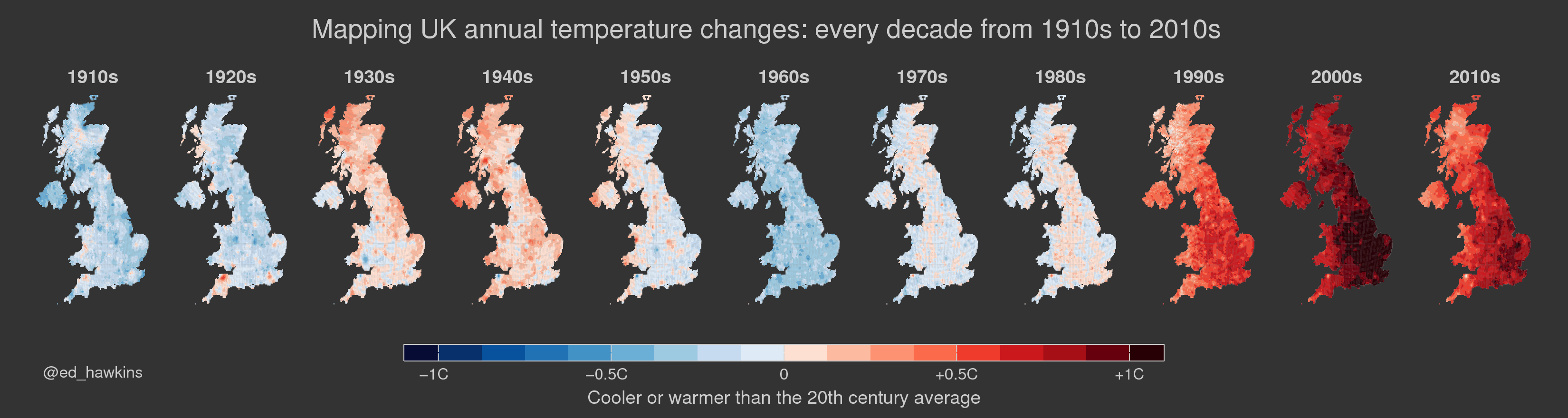
 Climate change is a complex global issue, requiring simple communication about its effects at the local scale. This set of visualisations highlight how we have witnessed temperatures change across the globe over the past century or more. The colour of each stripe represents the temperature of a single year, ordered from the earliest available data at each location to now. All other superfluous information is removed so that the changes in temperature are seen simply and undeniably.