How will UK summer temperatures change in future? And, how might we best communicate the possibilities? This is a short post describing one effort in visualising the possible outcomes.
Thoughts and comments welcome on how this visualisation, which is designed to be self-contained, might be improved! Technical details are below the figure.
[UPDATE 11/08/14: The figure has been updated based on discussion in the Comments. The original is here.]
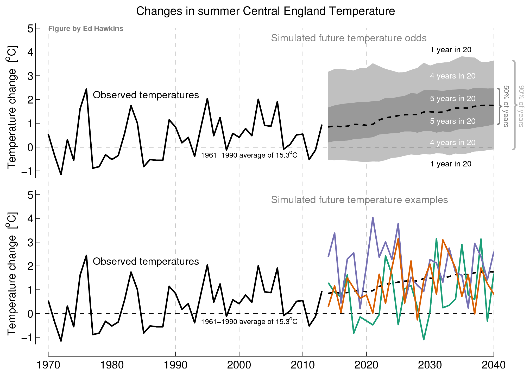
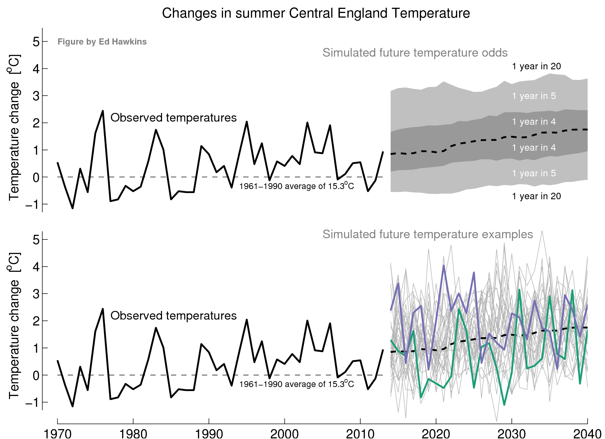
Details: The figure above shows observations of summer (June-July-August) Central England Temperature (CET) from 1970-2013 in black. The average of 1961-1990 was 15.3°C (dashed black line) and average summer temperatures have risen about 1°C since 1961.
The future projections show odds of particular changes in the top panel (grey shading) and example trajectories (bottom panel). These come from a single model (CSIRO Mk3.6) which has run 30 realisations for past & future climate, allowing such a comparison.
The three highlighted realisations show rather different evolutions of temperature for the next two decades which are both consistent with the projected long-term trends. The emissions scenario used was RCP4.5 but this will not make much difference for the near-term.
Over the years I come to dislike spaghetti graphs, so I would leave that one out as it doesn’t contribute much (except confusion). The envelope graph is simpler, but needs to be consistent. The inside band might be labeled ‘4 out of 5 years’ and the wider band ’19 out of 20 years’. Labeling the outside area ‘1 in 20 years’ might cause some confusion as it is then the opposite. There’s probably no need to have both a 4-year and a 5-year band.
If variability is expected to change (I don’t think it is) then tic marks on the left axis could show historical variability limits.
Thanks Robert – I think the spaghetti version shows that changes can be quite rapid and helps communicate the noisy nature of climate more clearly than the shaded version?
I like the idea of including historical ranges and will think again about labelling the odds – this could be done on the right hand side perhaps using curly brackets?
cheers,
Ed.
Please include more horizontal and vertical grid lines (they could be fainter or dotted / dashed) so that we can see the years when we had peaks and troughs, and how the projected temperatures are expected to match specific years in the past.
Does the CSIRO model include the effects of the current negative phase of the PDO ?
First question would be who are you trying to communicate to?
I’d like to see the 61-90 average extend across the whole graph (it would help to tie the two halves together) and if it wasn’t too busy see the simulated average for the last 30 years similarly shown (maybe extend the graph out to 2050 to give 30 years of simulation)
I wasn’t sure immediately what the top graph was telling me. I understood it better when thinking about 20 years of weather and
1 of 20 years are expected to fall in white range
4 of 20 years in light grey
5 of 20 years in dark grey
5 ”
4. ”
1. ”
The fact the numerators add up to 20 helps my simple ape brain.
Thanks HR – next version will have extended climatology line and show textual ’20ths’. Will look at adding shading for past too.
This is aimed at public & policymakers – eg something which a newspaper might show.
Do public understand odds or probabilities better?
Ed.
HR –
I had a similar moment of confusion concerning the labels, resolving it by converting to percentages rather than 20ths. My suggestion would be to drop the “1 in 4 years” &c, replacing them with vertical bars at the edge signifying that 50% of simulation results fall within the dark-shaded region, and 90% within the light- and dark-shaded regions combined.
Thanks HaroldW – will include some probabilities on right hand side of top panel in next version.
Ed.