All posts by Ed Hawkins

About Ed Hawkins

Climate scientist in the National Centre for Atmospheric Science (NCAS) at the University of Reading. IPCC AR5 Contributing Author. Can be found on twitter too: @ed_hawkins

Glimpsing the future

In December 2019, the average temperature across Australia was about 2°C above what would be expected for the present-day, which is another 1.5°C above temperatures that were normal for December before humans started warming the climate. These extreme temperatures have contributed to the catastrophic bushfires which have devastated large areas.

But what may be considered ‘normal’ is constantly changing.

In a world which has warmed by 3°C – roughly the current global trajectory – what was extreme will be entirely normal.


Continue reading Glimpsing the future

Warming soil temperatures

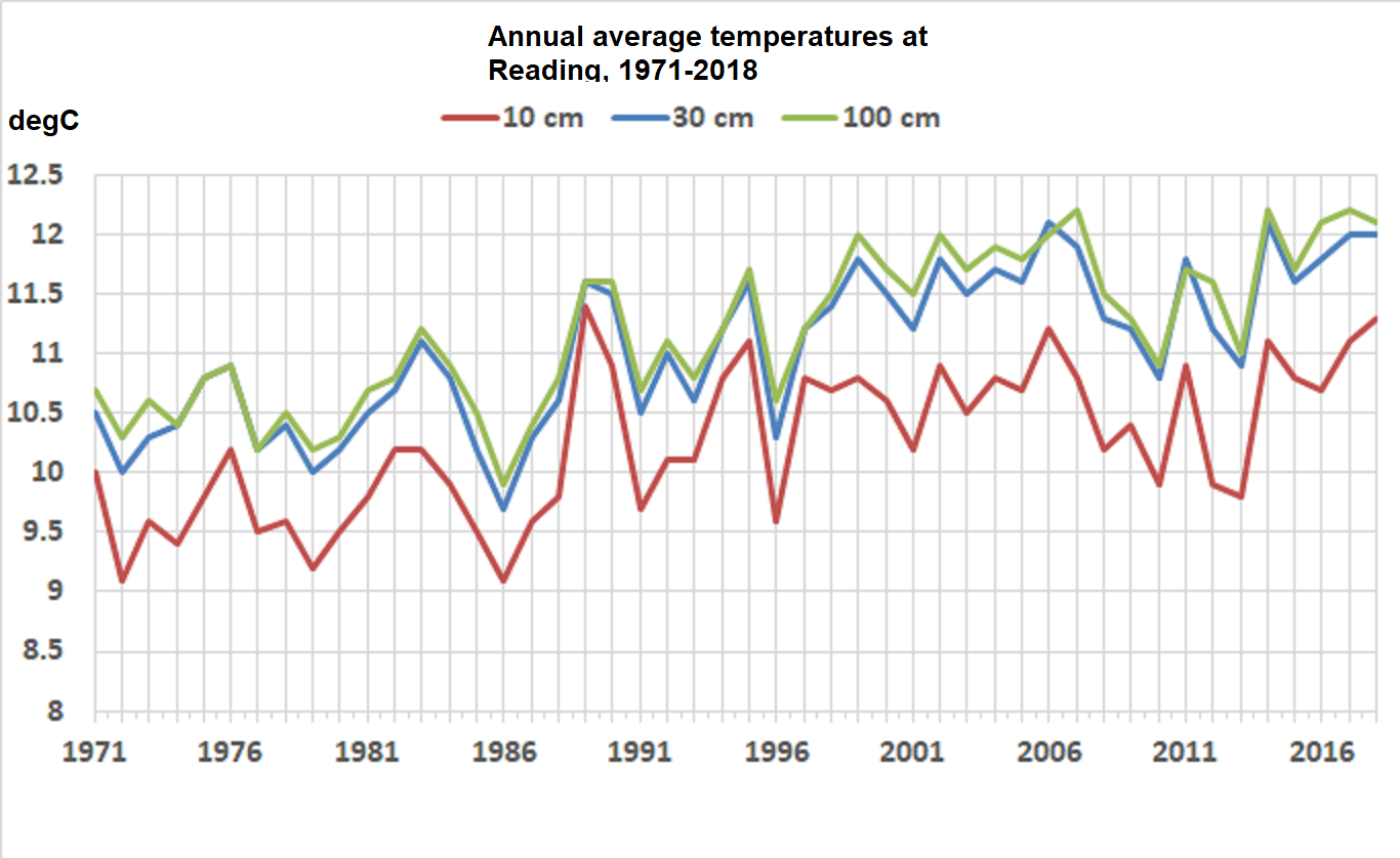
It is not just air and ocean temperatures that are warming through climate change – the soils are warming too. At the University of Reading we have monitored underground temperatures every day since 1971 from 10cm to 100cm depth. There is a clear warming observed at each depth

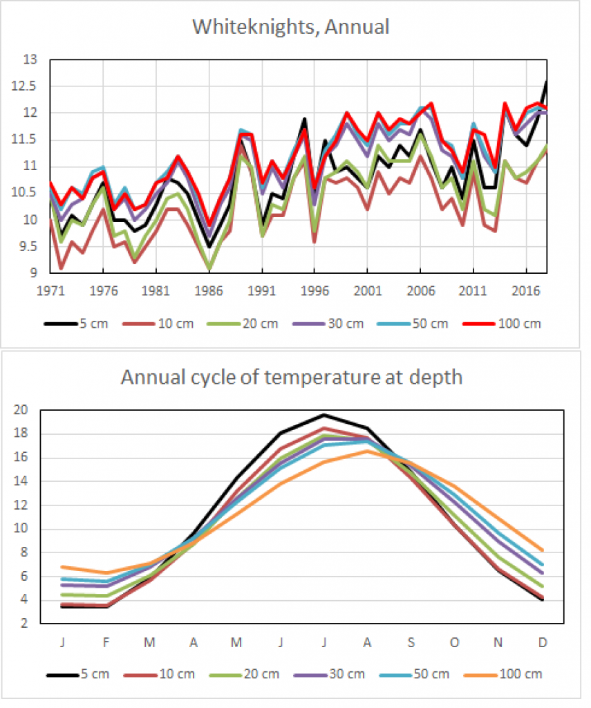
The time series for 30cm depth can be extended back further to 1941 using observations from nearby sites – Maidenhead, Hurley and an older University campus (London Road*). The variations between overlapping site records are very consistent and more than 1.5°C warming has been observed overall in the last 80 years.

(Added 12th October 2019)
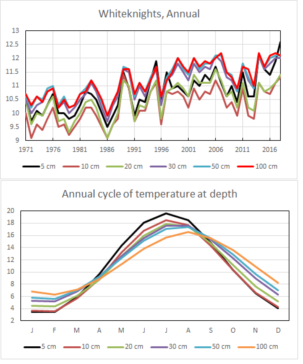
Data for other depths exists also. The seasonal cycle shows how different depths respond to the seasons, with deeper depths being lagged compared to the surface and smaller variations over the year. 10cm depth is coolest in the annual average, with 50-100cm being the warmest.

Graphics and analysis by Roger Brugge, University of Reading.

* Note the London Road campus is about 0.5°C warmer than the other sites, and this difference has been corrected for in the black line.

Atmospheric temperature trends

The lower atmosphere is warming while the upper atmosphere is cooling – a clear fingerprint of the enhanced greenhouse effect from human emissions of carbon dioxide.

The simple explanation is that some of the infrared radiation emitted by the surface, which would have normally reached the upper atmosphere, is absorbed by greenhouse gases in the lower atmosphere. The upper atmosphere therefore receives less energy than before, and so cools. The very warm years (intense reds) in the upper atmosphere are the 1982-83 El Chichón and 1991-92 Pinatubo eruptions respectively.

Changes in global atmospheric temperature at different levels in the atmosphere from 1979 to 2018: surface, TLT, TTT, TMT, TLS. Data from Cowtan & Way, and RSSv4. The colour scale goes from -0.75K to +0.75K, relative to the average of 1981-2010 for each layer separately.

#ShowYourStripes

On 21st June 2019, the #ShowYourStripes initiative was launched, providing ‘warming stripe’ graphics for virtually every country at showyourstripes.info.

The data was provided by Berkeley Earth and several national meteorological agencies, and the stripe graphics are available for 1901-2018 for most locations, but extended further backwards where the national data was easily available. The US States and UK regions have their own separate graphics, as do Stockholm, Oxford and Vienna – three of the longest continuous series in Europe.

Over 1 million graphics have been downloaded from the showyourstripes.info website, and many media outlets covered the story: BBC, Washington Post, Fast Company and Gizmodo. Continue reading #ShowYourStripes

Climate stripes for the UK

Following the ‘warming stripes‘ graphics for different locations around the world, this post focusses on the UK. The Met Office makes easily available long-running climate data from a small number of locations*. The visualisations below show the common changes in temperature and rainfall for the five longest climate monitoring stations in that set – Stornoway, Armagh, Durham, Sheffield & Oxford – which all have data for 1883-2017. Continue reading Climate stripes for the UK

What does ‘mean’ actually mean?

Are you a user of global temperature data? If so, have you ever thought about the meaning of the word “mean” in “global mean surface temperature”?

I’m guessing that for most people the answer to the second question is “no”. “Mean” is such a ubiquitous concept that we don’t think about it much. But let me try and persuade you that it might need a little more thought. Continue reading What does ‘mean’ actually mean?