The importance of the ‘pause’ in global temperatures has never been about whether some particular trend is just below or just above zero, or about whether a specific period shows a statistically significant trend (whatever that actually means), or even about whether the trend has changed. The ‘pause’ has always been about understanding whether Earth’s climate is evolving in line with our expectations.
Several papers have now emerged suggesting that there has never been a ‘pause’. This claim is based on a rather narrow definition – if you compare linear trends over certain periods then the linear trend has not actually changed by much. For example, the recent papers by Karl et al , Lewandowsky et al (in two similar papers), and Rajaratnam et al all compared trends over specific periods and suggest that there has been no ‘pause’ or ‘slowdown’, defined by changes in linear trends. And, Cahill et al find no recent ‘change point’ in global temperature trends.
Estimating linear trends is a helpful structure (and I have used it too), but I think these papers fundamentally miss the point – we do not expect the climate to change linearly.
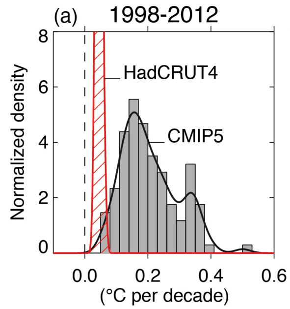
There was a recent period in which the observed trend was on the edge of the uncertainty derived from the raw projections from CMIP5, whichever observational estimate you use – the IPCC AR5 made this point in the Figure below (only using HadCRUT4). And, it is not just global temperature – for example, the winds in the Pacific are behaving outside expectations.
Science proceeds by taking an observation that does not match expectations and seeking to explain it. There are many possible explanations for this particular observation which have been analysed extensively, and the climate community now has a much better understanding of: the nature of climate fluctuations, the role of the Pacific and Atlantic Oceans in sequestering heat, the importance of observational coverage, how to best compare observations and models, and the role of uncertain radiative forcings.
This research has been valuable and worthwhile, even if global temperatures are about to break new records, in line with our expectations that the surface would indeed warm again.
ADDITION (19/09/15): Consider a hypothetical example where the observed warming had accelerated to (say) 0.25K/decade, but the GCMs had projected 0.4K/decade. Much of the same research would have considered the discrepency. The magnitude of the trend is not the point.
Hi Ed
how do you look at the difference between RSS/UAH and the surface series?
It’s not very likely that RSS/UAH will produce record temperature this year. According to the models they should give more warming than the surface. These seem to be valid question that draw little attention in the current debate about the “hiatus”.
Cheers, Marcel
Hi Marcel,
Interesting question – I am not an expert in the TLT trends, but I think we would expect them to warm due to the El Nino. I am speculating that there may be a time lag in the response, but I hope others may chip in here!
Ed.
Hi Ed,
the global tropospheric temperature response to ENSO typically lags the SSTs by 3-6 months so we should start seeing the response right about now. There was work by John Christy back in the 90s I believe on this which is likely still valid.
Nice piece by the way.
There appears to be not much of a response in either the surface or the satellite datasets in terms of a large spike. Given that the surface data shows significantly more warming recently than the lower troposphere, it would not take much of a spike anyway to push 2015 into record territory. It will take a huge spike in temperatures in the LT over the next 3/4 months to push 2015 anywhere near the record in 1998. If the expected uptick in global temperatures does happen, and even accounting for the fact that any increase should be exaggerated in the LT, it looks highly unlikely that either RSS or UAH will register 2015 as a record warm year. But as Marcel says, this fact seems to be studiously ignored by most commentators.
Hi Jaime,
First, there is spike in surface temperature – we are way above 2014 at the moment. Also, you will no doubt recognise that the large El Nino occurred in 1997-98, producing the warmest year in 1998, not 1997. 2015 is equivalent to 1997 in terms of the timing, not 1998.
Ed.
Hi Ed,
Yes, what I mean is the surface sets show a more gradual rising at the moment rather than a sharp spike.
http://www.climate4you.com/images/HadCRUT4%20GlobalMonthlyTempSince1979%20With37monthRunningAverage.gif
Entirely possible that the main spike will come in early 2016 but that won’t make 2015 the warmest year in satellite and it will have to be pretty spectacular to make 2016 warmer than 1998 in the LT.
Hi Ed I think the “pause” is a bit of a red herring in what is a complex non linear noisy climate system abounding with inter dependent variables, some of which may yet to be discovered?
The climate reanalysis data from NWP models data assimilation/initialisation captures this nicely in real time
http://models.weatherbell.com/climate/cfsr_t2m_2005.png
I find the amplitude in the anomalies pretty extraordinary. Anyone?
Sorry folks here’s the “0pen” link just scroll down to the NCEP derived GLOBAL TEMPERATURE TRACES, apologies.
Link aargh!
http://models.weatherbell.com/temperature.php
Interesting – a little surprised at seeing 1C changes in a couple of weeks for NH. But looks like anomalies from global mean for the hemispheres, which is a slightly odd way of presenting it? NH nearly always has larger anomaly than SH?
Ed.
“NH nearly always has larger anomaly than SH?”
Hi Ed, wouldn’t we expect that given the SH is mostly ocean that retains/releases its heat content which would have a “buffering” effect on the anomalies unlike the NH which contains most of our land masses?
Since the NCEP data is not just station data but all available meteorological data, satellites included with a high resolution run every six hours, I guess a one degree swing just highlights the dynamism of the climate system. Never a pause in sight 🙂
“I think these papers fundamentally miss the point – we do not expect the climate to change linearly.”
One aim (though not the only one) of these papers was to address questions that were raised by some outside the climate science research community in order to question the accuracy of GCMs or even the fact of ongoing warming. The “no warming since 1998” cherry-picking rhetorical argument has been a mainstay of climate skeptic groups for years, and has tied up too much researchers’ time in looking for detailed explanations for a statistically-insignificant variation. Hopefully these papers (and time) will help lay some non-issues to rest.
Hi Magma,
Yes – I agree that this was the main aim of the papers. Perhaps those authors have allowed the skeptic framing to seep into their thinking? 😉
However, the recent period IS significant when considered against our expectations which are NOT LINEAR! For example, if the recent trend had accelerated compared to an earlier period, but our expectations were for a faster acceleration, then the period would still have been significant for the same reason as now.
cheers,
Ed.
I appreciate this post because it expresses something that has always confused me about reporting in this field. I have never understood why anyone would expect a linear increase in temperature when the temperature increase is understood to be derived from an increase in Tyndall gas concentrations.
Any assessment of temperature should be related to Tyndall gas concentrations/inputs in the atmosphere. If the models are correct, larger inputs should result in larger increases. The issue with “the pause” is that inputs have continued, but corresponding temperature changes have not been observed. Linearity should have nothing to do with the discussion because inputs have not been increasing at a linear rate?
Hi Blair,
Yes – the rate of change of greenhouse gases is important, but they are not the only factors which influence global temperatures. Volcanoes, solar activity, sulphate aerosols are also changing at the same time as the greenhouse gases, and often in different directions. It is partly this combination of effects which produces the non-linear behaviour. And, then there are natural fluctuations from heat moving between the atmosphere and ocean and back again over the course of a decade or so.
Thanks,
Ed.
As sceptics have always liked to say “the climate has always changed”, by which they mean, in part, that there have always been natural temperature fluctuations caused by the things you mention, such as volcanoes and the sun’s output. But they can’t have it both ways: those natural fluctuations continue in their often random fashion to this day, only now an additional component—the relatively predictable human-caused steep rise in temperature linked to rising atmospheric CO2—is superimposed on top of that underlying fluctuating natural component. So the predictable and rapidly-growing human-caused warming repeatedly surges ahead and then slows in unpredictable fashion in sympathy with the essentially random underlying variations that would have occurred whether humans existed or not. It’s a bit like standing on the beach and tracing the path of a flag being raised at a steady rate up the mast of a boat which is bobbing on the waves.
These two separate but interacting elements would make a really clear animation if someone was so minded to draw it up. Ok, it might not be very scientific interpretation but that’s it in essence, is it not?
I like this animation, which is related: http://scied.ucar.edu/dog-walking-weather-and-climate
Ed.
Hi Ed, I would like to point out that the red area in the figure 9 is not the confidence interval for the observed trend. Only the uncertainties for the point measures are given there, but the uncertainties are much larger for the observed trend (especially with a correction for auto-correlation). For the latest version of Hadcrut it would be 0.056 +- 0.161 °C , as calculated in my applet (https://mrooijer.shinyapps.io/graphic/) or in Cowtan’s applet (0.061 ±0.155 °C http://www.ysbl.york.ac.uk/~cowtan/applets/trend/trend.html). So there is considerable more overlap between the observed trend and the CMIP5 models than this figure suggests.
Hi Jan,
I agree that the red area only encompasses the uncertainty in the best estimate of the trend. But that is the same as in the models too so it is a fair comparison. I’m not quite sure how to (physically) interpret the confidence interval on the observed trend as you suggest?
Ed.
Ed, I thought that was obvious. It means that the predictive value of the calculated trend is small.
For Hadcrut from 1998-2012 (using version 4.4) the linear trend on the year averages has an adjusted R^2 of only 0.02422 , which basically means that there is almost no correlation between the calculated trend and the measured observations. There is maybe not a physical interpretation, but the statistical interpretation is that this trend just measured a lot of noise and very little signal.
Hi Jan,
I think the problem is that you can probably find nearly any trend is ‘insignificant’ if you choose an (in)appropriate model for the noise!
But, I would agree that the magnitude of the trend is generally smaller than the interannual variability, which is why the R^2 is small, but we know that. The question is how to compare the models with the observations? The statistical uncertainty there is not helpful – I think we need a physical interpretation of uncertainty. For example, some uncertainty which is useful to know:
1) the uncertainty in the observed trend given the observed radiative forcings and observed weather
– we estimate this using different observational datasets, such as in the figure above. We could add GISTEMP, NOAA etc to this as well.
2) how might global temperatures have changed over the same period but with different weather
– this to me would be a useful estimate of uncertainty to know, but is not measured by the statistical uncertainty I think. In the models, we run the same period lots of times to produce an estimate of this, but we can’t do that for the real world!
So, unless someone can provide a physical interpretation of the statistical uncertainty, which itself depends on deriving a variance and auto-correlation from (say) 15 points, then I’m not convinced it is very useful for this particular comparison.
cheers,
Ed.
Ed, got here via link at Judith Curry’s site.
I’m struggling a bit here. It seems pretty black and white to me that climate science has ALWAYS said the temp rise would be LINEAR.
IPCC Third Assessment Report 2001
“…anthropogenic warming is likely to lie in the range of 0.1 to 0.2°C per decade over the next few decades…”
IPCC AR4 2007
“For the next two decades, a warming of about 0.2°C per decade is projected…”
IPCC AR5 2013
“The global mean surface temperature change for the period 2016–2035 relative to 1986–2005 will likely be in the range of 0.3°C to 0.7°C”
I got all this from Prof Curry, who I think is a reliable source:
http://judithcurry.com/2014/06/15/on-the-ar4s-projected-2cdecade-temperature-increase/
It’s historical revisionism to run this ‘climate science has always thought temp rise would be NON-LINEAR’ line, isn’t it? (If memory serves Richard Betts of UK Met Office has also run it recently.)
Right now the consensus climate science position projects LINEAR temp rise. I know it’s broad church and all but aren’t you out on a limb here? And if you’re not, how can we explain those IPCC reports?
WB – none of those quotes means there will suddenly no longer be the sort of year to year fluctuations you’ll have seen up to now. Or the changes in rate from decade to decade. A little while ago I pulled together some quotes, also from successive IPCC reports (the first in 1990 to the most recent in 2013), which indicate that there will continue to be internal variability:
http://blog.hotwhopper.com/2015/08/nothing-new-on-natural-variability-and.html
‘Linear’ in the quotes you provided is in contrast to, say, exponential or parabolic. And it’s averaged over decades, not year to year. The short term changes (say a decade or two) will generally be influenced by the oceans in particular (and volcanoes etc). For example, look at a chart of global mean surface temperature with ENSO events and the phases of the Pacific Decadal Oscillation:
Also, the blog you think is a “reliable” source: – it isn’t.
Hi WB,
There is no revisionism – the IPCC has given values for the expected average trend – but that is not the same as the trend for each specific decade, say. For example, from the very first IPCC Summary for Policymakers in 1990:
Remember that the IPCC graphics often show the ensemble mean, rather than the individual ensemble members. The real world is a single ensemble member:

This animation might also help clarify that even if the long term trend is a certain value, we expect to see variations:
And, of course, the radiative forcings vary non-linearly, e.g. solar cycle, volcanic eruptions, sulphate aerosols etc
cheers,
Ed.
Hi Ed, thanks for that gif. That’s pretty great. I get the concept of variation year to year.
I am just saying to you that climate science has been peddling via the IPCC, the global warming would occur at the rate of 0.2 per decade in the first 2 decades of the 21st century. That’s the consensus position. We’re 15 years in and it hasn’t happened as the IPCC projected, whether or not each year has shown variations.
The rate of warming in the 21st century has been less than the IPCC projected it would be i.e there has been a pause in the global warming experienced in the 21st century relative to the global warming that occurred in late 20th century. AR5 admits this, albeit grudgingly and briefly. Variations year to year within each decade are just obfuscatory.
In any case, terrific blog.
Hi WB,
Thanks! The other point to note is that the differences between simulations can last more than a decade, showing that there are longer timescales of variability than just year to year. So, a decade of slower warming (say 0.1K/decade) is not necessarily inconsistent with a expected mean rate of 0.2K/decade. This would mean that the real world might ‘catch up’ at some point, just like what happens in the animation with the two simulations.
Ed.
Hi Ed, you’re welcome.
I am getting lost again. What do you mean by real word ‘catch up’? I think I know what you mean – but to me that’s goal post shifting.
The consensus position is 0.2 decrees C per decade global warming for the first 2 decades of the 21st century relative to the last 2 decades of the 20th century. Simple. Straightforward. Measurable. There are only 2 decades covered by this IPCC consensus prediction, not 3 or 4 or 7.
If the IPCC had predicted across, say, 7 decades, it would be logical and reasonable for that 0.2 per decade temp rise per decade prediction to have been accompanied by clear caveats about inter annual and decadal variability going along until temps in the 80th year finally reaches a ‘catch up’ to the initial 1.4 degree temp rise prediction i.e non-linear. After all 7 decades is a long time and we are talking about global temperatures. Nature does exist, variability does happen.
But 2 decades? Inter decadal variability across only 2 decades is not logical or reasonable – the timeframe is simply too short to be an effective prediction. Think about it – to argue temp rises will be non-linear across those 2 decades is to argue that the rise can be absent in decade 1 and even half of decade 2 but that suddenly there will be a rise of 0.4 in the last 5 years: it is to have predicted the pause.
The IPCC consensus climate science never predicted the pause. AR5 acknowledges this plainly. Can we at least agree on this?
Thanks for the link Ed will enjoy reading the study 🙂
Ed,
When the animation says that for 2 runs of the same model with the same forcing giving different decadel trends “the only difference is the weather”. What exactly does that mean?
Is weather just a randomised variation, or do any models include real physical models for ENSO, PDO etc. ? My understanding is that it is the former.
Clive,
The models solve the fluid equations, which produces weather patterns, like in the real world. They do not have specific codes for ENSO, PDO etc, but ENSO-like, PDO-like and AMO-like behaviour emerges spontaneously – e.g. models produce decadal variability in the Atlantic and Pacific, and hence in global temperatures. So, each simulation will have different weather and due to interactions with the ice, ocean etc, different variability on decadal timescales is also seen.
Ed.
I guess you mean Navier-Stokes equations. ‘Weather’ in the atmosphere dissipates very quickly over timescales of weeks. Therefore the only source of decadel variability can only arise with ocean circulation.
Different runs for each model are distinguished by a naming convention (rip) . r1 and r2 are exactly the same simulation but started with ‘equally likely’ initial conditions. Initial conditions presumably are all the 3d (vector) fields of T,P, ice, aerosols…. etc. etc. used by the model.
p1 and p2 are ‘perturbed physics’ which to my mind means changing basic physics parameters slightly.
So which one are we talking about here and how sensitive are results to each?
Hi Clive,
Yes – the ocean is the primary source of decadal variability (there might be contributions from land and ice too), but this is often due to coupled atmosphere-ocean processes, as well as just purely ocean variations. There is an animation of a climate model here, showing the weather it simulates over a few months: http://www.vets.ucar.edu/vg/T341/index.shtml
[Note there are no random number generators in a climate model – all the variability arises spontaneously and deterministically.]
In the CMIP5 database, yes, the r1, r2 etc correspond to simulations with different 3d initial conditions (usually in around 1860). The p1, p2 etc are different versions of the model – usually with different parameterisation schemes, e.g. the GISS model has three different aerosol schemes I believe.
In the rX simulations, the overall long term trend will be the same, but with different annual and decadal variability – like in the animation I showed in an earlier comment, which were two different rX runs. In the GISS pX runs, the aerosol responses are different, so there are differences due to that, as well as different annual and decadal variability.
The CMIP5 description paper is here:
http://journals.ametsoc.org/doi/pdf/10.1175/BAMS-D-11-00094.1
cheers,
Ed.
Hi Ed,
Can you confirm then that if I run the same simulation r1i1p1 twice then I will get exactly the same numerical output ?
Afterwards if I then run r2i1p1, then I will get a different decadel variation to r1i1p1, but exactly the same net warming trend (TCR) as r1i1p1 in 2100?
cheers
Yes – the output should be identical (‘bit-comparable’ is the lingo) if you run r1i1p1 twice. Tests like that are done. [Note that this may not be true if you compile and run the code on a different supercomputer with different processors.]
And, yes, the TCR should be very similar for both simulations – but not absolutely identical because TCR can also be affected by variability. An earlier post described a set of 230 1%/year increase in CO2 experiments with a single GCM – http://www.climate-lab-book.ac.uk/2015/does-climate-sensitivity-change-with-time/ – and TCR sometimes differed by around +/- 0.1K. Note that in that ensemble a tiny perturbation to a single grid point is enough to produce different decadal variability (i.e. the ‘butterfly effect’).
Ed.
Thanks.
That is very interesting because it implies there is an underlying ‘uncertainty’ which no amount of progress in physical modelling is ever likely to overcome. So the spread of CMIP5 model results has essentially not changed since CMIP3 despite improvements and faster computers.
Therefore it makes a lot of sense to improve underlying estimates of effective forcings. Aerosols are still highly uncertain. As a result Figure 8.18 in AR5 gives total anthropogenic forcing in 2011 as 2.3 ± 1.2 W/m2. That is a huge range of error.
Hi Clive,
Yes – there will always be some inherent uncertainty for a particular region for a particular decade which we are unlikely to reduce. But, it is still important to improve and progress the modelling to ensure we have more reliable estimates of the long-term trend, on which the variability acts. And, I agree that improving the forcing estimates is key, especially for understanding past variations and deriving TCR from the observations.
Ed.
Hi Ed, Clive
One of the best “conversations” on a climate science blog ever.
Open question; how far off are we from developing “real”world initialised climate forecasts as opposed to “random” simulations of initial conditions?
I only ask this because Kevin Trenberth, about 8 years ago highlighted this as a weakness in the then current models.
Have we made progress?
Thanks Stephen!
Good question. There has been masses of activity in initialised forecasts since 2007 when the first experimental effort appeared (Smith et al, Science).
Fair to say that I think it is still experimental, though we have learnt a lot – mainly about how hard it is! The main area of benefit is in the North Atlantic – there is consistently more ‘skill’ because of the initialisation in retrospective predictions in that region than any other. Meehl et al 2014 is a relatively recent review, although the literature is expanding fast: http://journals.ametsoc.org/doi/abs/10.1175/BAMS-D-12-00241.1
cheers,
Ed.
I keep posting this paper in various conversations and the unvarying response so far is a big fat silence. So here goes again. The spectrum analysis technique which the authors use clearly shows three periods of cooling multidecadal variability which briefly interrupt the general linear warming trend: 1878 to 1907, 1945 to 1969 and from 2001 (the Pause).
“Henceforth, MDV seems to be the main cause of the different hiatus periods shown by the global surface temperature records. However, and contrary to the two previous events, during the current hiatus period, the ST shows a strong fluctuation on the warming rate, with a large acceleration (0.0085°C year−1 to 0.017°C year−1) during 1992–2001 and a sharp deceleration (0.017°C year−1 to 0.003°C year−1) from 2002 onwards. This is the first time in the observational record that the ST shows such variability, so determining the causes and consequences of this change of behavior needs to be addressed by the scientific community.”
http://journals.plos.org/plosone/article?id=10.1371/journal.pone.0107222
This strongly suggests that something more fundamental than simple multidecadal variability is going on, which actually includes the pre-hiatus warming period from 1992-2001. I don’t see any evidence of climate science taking on board this important finding (or indeed attempting to refute it). On the contrary, what we see is either an insistence that the pause doesn’t exist or that it can be explained by internal variability of the climate system. It strikes me that the post 1992 increase in the secular trend may be related to a recovery after Pinatubo (possibly, though not sure it would have such an effect), but this does not explain the sharp downturn in the trend from 2001 onward.
Hi Jaime,
I am very suspicious of such purely statistical analyses – the problem is one of understanding the physics – the system is not as simple as we might like it to be!
For example, their ‘secular trend’ does not decline during the 1950s-1960s when we believe that aerosols were producing a cooling, and nor does it decline during volcanic eruptions – these cooling contributions end up in their MDV sinusoidal curve instead – this is likely to be a false attribution and gives the impression of a regular MDV cycle when there is not one.
Ed.
Hi Ed,
Likewise, I tend to look askance at statistical analysis papers, especially those in climate science. SSA is a nonparametric analysis method of which Wiki says: “Nonparametric statistics make no assumptions about the probability distributions of the variables being assessed.” Thus it is generally considered a more robust form of analysis which is used quite extensively in the sciences to analyse noisy time series.
I just find the conclusions of the paper very interesting and am surprised (not!) that, unlike other perhaps rather less robust statistical analyses of the Pause, it has received very little attention from the climate community. It occurs to me that the brief cooling from volcanic stratospheric aerosols may just be too brief to register as anything but noise in the time series and as such would not have any effect upon the secular trend? However, the authors speculate that stratospheric aerosols may play some part in the recent large fluctuations in ST – though they don’t identify the source of those aerosols. They also speculate whether there might have been a change in sensitivity, which I believe was the subject of your last post
“This unprecedented modification of the ST behaviour should be more deeply studied by the scientific community in order to address whether a change in the global climate sensitivity [21] has recently occurred. The unique fluctuation in ST warming rate during the recent decades could have different origins, such as the proposed recent shift of the tropical Pacific Ocean to a quasi-permanent La Nina condition [16], could be related to the enhanced melting of Arctic ice in recent decades [22] or to the increasing stratospheric aerosol content [11].”
What is also interesting is that the authors suggest AMO may contribute more to MDV than PDO.
“Such an analysis [spatial distribution analysis of individual signals] could have also helped in clarifying the relation of the MDV to some of the previously described natural modes of surface temperature variability (e.g., PDO and AMO). However, a simple phase analysis (not shown) seems to indicate that the MDV is closer to AMO than to the PDO.”
Suggesting that the Atlantic is driving internal variability more than the Pacific and thus intimations of a return to positive PDO may have less of an impact on global temperatures in the coming decades than the expected downturn in AMO.
Purely by coincidence, I’ve just come across another statistical paper on the pause at Judith Curry’s site which also suggests that there may be something special about the current pause – at least within the context of the general warming trend since 1933. It defines a ‘pause’ as 5 consecutive moving decades of no decadal trend and finds that there were 12 such periods between 1850-1932, but only one – 2001 to 2014 – since 1933.
http://papers.ssrn.com/sol3/papers.cfm?abstract_id=2659755
But the phases in their model are likely incorrect because their ‘robust’ model is missing the physics of aerosol cooling!
Ed.
Ed,
But it’s not a model, it’s an analysis of actual data which one might suppose resolves fairly accurately the signals which are already there.
“For example, their ‘secular trend’ does not decline during the 1950s-1960s when we believe that aerosols were producing a cooling.”
If you look at Fig. 3 (a) of the paper, you will see that there is a significant uneven decline in the ST from about 1935 to 1965 which includes a period of an even steeper decline from about 1955 to 1963. Is this perhaps the aerosol cooling which you are looking for?
http://www.researchgate.net/figure/265509825_fig3_a%29-Warming-rates-%28C-year1%29-obtained-from-the-different-signals-identified-in-the-SSA
Jaime – of course it’s a model! Just a simple one. Just like a linear trend is a model.
And, Fig 3a (note it is rate of change) shows the trend in ST is always positive after 1880! No cooling.
Ed.
Ed- so you are saying that the decline in the warming rate as contributed by the secular trend from about 1935 to 1965 has nothing to do with aerosols?
Hi Jaime,
I’m not going to get involved in a long discussion on this – the paper uses a model which is too simple to base any firm conclusions on.
There is hardly any decline in warming rate – the model suggests the observed cooling is due to MDV, whereas we have good physical evidence that the aerosols were doing a large part of this.
End of conversation on this topic.
Ed.
Oh dear. We’ll leave it there then.
If you want an idea of expected secular trends it would be best to consult the CMIP5 model mean global average. For 10-year trends 1992-2001 is much greater than 2002-2011, 0.55K/dec versus 0.17K/dec. Yes, this is mainly due to Pinatubo.
‘I don’t see any evidence of climate science taking on board this important finding ‘
You seriously haven’t noticed papers being published suggesting a forced component to lower temperature trends?
(cough) http://www.nature.com/ngeo/journal/v7/n3/full/ngeo2105.html
“The ‘pause’ has always been about understanding whether Earth’s climate is evolving in line with our expectations.”
Is someone is going to use the word ‘pause’ within the context of global warming, it would be kind of nice if they actually meant a pause, rather than whether or not the climate system is evolving in line with expectations. That would require using another word which conveyed the correct meaning.
I agree that the terminology and language on this issue has not been very helpful!
Ed.
“The importance of the ‘pause’ in global temperatures has never been about whether some particular trend is just below or just above zero”
This is confusing (confused?). The “pause” is about whether there has been a temporary cessation of warming, hence the word “pause”, meaning “stopped temporarily”. Whether global temperature is rising at the same rate as projected all the time may be important to scientists, but that’s not the same as the so-called “pause”.
As for papers “missing the point” – I’d have thought that with some of them at least, that is the very point they are making. That temperatures are not expected to rise at the same rate all the time.
Some papers acknowledge that the temperature rise is not expected to be at a constant rate all the time. Some seem to try to avoid the issue (eg by comparing long term trends from 1950 – Karl15, the IPCC and the so-called “hiatus” are examples).
I liked the change point analysis by Niamh Cahill, Stefan Rahmstorf and Andrew C Parnell. The new Lewandowsky et al paper is also useful, and doesn’t dispute a recent slowdown (which seems to have itself “paused” with the El Nino).
Ed I like your articles, but denying that “pause” means “pause” when it does, seems to me to be a corollary of claiming global warming has “paused” when it hasn’t 🙂
If as you suggest, you and some other scientists have been using “pause” in the way you say, can I suggest you find a better word to describe a purported misalignment of observations and simulations. Try words like “mismatch”, “discrepancy”, “divergence” or similar. “Pause” doesn’t cut it.
Hi Sou,
See my addition in the post above – the magnitude of the trend has not been the issue. If the models had predicted zero warming, then this topic would not have gained so much prominence. I agree the language choice has been poor in this area. But, most of the analysis in the papers listed has been specifically designed to show there has not been a change in rate – specifically not taking the wider view of variations around a long term (non-linear) trend.
Ed.
“(non-linear)”
I take it from what you wrote earlier the non-linear arises from the fact that external forcing themselves dont increase in a uniform way and so temperatures themselves dont increase so (this is ignoring NDV). Is that correct?
Because my scepticism arises from a different linearity which is between the change in external forcing and change in temperature and the sense that this is well understood. It seems to be at the heart of the dog walker analogy where our view is drawn to how the dog wanders around the walker. We seem less critical about what’s causing the walker to take the route she does.
Hi HR,
Yes, overall the forcings are non-linear. The GHGs are roughly linear over short periods, but aerosols, volcanoes and the solar cycle are non-linear. And, aerosols and volcanoes can affect different regions in different ways also, and so may have different climate sensitivities.
So the dog walker will be walking non-linearly in reality.
Ed.
What a great resource. My question is about the linear rise of CO2.
How can it be so consistently rising linearly when surely there are ups and downs in CO2. Right now Indonesia is spewing more CO2 from burning its forests than all of the US. By contrast, individual countries or groups of states have succeeded in lowering their CO2 emissions with changes in their energy supply at times since Kyoto Accord. Surely after Chernoble and the fall of the USSR, with economic activity in the Soviet Union shut down, wouldn’t that have impacted CO2? Or wouldn’t it have increased during WWII?
Given all this variability, why isn’t the CO2 trajectory a bit more lumpy like the heat trajectory?
Hi SK,

The CO2 trajectory is a bit bumpy too – this image shows CO2 (top) and the change from year to year (bottom) with lots of variations:
Growth rate was lower in the early 1990s and large after the El Nino of 97-98 for example.
cheers,
Ed.
Hi Ed,
Wow! Figure (b) looks a lot like the step change in global SSTs, in turn GMST. There are also a couple of “hiatuses”(let’s not go there).
Cut to the chase the 97/98 large El Nino “out gassed” some CO2?
Hi Stephen,
Yes, El Nino years cause larger CO2 growth rates – this is mainly due to tropical drought and forests burning. Some of that extra CO2 will be absorbed next year as the forests regrow.
https://scripps.ucsd.edu/programs/keelingcurve/2015/10/21/is-this-the-last-year-below-400/
Ed.
The other really important point is that from year-to-year CO2 must always go up because we are adding it to the atmosphere, and there is no process which removes it quickly.
There is an annual cycle as CO2 is temporarily taken up by Northern Hemisphere forests in summer, and then released each winter. And there are geological processes which remove CO2 over hundreds to thousands of years. But, once fossil-fuel CO2 is emitted to the atmosphere it will stay there for a long time.
Ed.
About half of the extra CO2 we add each year is removed from the atmosphere. It would be interesting to see how long it would take to remove all the excess if emissions were stopped tomorrow. Unfortunately we can’t do that experiment!
There is an assumption that burning down forests or burning wood chips in DRAX somehow is ‘renewable’ and that it is only fossil fuels that are bad. Fossil fuels are simply organic matter that got buried anaerobically so that the carbon content was unable to decay with oxygen to release CO2 at that time. If the Indonesians are hell bent on burning down their forests to plant Palm Oil so that they can then sell us Biodiesel, we should pay them to cut the trees and let them rot in swamps. At least that way the carbon gets sequestered.
Biofuels are the problem. They should be banned.
Hi Clive,
Deforestation is a big issue, as well as fossil fuels. Chopping down old forests to grow biofuels is not a good idea in my view either.
cheers,
Ed.
Thanks. Yes, I realize it’s not going to turn around and go down since it’s cumulative, but I was expecting more variation like in the record you show – yes, that does make more sense.
Also, could you show the CO2 trajectory through 2014? I understand China has made a bit of difference in global CO2 by idling so much of its coal capacity while ramping up renewables in just the last year it has impacted global CO2.
But I’ve not seen any graphs.
Global emissions are still increasing so I would not expect to see a slowdown in growth rate. There will be a big spike in 2016 because of the ongoing El Nino and the forest fires in places like Indonesia.
cheers,
Ed.