Below is a simple example of using different colour maps to show the same UK mean temperature data for both normal vision and a simulation of colour blindness.
Viridis is a new colour map developed for Python (MATLAB code here) with lots of nice features, including removal of artificial perceptual boundaries which jet suffers from.
Which do you prefer?
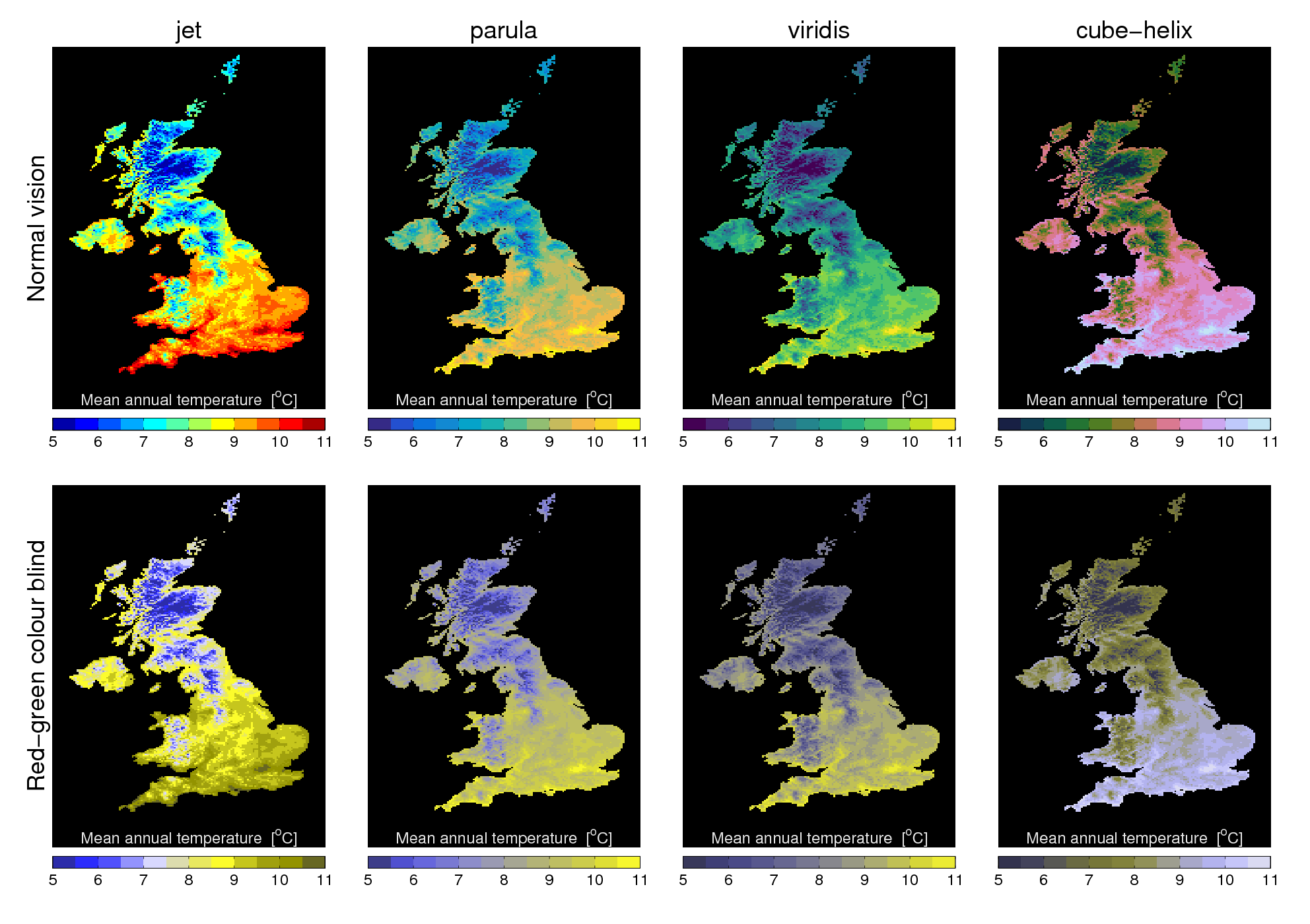
[This post continues our #endrainbow campaign to reduce use of ‘rainbow’ colour scales like jet.]
I’ve spent quite a bit of time looking at the images. I assume I have normal vision. Both versions of Jet seem to have better “contour resolution” between the temps, is that what you mean by “artificial perceptual boundaries “? OK in reality we don’t step over a simple line between boundaries but that doesn’t mean they are not useful to draw.
From a psychological perspective since we also distinguish between “hot” reds and yellows then viridis has a very “cool” look in “normal mode” whereas parula does not and both(parula and viridis) are pretty much indistinguishable from a red/green problem. So parula scores a plus IMHO. Cube helix looks inverted with a frigid south?
Ha! having now taken the time to watch the very informative video I understand the problem with my “favoured” parula, it aint free to use whereas viridis is. However the cool “snake eyed look”(Python and an asp viridis) might not prove popular in some MSM quarters. Not withstanding I can see great merit from a scientific POV.
This looks like the Linear_L colormap (https://mycarta.wordpress.com/2012/12/06/the-rainbow-is-deadlong-live-the-rainbow-part-5-cie-lab-linear-l-rainbow/) but with the white end cut off?
Agree that there is also a case for visual perception of cold/warm that these new colormaps struggle with in climate applications. Reversed cubehelix might be good, or just simply RdYlBu_r?
Alek;
“Agree that there is also a case for visual perception of cold/warm that these new colormaps struggle with in climate applications. ”
Too right, we could simply “solve” the perception of risk of AGW by using less emotive colours 🙂
A small joke but my company weather provider does use bright red for heavy precipitation on NWP models with grey, greens and blues for lighter precip . It took me a bit of time to get used to them TBH though it makes perfect sense in terms of the “psychological impact”. Red rings alarm bells afterall.
People are used to hot water coming out of the red tap (or the red end of a mixer tap) and cold water out of the blue tap (or the blue end of a mixer tap) and their skin turning red when the weather is hot, and blue when it is cold. These are instinctual and deeply entrenched.
You’re right! So you can use a diverging colormap: http://www.kennethmoreland.com/color-maps/
Jet gives me the most discrimination.
Parula is a diaster – I see nothing from 8-10.
Viridis is better than Parula – the steps are nice and uniform. However I find that any scale which goes dark-light loses discrimination for me compared to a more hue based scale, despite my protanopia
Cube-helix I marginally prefer to Viridis – the steps are more distinct, except in the 7-8 region.
With black for missing, I’d probably do better with seismic.
Thanks Kevin – interesting. I also use something like ‘seismic’ for a diverging figure with zero being white/grey/black.
In this UK example, a red-blue scale works ok – I compared this in an older post: http://www.climate-lab-book.ac.uk/2014/which-colour-scale/ where I also looked at a protanopia simulation. Would be fascinated to know how similar the full colour and protanopia simulation look like to you?
What would you use/prefer for situations which, say, aren’t temperature based but need a sequential scale? Would you always use red-blue? My concern is that style artificially puts a boundary at the red-blue transition point, which may not always be desirable?
And, do you agree with our #endrainbow campaign? http://tiny.cc/endrainbow
cheers,
Ed.