Our evolving climate: communicating the effects of climate variability
by Ed Hawkins [Published in ‘Weather’ magazine]
It is “very likely” that humans have caused most of the warming of the Earth’s climate since the mid-20th century; this was a key conclusion of the 4th Assessment Report (AR4; Solomon et al., 2007) of the Intergovernmental Panel on Climate Change (IPCC). For the UK, 2006 was the warmest year recorded to date, however 1998 remains the warmest year on record for the global average. This has led many to question whether the climate is changing as projected by the IPCC.
This article aims to portray and communicate the important role played by natural variability in our evolving climate. Understanding and acknowledging these variations is important for society and policymakers. Much of this variability is chaotic and unpredictable but some significant fraction is potentially predictable, providing an opportunity to narrow the uncertainty in climate predictions of the coming decade.
Our evolving climate
The Earth’s climate is changing primarily due to two factors – (i) the response to external forcings such as greenhouse gases, solar output and volcanoes, coupled with, (ii) the inherent internal (or natural) variability of the climate system. These natural fluctuations in climate can temporarily mask or enhance any long-term trends to the extent that one year, or even decade, will not necessarily be warmer (or wetter/drier) than the last.
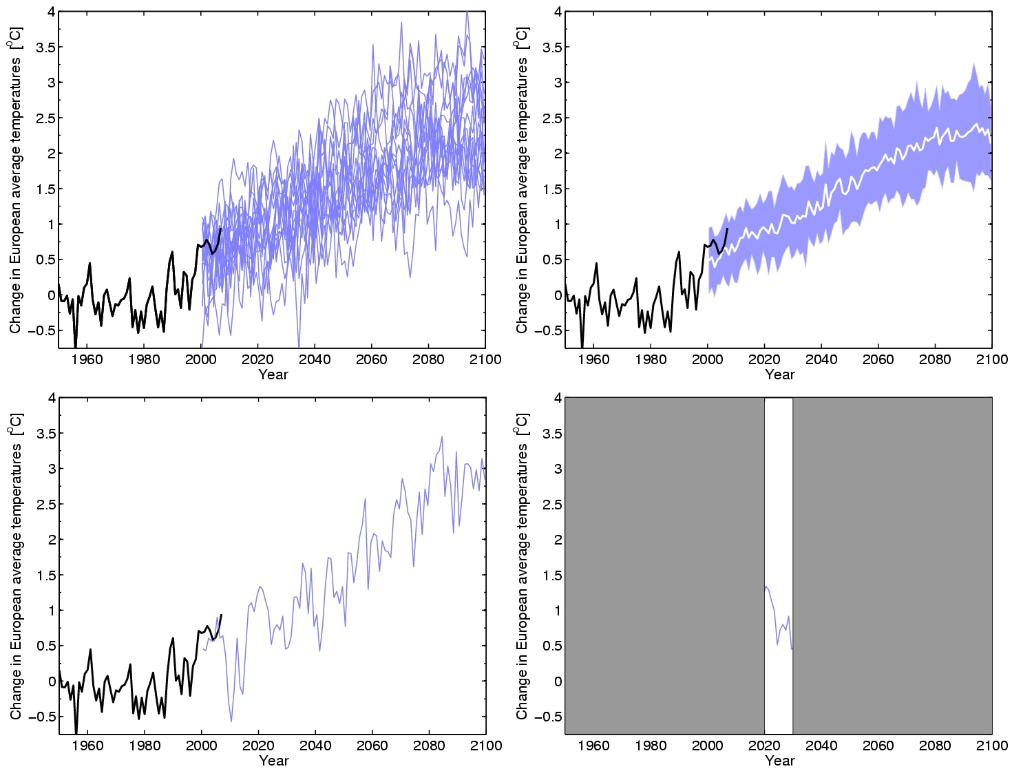
On seasonal and annual timescales, the main climate influence on global scales is the El Nino Southern Oscillation (ENSO) phenomenon – the periodic warming and cooling in the Pacific Ocean. It was the large El Nino in 1998 which helped produce the observed record global temperatures. Although ENSO has some impact in Europe (Ineson and Scaife, 2009), especially in winter, it does not dominate climate variability for the UK. Importantly, there are also longer decadal variations in climate, usually linked to changes in the ocean circulation. This type of natural decadal variability can make it difficult to distinguish between a long-term tend and a short-term natural fluctuation, illustrated for European (EU) temperatures in Fig. 1. The black lines in each panel show observed annual average EU temperatures from 1950 onwards. Temperatures have varied considerably from year-to-year, and decade-to-decade during this period of observations.
Various global climate models (GCMs), designed by different research centres around the world, predict climate assuming high, medium or low `scenarios’ of future greenhouse gas emissions. These GCMs all differ somewhat in their response to emissions, giving a range of `projections’ of how the climate will evolve through the coming century. For instance, the range of GCM responses for EU temperatures in the low emissions scenario indicate an increase in temperature between 1.5-3.5K (Fig. 1a, blue lines), i.e. there is some uncertainty in the magnitude of temperature change even when the same future emissions are assumed in each GCM projection. It is also clear that both the historical observations and temperature projections exhibit variability. However, when presenting this range of responses, the IPCC tends to show the average and spread of the GCM projections, indicating a relatively smooth increase in temperatures over the coming century (Fig. 1b, blue shading). Although this representation provides a range for the likely increase in future temperatures, it tends to disguise the natural variability of climate. One particular projection illustrating the impact of internal climate variability on EU temperatures is shown in Fig. 1c. To highlight the importance of the natural fluctuations in climate, a decade which shows a sharp decline in temperatures is then chosen from this particular projection (Fig. 1d), demonstrating how a climate trend may be misrepresented when considering a relatively short time period. Although this particular decade is chosen specifically, it is not unusual – there are also several periods of rapid warming and rapid cooling in the observational record.
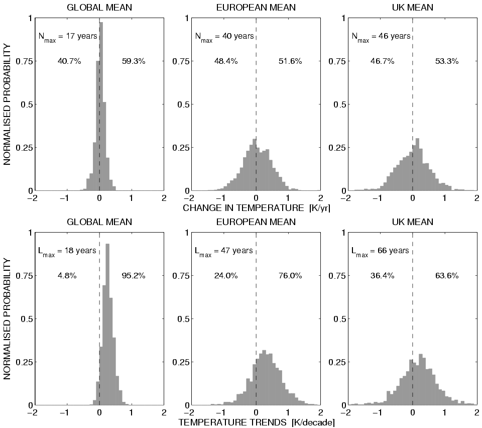
So, what is the chance of one year being cooler than the last? For global mean temperatures in the future, there is roughly a 40% chance that one year will be cooler than the last (Fig. 2a). Equivalently, this could be expressed as `2 in every 5′ years. For smaller regions, such as Europe or the UK, this chance is higher (around 47%). Although this may seem quite counter-intuitive, there is not much difference between the chances of a head or tails when tossing a coin, and whether the temperature in Europe one year will be warmer or cooler than the last.
However, for longer timescales the odds change because of the gradual upwards trend in temperatures. Decades which exhibit a cooling (or a negative temperature trend) are only expected occasionally in the future for the global mean (about 5% of decades), but these chances increase to 24% of future decades for Europe and 36% of future decades for the UK (Fig. 2b). Expressed as odds, there is roughly a 1-in-3 chance of a particular future decade exhibiting a cooling trend for the UK. This is a key point which is essential for society and policymakers to appreciate – temperatures are expected to (temporarily) go down as well as up, even in a warming climate.
Another interesting question to ask is, how long might we have to wait before a warmer year occurs? Although, we may be surprised that 1998 is still the warmest year recorded, the GCMs suggest that, for global mean temperature, it is possible that we could wait 17 years; and so far we have been waiting 12 years. For smaller regions, climate fluctuations are larger and for UK temperatures, we could wait nearly 50 years, although usually it would be under 5 years.
Although there are caveats to this simple analysis, it demonstrates how climate variability is likely to affect an individual’s interpretation of whether there are long term changes in climate or not. To determine whether the climate is truly changing, it is essential to consider long (multi-decadal) timescales and large spatial scales.
Variability as an analogue for the future
As described above, our climate is changing relatively slowly compared to human memory. As significant climate changes tend to only appear after many years, it can be hard to appreciate how the climate has already changed, and hard to imagine the impacts that are projected to occur; the climate in the 2050s may seem quite a remote prospect. However, natural climate fluctuations can help us appreciate what living in a changed climate would be like by acting as an analogue for what the future holds.
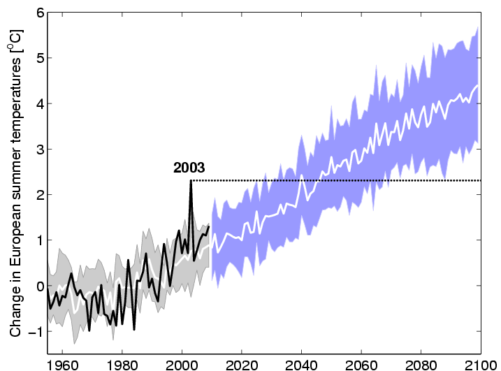
For example, the extreme European summer heatwave of 2003 gave us a taste of what is projected for Europe in the 2050s. The heatwave probably caused an estimated additional 30,000 deaths across Europe, an increase in forest fires, lower crop yields and disrupted transport (UNEP Environment Alert Bulletin, 2004). Although climate change did not cause the heatwave, it has made such events more likely. In fact, Stott et al. (2004) suggested that the chances of such an extreme heatwave had been at least doubled to about 1-in-every-250 years by the climate change that has already happened, and that this risk is increasing rapidly.
The extreme summer temperatures in 2003 are evident in the observations (Fig. 3, black line). Projections of summer EU temperatures (for `medium’ future emissions) indicate that the type of summer experienced in 2003 will become normal (i.e. 1-in-every-2 years) by around 2050, and that Europe would rarely experience a summer as cold as 2003 by the end of the 21st century (Fig. 3, blue shading).
Variability as uncertainty
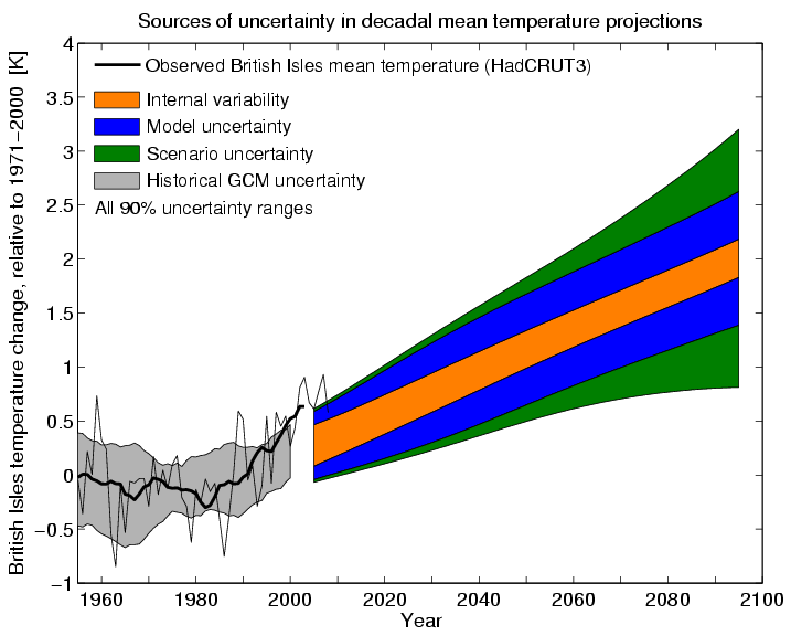
Although climate scientists are confident in the direction of any long term change in temperatures, there is a range of estimates for the magnitude of the change, i.e. some uncertainty. However, there are several different sources of uncertainty in our projections of climate. As indicated previously, the climate we will experience in the coming decades is significantly influenced by natural fluctuations, giving rise to some uncertainty over the trajectory the climate will follow (the internal variability component of uncertainty). There is also uncertainty in future climate due to different GCMs having different responses to greenhouse gases etc (termed model response uncertainty, for example, as shown by the spread in projections in Fig. 1a), and also uncertainty in the rate of future greenhouse gas emissions (termed scenario uncertainty). The potential to narrow uncertainty in climate projections depends on which source of uncertainty is dominant. For example, climate science can tackle the model response uncertainty, but can do little to reduce the uncertainty in future emissions because this depends on economic development and human behaviour.
To determine the dominant source of uncertainty, we can examine how the relative magnitudes of the different sources of uncertainty vary for different regions over the 21st century (Hawkins and Sutton, 2009). For example, projections of UK temperatures at the end of the 21st century vary from 1-3K above recent levels2. This total uncertainty in the projections can be separated into the three sources of uncertainty (Fig. 4). The natural, internal variability component (orange) is the largest source of uncertainty for the next couple of decades, and the choice of emissions scenario (green) is relatively unimportant for the near-term. This may be surprising, but it takes around 30 years for any changes in emissions to have an appreciable effect on the climate (so called `climate inertia’), suggesting that we have little chance of avoiding climate change in the UK over the next few decades and we may have to adapt. Towards the end of the century, the particular levels of greenhouse gas emissions have a larger impact on temperatures. Thus, we are committed to further increases in temperature, and any actions taken now to change our emissions will only have an influence later in the century. However, waiting to reduce emissions will further delay the climate response and lead to a larger increase in temperatures. The remaining uncertainty is due to our choice of climate model (blue). Reducing this uncertainty by improving our climate models is possible, but challenging, and is the only way to narrow uncertainty in long term projections.
Predicting a decade ahead
Climate projections assessed by the IPCC are not true `predictions’ per se; they attempt to forecast the trends in climate (Fig. 1b); variability seen around the trends are examples of how the climate might evolve (Fig. 1c). For considering mitigation of climate change, the magnitude of the upwards temperature trend is important, as this dictates how quickly greenhouse gas emissions need to decrease to meet targets for global mean temperatures. The IPCC present their climate projections as depicted in Fig. 1b for this reason.
However, it is important to make planning decisions so society can adapt to a changing climate on decadal timescales (e.g. Sutton, 2005; Wilby and Dessai , 2010). For example, an assessment of when to replace railway track might include the risks of a heatwave causing the lines to buckle, as happened in the UK during the heatwave of 2003. For most regions, it is natural variability which dominates this decadal timescale, as seen above for UK temperatures.
As a further example, imagine we are in the year 2020 and the climate evolves along the blue line in Fig. 1c. The impacts of a decrease in temperatures such as that seen in the 2020s in this hypothetical case, would be significant, e.g. to farmers planning which crops to plant. It may even cause renewed doubts over whether humans are causing the climate to change. After seeing a dramatic increase in temperatures over the previous decade, could we predict the rapid decline that subsequently happens?
We do not yet know the answer to this key question. Some fraction of these fluctuations are chaotic, and inherently unpredictable, but some derive from the slower evolution of the climate system. Research into the causes of such decadal variability focusses on the role of the oceans, and particularly for Europe, the thermohaline circulation in the Atlantic Ocean (e.g. Sutton and Hodson, 2005), the role of the stratosphere (e.g. Scaife et al., 2005) and the climate response to the solar cycle (e.g. Lockwood et al., 2010). A more comprehensive understanding of the causes of such variability may also allow testing of climate models, and to help distinguish variability from long-term trends.
In particular, if we can predict the evolution of ocean temperatures (e.g. Smith et al., 2007) we may be able to predict some of the related impacts over land. For example, the Sahel region of Africa experiences significantly more rainfall when the tropical North Atlantic ocean surface temperatures are warm, and vice versa (e.g. Folland et al., 1986). In fact, for many tropical regions, the projected trends in precipitation are relatively small compared to the magnitude of natural variability. For these regions, the focus should remain on adapting to the impacts of precipitation variability.
The IPCC do not currently assess predictions of the exact trajectory of the climate, as this does not impact the key issue of mitigating against the expected change in climate by the end of the century. However, the next IPCC report will be different, and will include a multi-GCM comparison of near-term forecasts which will attempt to predict both the continuing climate response to greenhouse gases, and the internal variability component over the next decade (see Meehl et al., 2009).
This type of prediction is technically extremely challenging. To predict how the ocean will evolve requires accurate knowledge of the ocean state, especially below the surface, which in turn requires continuous monitoring of the global oceans. The quantity of ocean observations decreases going back in time, particularly below the surface. This limitation of data only allows a reasonable estimate of the ocean state to be derived from around 1960 onwards. The recent deployment of a network of around 3,000 autonomous ocean floats (ARGO) which circulate in ocean currents has substantially aided this endeavour. These floats take regular measurements of ocean temperature and salinity from the surface to a depth of around 2km, with the data transferred to monitoring stations via satellite.
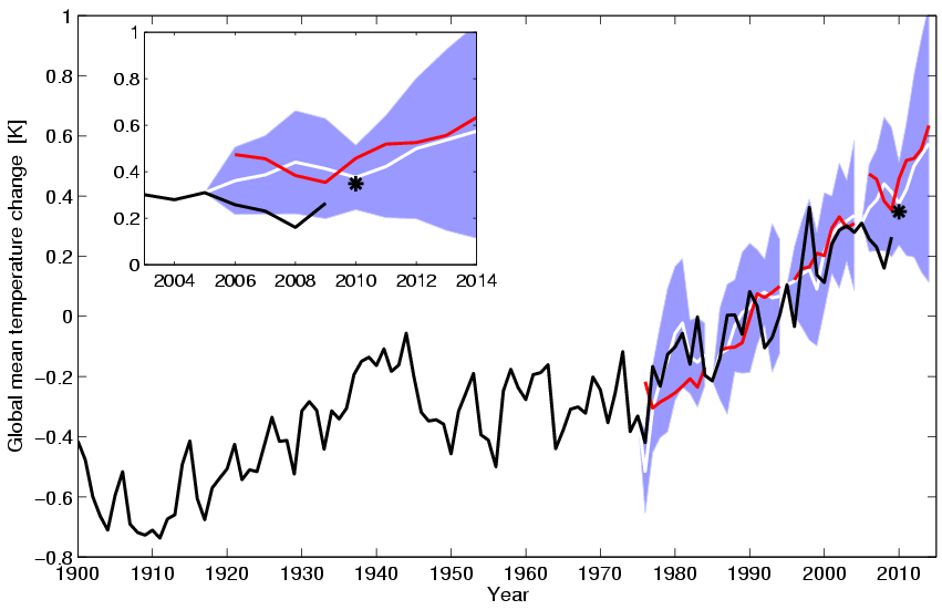
Smith et al. (2007) produced the first climate predictions which compared forecasts with and without ocean state information at the start of the forecast. Examples of such decadal retrospective predictions of global temperatures are shown in Fig. 5. The blue shaded areas indicate the predictions made using the additional ocean data (`initialised’) and the red lines are standard climate projections which did not use any extra ocean state information. Although both methods predict the upwards trend in temperatures since 1975, the initialised predictions predict the evolution of the climate more accurately, especially for the first year or two, demonstrating their potential to improve predictions and narrow uncertainty.
The inset in Fig. 5 shows individual forecasts started in 2005. Although the subsequent observations are generally within the range of predicted temperatures, they are at the lower end. This could have happened for at least three possible reasons, (i) by chance, or (ii) because the model is not able to fully predict the natural variability (such as the 2008 La Nina), or (iii) because there are other external forcings which are not yet fully accounted for in the model.
Numerical weather prediction has benefited from continually assessing the ability of the computer models to make forecasts. Further testing of our climate models in a similar way is vital to increase confidence in their use for longer term projections and potentially identify parts of the model which require improvements. Whether these types of decadal prediction can produce more accurate forecasts for smaller regions, and of other relevant climate variables, such as precipitation, remains to be seen (although see Smith et al., 2010). The provision of climate information relevant for adaptation – or `climate services’ – is growing because of this potential for more accurate near-term predictions.
Summary
Our climate is evolving. Although global and regional temperatures generally have a long-term upwards trend, the presence of natural variability means that each year, or decade, is not necessarily warmer than the last. Communication of the impact of natural fluctuations is vital for decision makers and for a sceptical public. Progress in understanding and predicting the natural fluctuations in climate offers the potential to test and improve climate models, narrow the uncertainty in climate predictions and aid adaptation to our evolving climate. Meeting these substantial scientific challenges requires continued investment in global observations, more advanced climate models and better ways of testing climate models against observations.
The author welcomes any feedback on this article and communicating climate variability and climate uncertainty in general.
Ed, Judith Curry has a blog on your paper at http://judithcurry.com/2011/07/20/essay-on-our-evolving-climate/ . There are over 100 comments, many of little use but some which you might find of interest and perhaps worth a response.
Thanks Faustino – Judith was kind enough to let me know that she had posted an article. I will stop by and see if I can contribute usefully.
Ed.
To understand the CET evolution since 1650’s, it is important to understand the North Atlantic, and it appears that very few do.
Note the important point made by Tony B
“It’s especially interesting because of the dramatic warming trend from 1690 to 1730.”
http://judithcurry.com/2011/07/20/essay-on-our-evolving-climate/#comment-88564
No science hypothesis even less a theory regarding the CET trends is complete without an explanation for this extraordinary period, it is just no good avoiding it!
I would recommend the article from the WHOI stating:
One of the “pumps” that helps drive the ocean’s global circulation suddenly switched on again last winter for the first time this decade.
http://www.whoi.edu/page.do?pid=12455&tid=282&cid=54347
then a quick look at:
http://www.vukcevic.talktalk.net/NAOn.htm
Going back to Tony B’s point 1690-1730. The WHOI’s “pump” of thermohaline circulation (THC) in the North Atlantic is controlled by the subpolar gyre. Data related to these events clearly shows a direct correlation to the one of more puzzling periods (1690 to 1730) in the CET evolution.
http://www.vukcevic.talktalk.net/CET-NAP.htm
Hi vukcevic,
I agree that the 1690-1730 period in CET is interesting, but the CET observations do have considerable uncertainty before 1772 (see hadobs). And note, that I don’t use CET in this study.
Also, in your links you don’t explain what your NAP precursor actually is a measurement of.
Ed.
Thank you for your reply.
– The CET, as the longest temperature record available, is a good representation of the N. E. Atlantic’s area trends. Expanding to European (to Urals and Turkey) is just inappropriate since Mediterranean trends are different (the NAO effect). Further and wider move to the global temperatures could be even more problematic, if the science is to find the true causes of the climate change.
– Scientists avoid the CET before 1772 not because data is unavailable (it is here: http://www.metoffice.gov.uk/hadobs/hadcet/cetml1659on.dat) but it is inconvenient problem of the 1690 – 1730s period. Dr. Lockwood should also note that the sharp rise started some 15 years before the Maunder min ended.
– the NAP data is a dataset I developed and will be, with the all relevant information, available online as soon as I complete an article dealing with natural causes of climate change.
“your links you don’t explain what your NAP precursor actually is a measurement of.” Seconded.
Thank you for making this available. I wonder how are the probability distributions in figure 1 arrived at? I would like to use ‘R’ to reproduce them. Why? Well I get confidence by doing the sums and I learn a bit more the same way. In the absence of clear hard-edged falsifiable predictions or ingenious pieces of technology I find re-working the sums is the only thing left. I like it too – but not getting stuck 🙂
Hi Peter,
The global mean temperatures from a whole range of CMIP3 climate models are available here:
http://www.ipcc-data.org/ddc_gcm_intro.html
This should allow you to make versions of the global histograms in Fig. 2 fairly easily. Email me if you want to check anything.
Ed.
PS. Note that you may not get a perfect reproduction because I used the global mean data from the range of models I had already downloaded at the time I made the figures.
“It was the large El Nino in 1998 which helped produce the observed record global temperatures.” But was 1998 really the warmest year on record? It depends on whose data you use:
According to HadSST2, HadCRUT3 and NCDC “ocean” 1998 was the warmest year on record.
According to CRUTEM3 it was 2006.
According to NCDC “land” it was 2007.
According to GISS LOTI there was a tie between 2005 and 2010.
According to GISS “meteorological station only” and NCDC “land and ocean” it was 2010.
The bottom line is a) that we really don’t know what the warmest year on record was and b) that we should be careful to specify which data set we are referring to when we talk about “surface temperatures”.
Hi Roger,
Thanks for the comment – I fully agree.
The published version of the paper (unfortunately behind a paywall) does include the information about the dataset used, and a mention that other datasets are different.
Ed.
Thanks Ed
As a matter of interest, which data set did you use?
It was HadCRUT3 throughout.
Ed.
Ed
Thanks for working to clearly present the uncertainties involved.
See my recent post on further issues to address.
Ed:
I’m going to run out of lateral space if I use the reply option again, so here’s a new comment.
HadCRUT3 averages surface air temperatures with SSTs. There would be nothing wrong with this if SATs and SSTs behaved similarly, but they don’t. If we compare HadSST2 (or 3) with the GISS met station only SAT series, or with the Lugina series, or even with the 2% version of BEST, we find that the air shows about 0.3C more straight-line warming than the oceans since 1970 – a substantial difference. Clearly we are looking at two different warming trends in two separate physical environments, but HadCRUT3 averages them together anyway.
If we want to distinguish anthropogenic impacts on climate from natural variability we need a robust surface temperature record to work with, and I’m not sure HadCRUT3 qualifies (NCDC “land and ocean” and GISS LOTI have the same apples-and-oranges averaging problems). But whether it qualifies or not we would still get more objective results by comparing our data separately with the SST and SAT records, because the two aren’t the same.
To put it in simple terms, we don’t average the lower stratosphere temperature record in with the lower troposphere record, we don’t average the lower troposphere record in with the surface air temperature record, and we shouldn’t average the SAT record in with the SST record either.
Roger Andrews
I would be interesed to know Ed’s thoughts on the accuracy -and therefore the value-of the SST record as produced by Hadley to 1850 or so.
tonyb
Hi tonyb,
I think the new HadSST3 dataset is a good step forward – it has a more robust error analysis, and a whole ‘ensemble’ of possible past SST changes, allowing people to examine how uncertain any trends are. Of course the SSTs further back have larger error bars but, fundamentally, it is rather hard to rigorously assess the accuracy as we can’t go back and remeasure!
Ed.
Hi Roger,
Firstly, climate scientists do the just SST & land SAT comparisons all the time.
And, I don’t see what is wrong with averaging – the land is warming faster than the oceans, which is a well understood physical phenomenon (google land sea warming contrast), and if we want a ‘global’ picture we have to use the SST and SAT records together.
So, the surface temperature is SST over the ocean, SAT over the land and a blend where the two meet. Seems perfectly sensible to me.
Ed.
Ed
Re: Fig. 1 “projections for the 21st century from a range of global climate models (GCMs) using the `low’ future emissions scenario (SRES B2). (a) The individual projections from each GCM. (b) The mean (white) and spread (blue shaded) of the individual projections.”
Appreciate it if you could provide further details on:
1) Which GCMs were used? and
2) How many runs were used for each of those GCMs?
PS Lucia at the Blackboard is analyzing uncertainty boundaries on data vs projections. e.g. See comparison of 2001-2011 vs IPCC projections.
Hi David,
I believe it was 15 models, each having 1 run – so 90×15 possible decades.
Ed.
Ed:
You say “the land is warming faster than the oceans, which is a well understood physical phenomenon”. Three observations:
First, I assume that when you say “land” you mean SAT over land, which of course ignores SAT over the oceans. This subject is too complex to get into here, so I’ll just say that my results show no significant differences between SAT trends over the land and over the oceans during the 20th century and leave it at that.
Second, the SST/SAT warming differential is a function of sea-air heat transfer. Sea-air heat transfer is a highly complex mechanism, and we still don’t really know how it works because of uncertainties related to back radiation, skin layer effects, ocean circulation impacts etc. It certainly isn’t “well understood”.
Third, the air doesn’t always warm faster than the oceans. Between 1910 and 1940 the oceans warmed faster than the air. (Another example of natural variability, I think.)
Next, on the issue of whether global warming has stopped. If we look only at SST it has – there’s been no significant warming since 1997. If we look at SAT it hasn’t – there’s been 0.3C of warming since 1997. We could avoid a lot of confusion if we pointed this simple fact out. The air is still warming, the sea isn’t. Take your pick.
Finally on the question of the warmest year on record. It was 1998 based on SST (2010 came second) and 2010 based on SAT (1998 came fourth). Again, take you pick.