 Climate change is a complex global issue, requiring simple communication about its effects at the local scale. This set of visualisations highlight how we have witnessed temperatures change across the globe over the past century or more. The colour of each stripe represents the temperature of a single year, ordered from the earliest available data at each location to now. All other superfluous information is removed so that the changes in temperature are seen simply and undeniably.
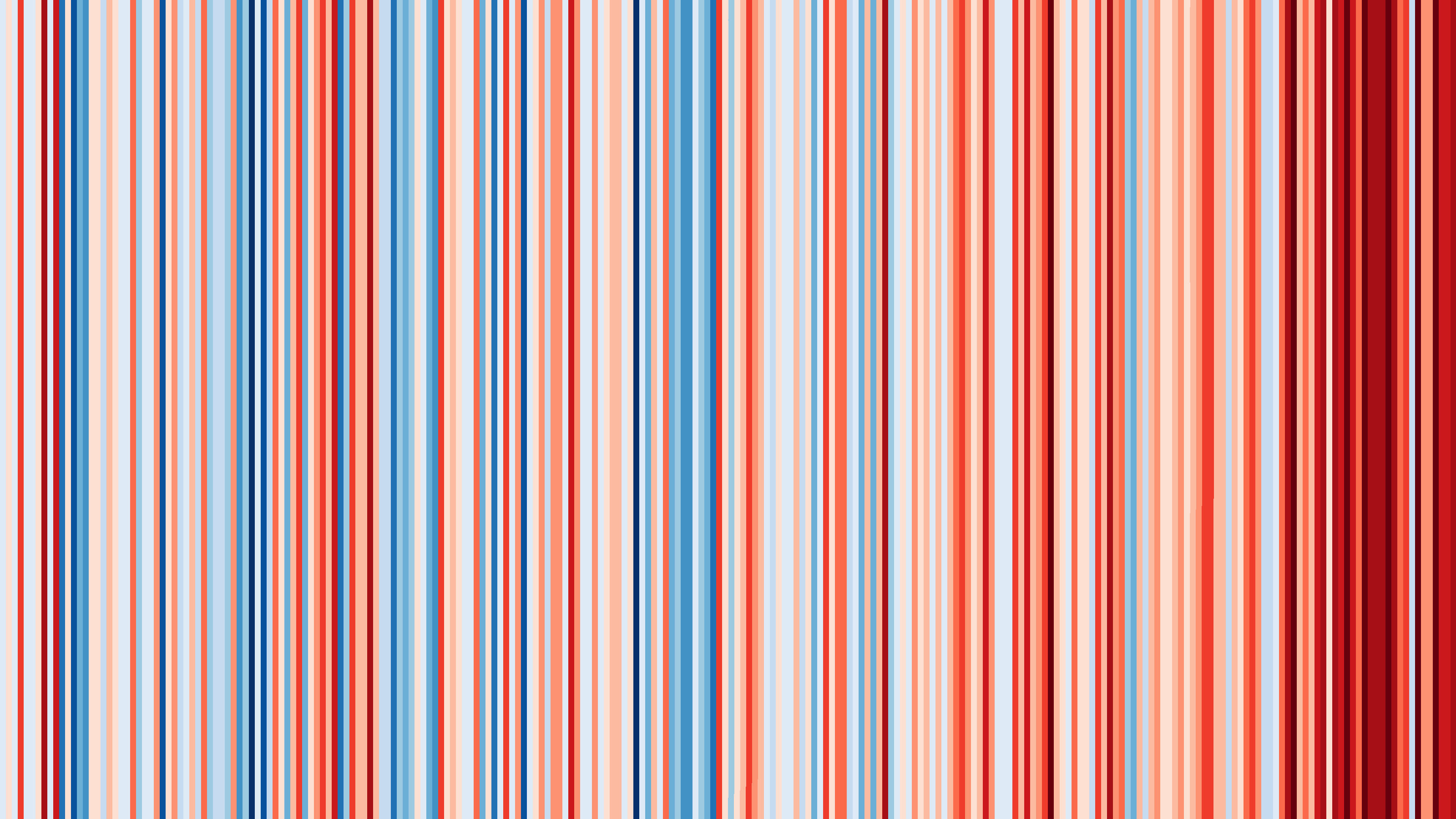
Annual global temperatures from 1850-2017

The colour scale represents the change in global temperatures covering 1.35°C [data]
In the UK, the Central England temperature timeseries stretches back to 1772 with observations every single day. For the wider UK, a set of stripes for different locations is also available, as used by the i newspaper.
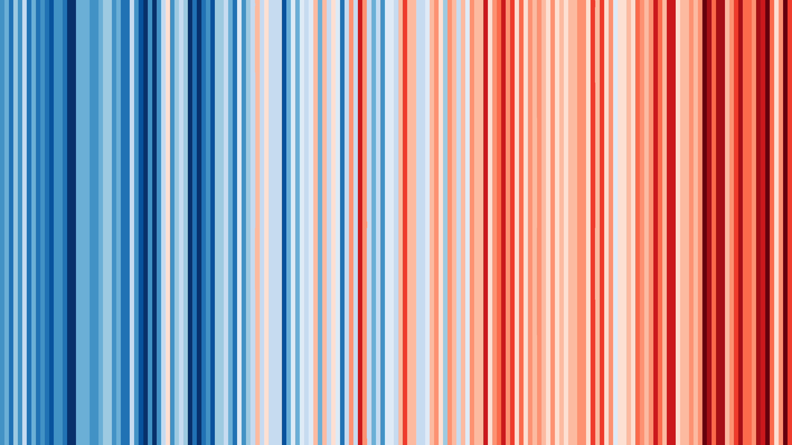
Annual temperatures in central England from 1772-2017
The colour scale goes from 7.6°C (dark blue) to 10.8°C (dark red) [data]
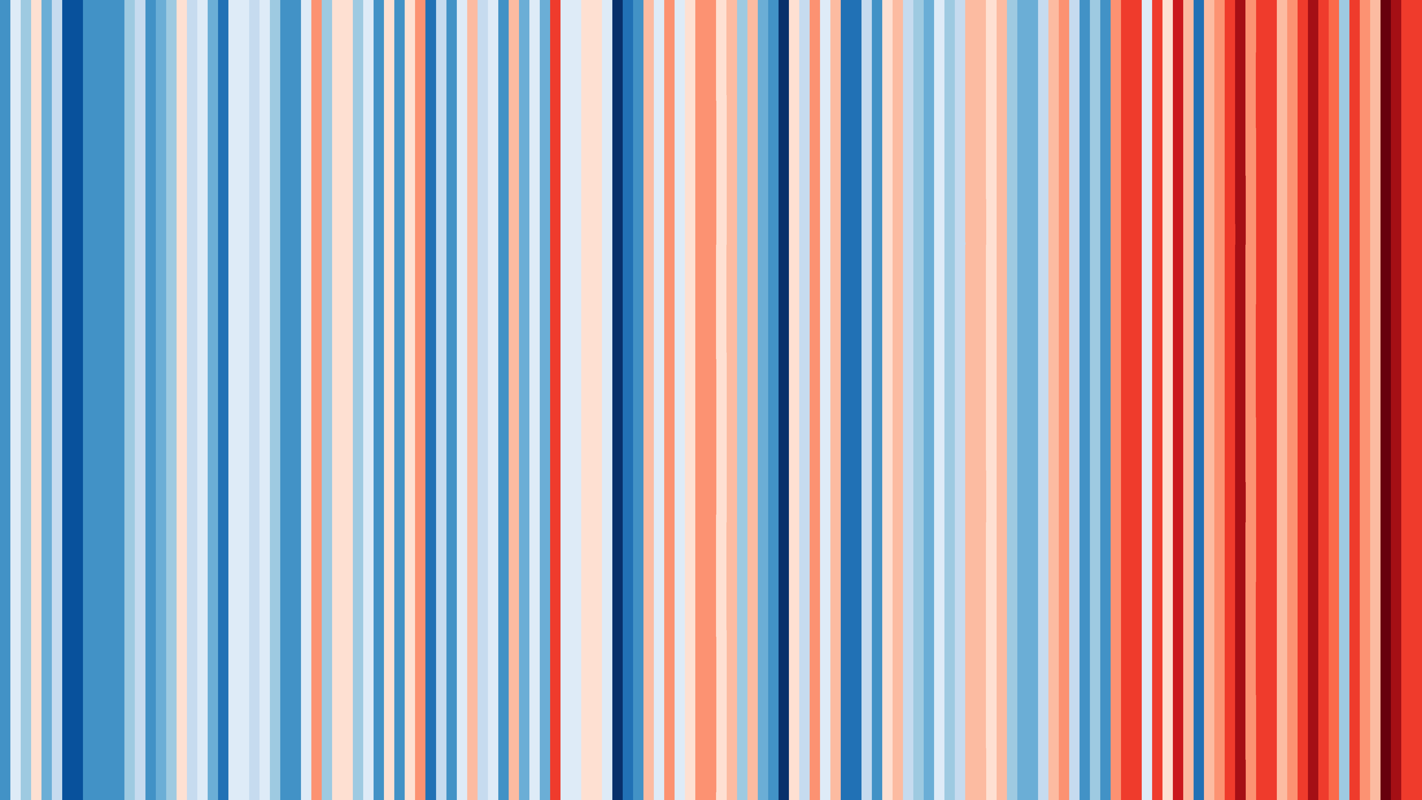
Annual temperatures for the contiguous USA from 1895-2017

The colour scale goes from 50.2°F (dark blue) to 55.0°F (dark red) [data]
This stripe concept was adopted by CBC News to communicate climate change in several Canadian cities, including Toronto.
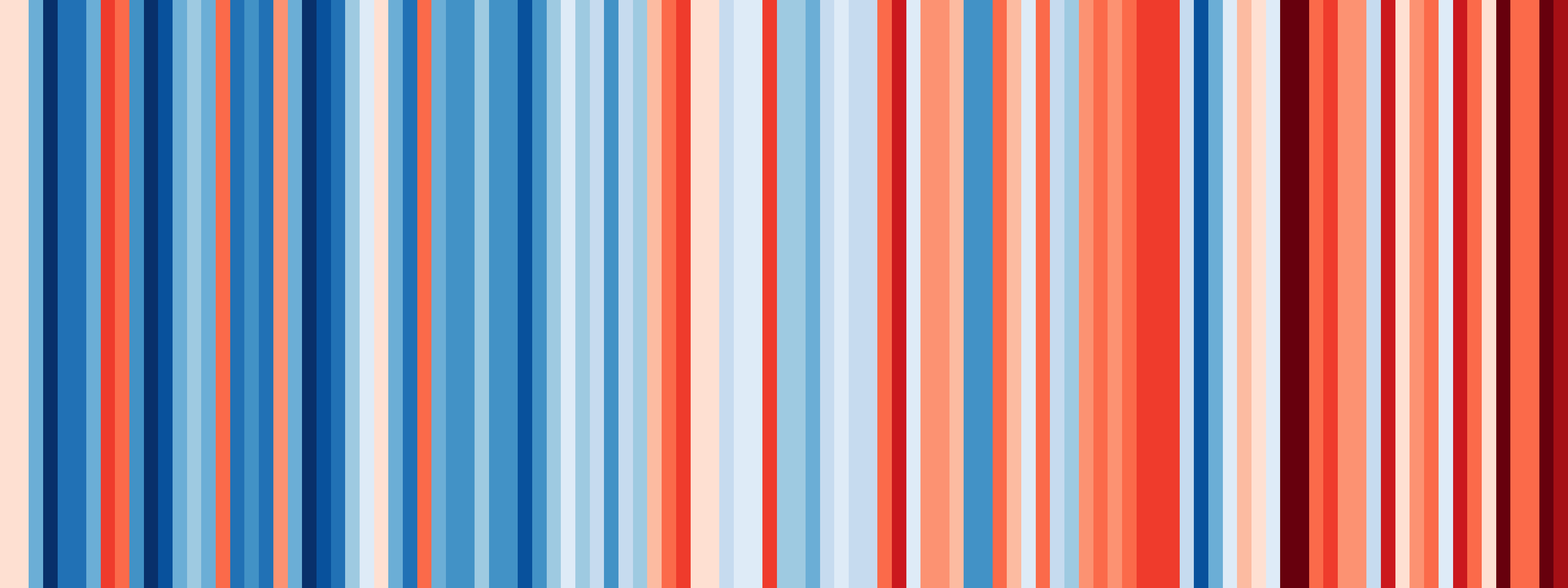
Annual temperatures in Toronto from 1841-2017
The colour scale goes from 5.5°C (dark blue) to 11.0°C (dark red) [data]
Annual temperatures in Germany from 1881-2017
The colour scale goes from 6.6°C (dark blue) to 10.3°C (dark red)
Annual temperatures in Vienna from 1775-2017 (appeared on front page of Weiner Zeitung)

The colour scale goes from 7.5°C (dark blue) to 12.0°C (dark red) [data]
Annual temperatures for Australia (1910-2017)

The colour scale goes from 20.7°C (dark blue) to 23.0°C (dark red) [data]
Annual temperatures for Switzerland (1864-2017)
 The colour scale goes from 3.0°C (dark blue) to 6.5°C (dark red) [data]
Annual temperatures for New Zealand (1909-2017)
 The colour scale goes from 11.3°C (dark blue) to 13.4°C (dark red) [data]
More locations coming soon…
visually very impressive, but what is the scale?
Thanks Alexandra – the scale differs between the locations, but covers around 3K for the central England version. Could add a scale to each, but was trying to keep everything as simple as possible for these particular visualisations.
Ed.
Is there a way you could line up these graphs so that all have the same time frame by size? Yes, England’s graph would start sooner, but it is disturbing (haha) to me that I can’t accurately compare the areas as it is currently shown. Thanks!
Nice, I’m guessing each graph is on a relative scale, which does an awesome job of showing what really matters (warming). Then for more details (e.g. how many degrees of warming and what that will cause), people can delve deeper into other graphs. Would be great if you could make a page that starts with your graphs, and then goes further into the details step by step.
If dark blue represents 7.6 degrees C on one chart, 50.2 degrees, F on a second chart, and 5.5 degrees on a third chart, what’s the point?
Also, why are 15 color gradations used on the global temperatures chart to show a change of only 1.35 degrees C of data?
The point is not comparison between countries, but change over time for each country.
The colour scales represent deviation from the mean for each area. Change is what is being shown here – change is mostly clearly seen as deviation from the local mean.
15 colour gradients are useful for global change, because 1.35 degrees is a HUGE amount of change for the global average. Global temperature difference during the Little Ice Age was only -0.8*C, yet it had massive economic and social impacts.
Why is 1.35 degrees C a big deal? For a perspective from the US, read what NASA has to say on the subject.
https://climate.nasa.gov/news/2458/why-a-half-degree-temperature-rise-is-a-big-deal/
That is written in regards to an additional change of 0.5 F.
If the world temperature rises by two degrees, mountain glaciers and rivers will start to disappear and mountainous regions will see more landslides, as the permafrost that held them together melts away. By 2100, sea levels could rise by a metre, displacing 10% of the world’s population
1 degree celcius increase is the global average. In some areas it increases more rapidly. Especially in arctic areas during cold seasong, and areas around equator during warm seasons.
ex. The temperaturen on the Island Svaldbard north of Norway, has experienced a 5.6 degree celsius increase since 1961.
The trend for each graph is surely the point here. The time period may be different for each chart. The temperature range might be different but the trend is obvious. warming is taking place.
Well done Ed, the best visualization on global warming.
Jabson
I agree with Alexandra … at least it needs a bit more explanation of what we are looking at.
But very striking – can’t you get a few arts students to knock up something – it should be in the Tate Mod (Turbine Hall preferably)?
It IS a work of art as it is.
With a message we can immediately recognise.
Think the Tate modern turbine hall is a great idea
Brilliant. Be nice to have a detailed caption stating the period and temperature range.
Thanks everyone for the comments – have added a few more details and links to the data.
Ed.
Hi Ed. When can we get one for South Africa?
http://www.showyourstripes.info
I love the display, allows to visualize at the same time past variations, but also the global shift. And much “funnier” than XY chart.
Still, I agree that it would be good to have some explanation and scale. I suppose it’s yearly average minus average for the period (or first year) (?)
These are awesome. How easy would it be to divide the vertical axis into months, so we can see seasonal variation?
The beautiful colours of human extinction
I think human extinction is going a bit too far but for some other species it is a big risk.
Ed.
Excellent visual rhetoric!
Great job. For some reason this is quicker to understand than any other charts I’ve seen (and understood).
Do you think that (if there were any way for humans to have documented before 18xx) there’s a possibility that these weather increases could be a part of a cyclic weather pattern gradually over the centuries? Hot >cold>hot? My father and I had this conversation where he brought that up, and looking at your data I’m wondering about it. Either the planet was stable since created and was always around 5 degrees cooler; or it was freezing at inception and has been continuously getting hotter; or it has a constant state of change (which is what this existence is all about) and the temps will continue to go through the high/low phases.
@Yvonne: See the following link for a nice infographic conveying both the size and timescale of temperature changes for the last 20,000 years. It uses a long scroll to allow for scale. You can zip by quickly to get the gist, and then slower to examine details and caveats.
https://www.climatecentral.org/news/climate-change-xkcd-comic-20696
Should have this on T Shirts and bumper stickers.
T-shirts, buttons, bumper stickers, posters, and pretty much anything else you might imagine are available through https://www.zazzle.com/store/climate_visuals/products
Follow the dotted line on this graph, answers this once and for all:
http://www.climatecentral.org/news/climate-change-xkcd-comic-20696
Notice the huge acceleration of warming at the end of all these graphs. That is the part that really reflects human influence in the past century or so.
This is nicely done. It really shows the variation in various areas but how they all sow similar trends. I was wondering if there were any countries/cities etc whose data doesn’t fit and shows a trend from warmer to colder. It would be interesting if they existed.
It’d be interesting to see points on the chart at the times we know elements that contribute to climate change were introduced e.g. automobile invented, etc.
Any chance these are being reproduced as art pieces?
I actually saved the image and sent it to an online canvas-making company, turned out well! https://lh3.googleusercontent.com/AfGURdqSBt04LdUwv2VYrOegTFZ02oZCdggssHWvMdxxrao3hTczS5Fu8M3ETf82nYfvmSrL7mtNLfepBRpsWGcHdUN3VM22XDsPqFSPKJhMVAp9YLtpgPHb9TXlmh7FQs2TYHVagkEWo5r7dxnEiRW2AyBCiTp6TLduRtFK7Ab–xqcv_xNWUIkY6KxgZHIDfP4plqaVxbod4s0-sSm4D7z1L5DutYi6_hVORmYBUS9H0F2hsiyZhYWyPZJh7RopmsZGpgc9XsxjuoVJfoRq105jg46KBEf0_TEQQ3TsF7AFwVQRTwgV1uR9jwelvRCAO6jwtDWbnzoLVBpdBqVQIQduBlLE-J3fL_Z7tRPvZ-6MT4XhKiw9wc3mvTEcOKX6nOUZBMeqZBGuvLPeVkKMw-86kKgnyDZ5405YN-5DzctrKfmFvPKzWAGQIZ5Hj4xunnpVNn6mdf7CTXej6Ossi51qyH3i1y8gz20pbEddH4fvD2UuXVOz7dyvuC_bawlrIqVDQPQ6NBddTOs3xaBNVWfFGWLdg0oiKTW8hzGVwK99PJDKBwLOSB57QImfE5aPw79bGWSWbehvnrbpJYTa67GA40L7AIWGrqSp3PC=w1279-h960-no
As a matter of fact, I made an art piece in 2015 depicting the global annual mean temperature series 1600-2014.
http://sheldonfiberdesigns.net/the-globally-warm-scarf/
I love the visual simplicity and lack of distractions.
If there were some roll-over effects, like roll over a line and it tells you the year, that would help people to delve more deeply into the information behind the images if they were inclined to do that.
Thanks Kevin – I like the idea of roll over effects but don’t have the expertise to do that unfortunately. Ed.
Pretty.
It would be ideal to overlay the actual chart with error bars, show labelled axes with temperature and time, and then all information would be instantly visible.
Using the HSV system with hue to show temperature from cold (blue )to hot( red) leaves the possibility of using saturation or value as a dimension to show the uncertainty. Low saturation would allow the least accurate temperatures to be shown fading into the mist (palest blue or pink ) of uncertainty or alternatively using low value for disappearing into the darkness.
With 3 colour dimensions to play with perhaps you could do temperature(H), uncertainty(V) and percent of globe covered (S).
I would purchase as a poster. any plans for that? Maybe as a find raiser the NCAS. OK, the NCAS christmas party, but I’m serious… a daily reminder on my office wall…
Take my upvote.
Agree! And when a visitor commented on it, it would be a great conversation starter
Is it more illustrative or informative than a curve? Maybe not.
But sure it’s always interesting to see new representations
The earth systems have been placed in balance from its creation. It’s the increasing dramatics that threaten life…especially species less resistant to environmental change. It’s ironic that species most endowed with creative talent are creating the most dramatic disruptions of a balanced earthly environment. A violation of the first rule of science is the cause. “don’t fix it, if it’s not broke” ; street rule, “if you broke it, you own it.” Law of the harvest, “whatever a man is sowing, this he will also reap.”
From bad to worst, the prophecy is being fulfilled…”may the worst be with you!”
2012, the day after tomorrow
Projected human extinction isn’t a reach too far. Although natural cyclical changes do cause extinctions, there is a point of no return in this progression and mankind is clearly involved.
Thanks, great job !
One tiny question thought :
“The colour scale represents the change in global temperatures covering 1.35°C”
I thought it meant there is 1.35°C from dark blue to dark red (same as other images), but ulyces.co says each shade represents a variation of 1.35°C (meaning a dozen times × 1.35°C scope).
Can you enlighten me ?
Hi Robin – the total scale is 1.35C. Thanks, Ed.
Hi Ed, I like those a lot…great graphics! I worked a similar set of data up in slide 20 of http://chrisbeales.net/environment/extreme%20events.html . It’s proved a useful way of explaining how unusual the last 20 years have been.
All the best,
Chris
Hi Ed, I like those a lot…great graphics! I worked a similar set of data up in slide 20 of http://chrisbeales.net/environment/extreme%20events.html . It’s proved a useful way of explaining how unusual the last 20 years have been.
All the best,
Chris
The bottom 2 graphs really already show a rising trend as early as 1900, which raises the question if there is not another mechanism.
Yes, guess what, CO2 is not the only cause of global temperature change, but it is the dominant one. Ed.
Um … coal industrialization?
Brilliantly frightening. Thank you for creating Ed.
Subject to temperature data availability, it would be interesting to create an open tool for users to be able to type in their city / region to create their own.
Why show 1D data as a 2D plot? Stretching the y-axis adds no information and just makes the images unnecessarily big. I would just squeeze the y-axis 75% smaller or so…
These dimensions are 16×9, ideal for slide presentations!
CET is very Bridget Riley / Paul Smith
In Mexico open data portal there is this datasets’ set called “Indicadores Básicos del Desempeño Ambiental – Atmósfera – Cambio climático”. Inside this there is the dataset in CSV called “Variación en temperatura global”. It covers data since 1880!
In Spain there is AEMET (Agencia Estatal Metereológica? with temperature datasets in CSV, but you need to browse inside “Catálogo. Plan RISP” to find what you need.
Ed,
I think you are scaling all temperature (anomalies) for each example to the full colour scale.
It’s OK if you do that, but then it does mean you can’t compare one example against another. That should be made clearer.
cheers
The post describes the scale used in each graphic so it is very clear!
I think the correct link to the last pictures should be:
https://www.metoffice.gov.uk/hadobs/hadcrut4/diagnostics.html
What platform were these graphed in? If there is code available, would you consider sharing it so that people can apply it to their own data sets of interest?
I use MATLAB but the code is very simple. Several others have produced similar graphics for different datasets already.
Thanks,
Ed.
Any chance these are being reproduced as purchasable prints?
I am working on this… will link when they are available.
Thanks,
Ed.
Great! I’d buy a necklace.
Ed, thanks for this. I have the last one hanging in my living room now.
https://lh3.googleusercontent.com/AfGURdqSBt04LdUwv2VYrOegTFZ02oZCdggssHWvMdxxrao3hTczS5Fu8M3ETf82nYfvmSrL7mtNLfepBRpsWGcHdUN3VM22XDsPqFSPKJhMVAp9YLtpgPHb9TXlmh7FQs2TYHVagkEWo5r7dxnEiRW2AyBCiTp6TLduRtFK7Ab–xqcv_xNWUIkY6KxgZHIDfP4plqaVxbod4s0-sSm4D7z1L5DutYi6_hVORmYBUS9H0F2hsiyZhYWyPZJh7RopmsZGpgc9XsxjuoVJfoRq105jg46KBEf0_TEQQ3TsF7AFwVQRTwgV1uR9jwelvRCAO6jwtDWbnzoLVBpdBqVQIQduBlLE-J3fL_Z7tRPvZ-6MT4XhKiw9wc3mvTEcOKX6nOUZBMeqZBGuvLPeVkKMw-86kKgnyDZ5405YN-5DzctrKfmFvPKzWAGQIZ5Hj4xunnpVNn6mdf7CTXej6Ossi51qyH3i1y8gz20pbEddH4fvD2UuXVOz7dyvuC_bawlrIqVDQPQ6NBddTOs3xaBNVWfFGWLdg0oiKTW8hzGVwK99PJDKBwLOSB57QImfE5aPw79bGWSWbehvnrbpJYTa67GA40L7AIWGrqSp3PC=w1279-h960-no
Looks fantastic! I hope to be providing a place to order these prints soon.
Thanks,
Ed.
Hi
Is Germany also available in really high resolution or vector? I would like to print that out to use it as art and as a warning to all of us, that this is a dangerous trend.
Let’s keep all aware of that dangerous clima trend…
Hi Axel – send an email to editor@climate-lab-book.ac.uk and I’ll send a high-res version.
Thanks,
Ed.
Erstklassiges und anschauliches Diagramm. Die Farben spiegeln sehr schön wieder, wie sehr der menschliche Einfluss die Evolution komprimiert.
Hi Ed, how large are the Warming Stripes files? I’d like to print the world data file, frame it and put it up somewhere at home. Thanks, Matias
The files weigh 5KB. Where might I find a large, printable image?
Thanks again,
Matias
@Matias – as the images are all vertical stripes with no gradient in any single stripe, using an image editor to convert them from raster (pixel/dot-based image) to vector (shape-based image) will result in an intermediary file, likely SVG format, that you can stretch to suitable print dimensions before converting back to a raster format. There are online editors that will provide this service for free. Cheers!
I would like to see these datasets redone with the “Human Comfort Zone” (15°C/59°F – 25°C/77°F) as the white area (centered on 20°C) and then shifting to red & blue as the numbers exit this zone. This would allow all the graphs to be on the same visual scale for comparison. I know some areas are more “used to” more extreme temperatures but the HCZ is said to represent the range that reflects the average person’s healthiest range worldwide.
I’m sure when you use Arctic stations, the right half would even more red than in Toronto and the right end very dark red. In the most crucial ecosystem for human survivability.
Is is permitted to use this global graphic on social
Media – I’m thinking a viral awareness campaign with a share of the graphic on its own to start with – then after a few days you include an explanation.
If the hottest in UK is 10.8ºC that means you are aproaching to Mediterranean Europe although you still have a long path to go across. That day, you will start a weather which is quite nicer that the current at the UK to live (outdoors living, terraces instead of dark pubs, open air markets, balconies at your appartments.. that is life!).
Hello Ed, I was wondering if these are under a Creative Commons License or something else? On what terms (if at all) can I use them for a presentation/poster? Have a great day!
They can be freely used, but would appreciate an acknowledgement somewhere!
Thanks,
Ed.
+1 for Arctic stripes.
Thanks for such a great graphic! I will use the one for Toronto when teaching. I would like it more if the link to the data is not broken, though…
Link fixed!
Ed.
Hi Ed,
great work! Are the graphics free for use under a Creative Commons License or eventually public domain? I’d like to share them on our blog and in our client magazine (https://www.mahlwerck.de) because we went to a clima neutral production (as a first step). Thaks a lot!
Hi Ingo,
Graphics are free to use with an acknowledgement, and a link to the source (this page) if online.
Thanks,
Ed.
Dear Ed,
with great interest and admiration, I have followed your publication of the warming stripes. I would like to hang the picture for Germany as a large-scale expression in my office as art and at the same time warning everyone that this is a dangerous trend. Could you send me a high resolution file via Mail: bjoernruesing@gmail.com
Thank you in advance and best regards from Germany
Björn
At first glance very impressive graphics. But….
Are historical readings 100% credible?
What do we know about measuring principles and methods decades and centuries ago?
What do we know about measurement accuracy, calibration and uncertainties?
How would the graphics look like if historical readings would be corrected in an appropriate way?
I agree, Helmut.
How do the accuracy and granularity/resolution of recent, historical, and pre-historical data compare?
The reason the accuracy matters is that these all seem to represent small degree variations, which might be on the order of the inaccuracy of historical/pre-historical data/estimates. What is the accuracy of historical/pre-historical data sufficient to conclude that current temperature variations did not also happen historically?
The reason granularity/resolution matters is that the time span of the rapid temperature increases that are depicted in these warming stripe graphics are on the order of decades — and sometimes even years (because that’s the time resolution of more recent measurements), but it’s not clear that there is historical/pre-historical data with comparable time resolution. If there is not comparable resolution, then it is possible that recent short-term warming of the degree evident in these depictions might have also happened historically, but the lower resolution of historical data would not show this warming.
I guess the broad question is: If the earth is about 450 million decades old and we have data of sufficient accuracy and time resolution (to discern the current, distinct warming trend) from only the most recent decades (recent = ~20-~40 decades?), how do we know something like the current warming trend hasn’t happened historically and the historical data just isn’t good enough to show it?
And just to finish that thought, it matters if a similar abrupt warming happened in the past because if it had, then we would have to show that the mechanism of previous warming is different enough from the current situation (which includes “natural” and direct and indirect human influences) to rule that mechanism out as the possible cause of the current warming — that is assuming we could accurately characterize the mechanism of the previous warming.
Hello Ed,
Can I get the images also for my computer, tablets and phone (for the background). It is a stark reminder to do every day the right thing to stabilize the climate. And to talk with people about it, if necessary. It is visible this way and a topic for a conversation.
Thanks!
Richard
We can play with statistics, computer modelling, even drag up articles from nearly a hundred years ago, but sooner than later, the realisation that there is something askew with our environment and our climate, that even the overly optimistic deniers must give credence to.
In truth there is just one graph, it starts from 350 degrees 160 years ago and heads up on a 45 degree angle.
The problem is the math in most people’s head. They think 1.5 degrees is insignificant. The Ocean doesn’t, neither does the troposphere, and neither do those ‘eager-beavers’ in waiting; the millions of tons of Methane Hydrates patiently biding their time to raise their ugly heads and use 1.5 degrees as the catalyst for 3 degrees, 4 degrees, 5 degrees!
But what about the human factor, will we suddenly get into gear and do something?
Well, going by the endless climate summits, that is very unlikely, and even if it were, the inevitable, self-centred question will be asked… What do we want everyone else to do about it!
Hello, these are great. Trying to get my around all the details so I can explain the figure to others. Could someone explain in laymans terms how the temp for each year is derived? Is it a country wide average? and from how many sources? For example the Australian data linked says it is the annual mean temperature anomaly, that would mean as there are more and more hot years the average will also rise more and more over time and the increase in temp will be somewhat masked by using the temperature anomaly wont it?
Upvoting for some Scandinavian versions 🙂
Like these a lot its what might bring it home to less technical population, who need to see them, these are representations and for those who criticise the lack of this and that well you could have done it first with all the bells and whistles added.
This is really effective. I like the way it’s easy to see trends over all the noise of annual temperatures. It’s a very good way to explain why a cold year a couple of years ago, or a run of hot years 100 years ago is not particularly relevant to climate trends.
The chart seems to have only plotted since 1772-2017 for example. However, this is only the last little bit since the Roman Warm Period, then we have the Medieval Warming Period, then the Little Ice Age and then as partially plotted in the Warming Stripes. Seems to have missed the earlier periods that we kind of know of about 15,000 BC.
Dear Ed, I followed with great interest your publication of the warming strips. Do you have a version for France? If yes, I could broadcast it to French meteorological weather presenters. Could you send me the visual in high resolution so that the French media can use it with your coordinates? With My best regards Christian
Brilliant visualisation! Thank you for that. I would be interested in temperatures in non-built-up areas though. Simply because cities produce and keep the heat with all the concrete and no trees to compensate. This means, while the temperatures are correct, they don’t necessarily show the climate change correctly I think.
Great visualization. Something from Brazil? São Paulo maybe …
I am confused about what information is displayed as the verbal description varies from what I think I see.
Is the neutral (colour) point for each location the average annual temperature for that location over the entire time range for that location or for a subset?
Alternately is it as the verbal description seems to say, how much each year’s average temperature varies from the previous year’s average? Graphically it appears this is not what you are trying to display.
Looking at these bar graphs tells me that from the start to the current date the cities and countries depicted have seen population growth. City sizes have grown and with this growth the amount of heat generated by everything in these cities from industry to people to the parking lots, streets, houses sidewalks. Now if the populations of these cities and countries were to shrink and the infrastructure were also to decline with the population, one would see the temps decline as well.
Hello Ed, I love the warming stripes. Quick question though: the Germany one does not have its data listed. Where does it originate from?
Hey Ed,
great job and very useful for showing to normal people and it’s easy for them to get the feeling. Would love to see something from the most populated, polluted and burning cities in the world maybe New Delhi or Mumbai?
thanks!
You should turn these into Ltd edition prints . I’d buy one for Aus and one for the UK.
Amazing job !! When the French warming strip will be available ?
this is a very nice illustration of an unfortunately severe problem…
I have the most minute of editorial comments for the “Annual temperatures in Vienna from 1775-2017” the newspaper should be “Wiener Zeitung” not “Weiner Zeitung”
Southern Africa soon…..esp South Africa / Cape Town?
Hey, great work!! Is there any chance to buy prints or to get print data? We are interested to display those graphs in the period of a thematic week
Also interested – would love to print one out that I could hang in my office 🙂
Here is an R package to make climate stripes with various options that may be interesting to some
https://github.com/duplisea/climatestripes
The mainpage shows how to install and run the package with examples.
Hi there, that’s a very effective infographic. Apologies as I haven’t read all the comments – but I’d really like to see this as a classic graph with error bars, a line of best fit and some statistical testing to see if there is a significant difference between the temperatures at different periods of times. I assume you have done something of this nature – perhaps something more sophisticated and appropriate than my suggestion. I see from the data link that there is a paper about the uncertainty in these measurements, so it would be good to see uncertainties included. Admittedly it won’t be a very good infographic but will provide confidence to people with scientific training/interest.
Many thanks, Anita
Alexander Radtke takes these warming stripes one step further, and shows the stripes out to 2200 based on the choices we make today. To quote Dr. Brown from Back to the Future, “the future isn’t written yet, no ones’ is, so make sure it’s a good one!”
https://twitter.com/alxrdk/status/1111330739822477312
Since everyone seems to be so sure about their explanation for recent warming, where is the explanation for the consistent, much more dramatic declination of temperatures from 1850 to 1930?
I would like to use the warming stripes as an electronic signature. Is that allowed?
For the global warming stripes I superimposed the temperature values (Berkeleyear.org.data) .
Best,
Doris
It only gets really bad since the millenium when we stopped pumping soot into the atmosphere. Start pumping again to save the pacific islands
This is the best way to show show climate change I’ve ever seen.
I’m a school teacher and want to use the stripe image as a continuing art project; we start by painting thin pieces of wood according to your stripes and hang them on the wall. Every year we’ll place a new piece with the correct colour and then my question is:
How do we determin the colour based on the annual avg. temperature? I’ve tried to search for a “recipe” where a specific temperature corresponds to a certain colour but haven’t been able to find an answer…
Like all good ideas, and many of the greatest, the sheer simplicity and clarity of this graphic mean it’s a global winner. Where can I buy a badge like American senators are wearing?
Well done in developing your use of colours v temperature to communicate the escallation of global warming over the years.
May I ask to be able to illustrate a paper I am preparing, on the solution to global warming, with one of your illustrations? Due credit to yourself will be made clear.
Sincerely,
This is a very effective graphic technique that can be used for other univariate time series. (I tried to do this for global mean temp with water colors a decade ago but have neither training nor talent so it neve went anywhere.) I appreciate the R code. I wonder if anyone has developed code in Stata or SPSS (which my students know more often than R).
It would be helpful to have a color legend to indicate what each color stripe represents.