The warming that has occurred over the past 160 years has not been the same everywhere. Certain regions, such as the Arctic, have warmed far more than the Southern Ocean for example. How well do our climate models represent these differences?
One way of examining the regional differences in warming is to look at the average for each latitude (or zonal mean). Instead of showing monthly values of global average surface temperature (as in some previous graphics), this shows annual values, averaged around latitude circles. Thanks to Matt England (UNSW) for suggesting this zonal mean idea.
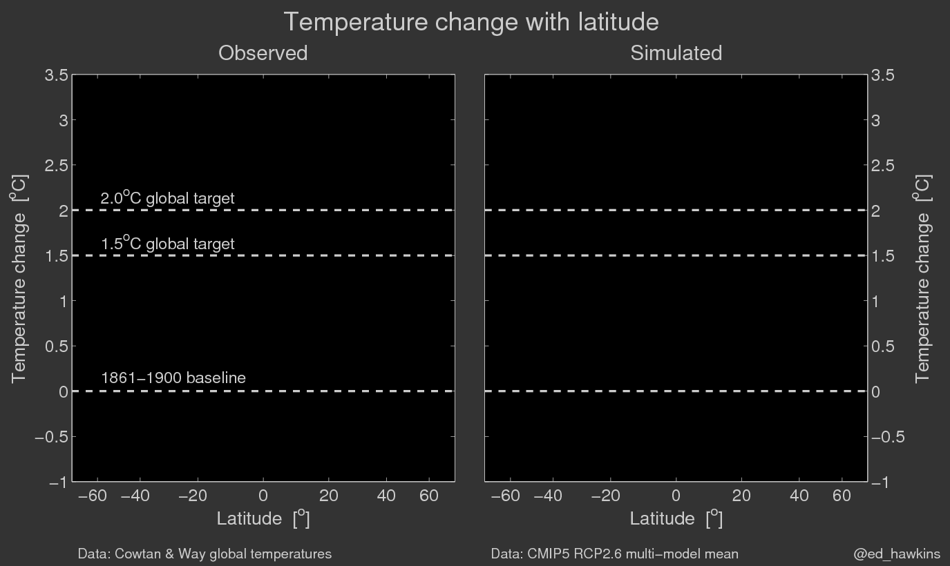
The figure below shows the zonal mean from observations (left) and the average of many different climate models (right). The different coloured lines represent every year from 1861-2016. The dashed horizontal lines indicate the 1.5°C and 2°C global temperature targets suggested by the UNFCCC in the Paris Agreement.
An animated version is available by clicking on the image, which also extends the model simulations to 2100 with a medium emissions scenario (RCP4.5).
The observations clearly show more variability from year-to-year. This is to be expected as by taking the average of the models we are removing variability from the simulated panel.
For example, the observed warming due to the large El Nino of 1877-78 can be seen, along with the warming in the Arctic in the 1940s and subsequent cooling. These are examples of natural variations occurring on top of the long-term trend.
The effect of the major volcanic eruptions can be seen as a cooling in the simulations (e.g. in 1883, 1902, 1912, 1961, 1982, 1991) whereas this is more noisy in the observations.

(or equivalent for RCP2.6 low emission pathway & RCP8.5 high emission pathway)
However, it is also clear that the structure of the warming in the observations and models is similar with amplified warming at high northern latitudes and much less warming in the southern oceans. The physics of this is also understood – local positive feedbacks in the Arctic are present as the sea ice melts, whereas the southern oceans are a large source of deep ocean mixing, drawing heat down into the depths and so warming less at the surface.
Currently the Arctic is observed to be warmer than the models (on average) suggest it should be, probably because the sea ice extent is also less than simulated. The opposite is true in the southern oceans where the observed warming is less than the models suggest, and there is more sea ice than simulated.
The animated version of the figure also shows a projection for the future, assuming the RCP4.5 pathway which stabilises temperatures at roughly 2.5°C above pre-industrial by the end of the 21st century. The warming is projected to continue everywhere, but at different rates, with a similar structure to recent observed changes, i.e. more warming in the Arctic and northern hemisphere, compared to the southern oceans.
Further details
The observations panel uses the infilled Cowtan & Way global temperature dataset, referenced to 1861-1900 to approximate pre-industrial conditions. There is some uncertainty in the zonal mean for this period, especially in the southern ocean where available observations are more sparse. The multi-model zonal mean is also referenced to the same 1861-1900 period. The latitude dimension is stretched to ensure equal surface area is represented per unit distance along the axis.
Update (11th May): added links to animations for high and low emission pathways
Dear Ed,
Thanks for the very nice animation, it condensates a lot of useful information at once.
Out of curiosity, do you have an idea whether the observed and simulated profiles are at all incompatible (in a statistical sense), especially in the Arctic? As you write, averaging the models has an effect on the conclusions; you are not strictly speaking comparing apples and apples. I would be curious to know how many individual CMIP5 realisations exceed the observed warming, for example.
All the best,
François
Thanks Francois – it is an interesting question. I suspect there would be individual realisations which do show larger warming in the Arctic, but I have not looked at this yet.
cheers,
Ed.
This is a terrific graphic. You say that you “average many different climate models.” Is it possible to say something more specific, like table 9.5 of the AR5, which provides the mean equilibrium climate estimate from 23 of the CMIP5 models, which calculated equilibrium responses? Or something equivalent.
Keep up your great work,
Ellen
Thanks Ellen – for the animation I used all 42 models which had an historical and future RCP4.5 simulation – the same models used in most of the IPCC projection graphics.
Cheers,
Ed.
Ed, is there a journal article that details the faster warming of higher northern latitudes? Thanks. Darrin