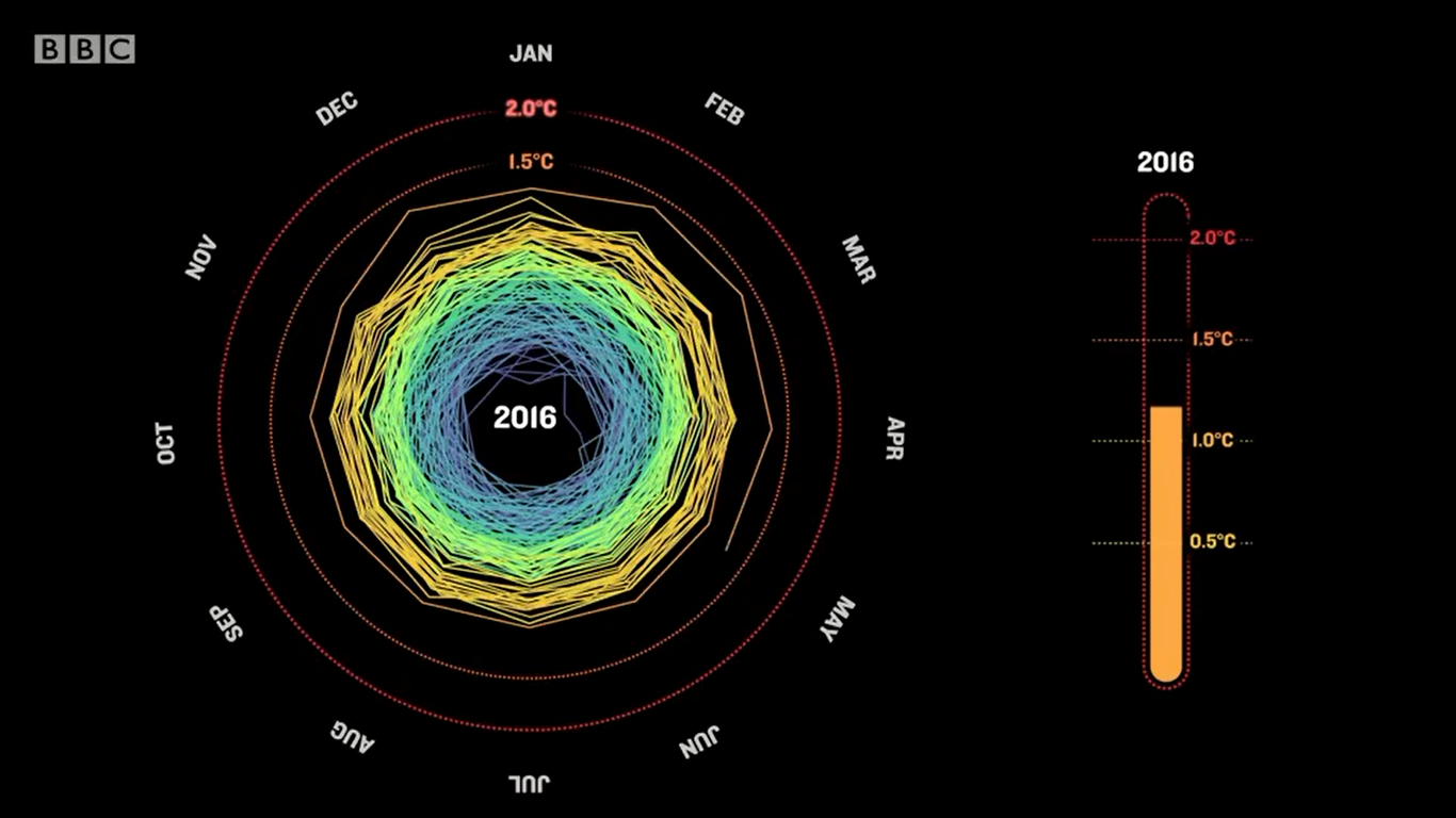
If you watched the opening ceremony of the Olympics, you would have noticed a segment discussing climate change, accompanied by graphics of CO2 emissions, Arctic sea ice melting, sea level rise and a somewhat familiar spiral representation of rising global temperatures (above), a version of which you may have seen somewhere before.
Needless to say, I was rather shocked while watching!
Clearly you stole the idea from Dame Judi Dench.
Congratulations! It clearly made an impact.
And to revive an old topic, I tried out the viridis colormap for an upcoming (minor) paper. I’m pleased with the results.
Thanks Kevin – and great that you like viridis! [Other colour scales are available.]
cheers,
Ed.
Congratulations. That is impact, no need to write boring scientific articles any more. They will be insignificant compared to the Olympics.
My favorite creativity book has a beautiful exercise/recommendation to come up with 5 variants before you chose. So we can plot temperature changes as
1) a line graph,
2) a spiral,
3) percentage of the surface and year that is 1°C warmer than pre-industrial,
4) a Hovmöller Diagram,
5) …
Help me out.
Thanks Victor!
Like the creativity book idea. How about a cycle plot? Bit like this one: https://twitter.com/ed_hawkins/status/727920589814517761
Ed.
Nice. Or a bicycle plot? The temperature and Arctic sea ice spirals next to each other (tires) with a triangular frame in between.
A paleo spiral with temps of the last 1000 or 2000 years would also be interesting and very fitting because the best part of the spiral plots is that is shows how extraordinary the end of the series is.
Congraulations, Ed!
+1
So was that YOUR graphic? Did you get acknowledged?