2014 was a warm year for much of Europe and the globe, and may end up being the warmest year on record globally. But, no-one experiences a global mean temperature directly, so how about more locally? Can the signal of a warming climate be seen?
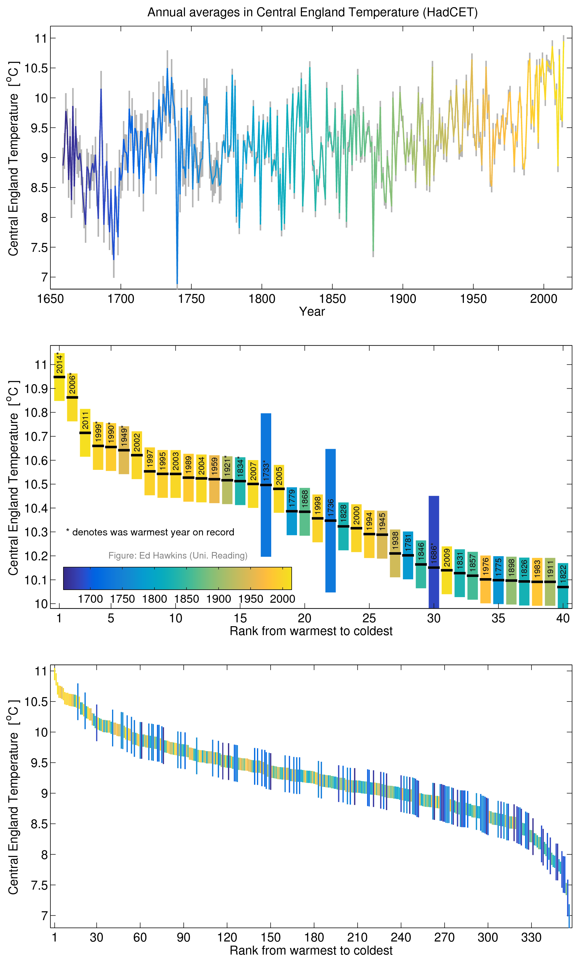
Central England Temperature (HadCET, Parker et al. 1992) is the longest continuous instrumental temperature record available, starting in 1659 (monthly averages) and 1772 (daily averages).
The timeseries of the annual averages shows an overall increase in temperatures of around 1.5°C, and considerable fluctuations around the long-term trend (see figure). Some of these fluctuations are probably due to changes in solar activity & volcanic eruptions, but much is just due to the chaotic variations in weather experienced in the UK.
The long-term trend, especially since 1950, is at least partly due to human activity. And, for the January-December average, 2014 is the warmest on record (see figure), although note the uncertainties of about 0.10°C for an annual average. [This uncertainty is larger, around 0.3°C, before 1772.]
These rankings should not be over-interpreted – there is clearly a strong influence of random weather on UK climate in each particular year. However, the warming global average temperatures are increasing the chance of seeing warm years locally, such as 2014 in the UK and Europe.
The surface area represented by CET is tiny (≈1/22000 of the entire planet), and is in one of the most climatically variable parts of the world. Yet, the signal of a warming world is still clearly visible even at this local scale where changes in climate are actually experienced.
[02/12/14: Updated with fraction of surface area sentence.]
[03/12/14: Figure updated to include: (i) finalised November data for 2014, (ii) a better representation of pre-1772 uncertainty (0.3°C – see Comment from Mark McCarthy) and (iii) using the daily data after 1772.]
[22/12/14: Figure and text updated to include data up to 21st December]
[01/01/15: Figure and text updated to include all data from 2014]
Now turn the graph upside down and repeat the exercise up to 1690 and you will discover that the new graph also has “unprecedented warming” … except this time it really is unprecedented because the warming from 1690 to 1730 is massive compared to anything we’ve seen recently. (2C rather than <1C)
And what happened in the 1690s? Scotland experienced a famine so severe that up to a quarter of the population died. Probably the biggest calamity in Scotland history since the black death … caused by the cold [& other factors – Ed].
[snip – this is a scientific blog – keep on the science]
Many factors affect global and local temperatures. Solar activity was very low during the late 17th century – the Maunder minimum – which affected temperatures worldwide. The warming from 1700 onwards was partially due to the recovery of solar activity. We have not seen any comparable solar change in modern times – so you’re not comparing like-with-like.
And, not all human activities warm the climate – there is also a hint of aerosol induced cooling in CET post 1940.
Ed.
Looks to me that it is the dip c. 1690 that is significant, not the almost immediate rebound.
That was possibly the end of the Little Ice Age that began earlier that century, attended by many global crises. See Geoffrey Parker’s Global Crisis, describing (among other events) the collapse of the Ming Dynasty in that century, general wars in Europe (Thirty-Years War, War of the Three Kingdoms in these parts, revolt of Portugal, the Netherlands and Catalonia in the Spanish Empire), the decline of Spain, the Ottoman Empire, the Mughals, the Polish Commonwealth, and the corresponding rise of France, Britain, Austria-Hungary and Russia.
I suspect that the uncertainty for the early data is quite large, and the large variability there may partially be an artifact due to that.
Thanks Lars – yes, am sure the uncertainty on the pre-1772 data is larger. But, I think there is a signal of the Maunder minimum in the late 17th century as well.
cheers,
Ed.
And not to forget volcanoes ;-). Almost each “dip” is attributable to a large eruption, e.g. 1667, 1694, 1740 …
See Fig 2 in Crowley et al. 2008
Indeed they are. Prior to 1700s Manley only estimates to within whole degrees and early 1700s to 0.5
The warming trend from late 17C through early 18C is briefly discussed in a European context in Luterbacher et al. (free with registration) http://www.sciencemag.org/content/303/5663/1499.full
Thanks Mark! Would that be your estimate for the error bar on an annual mean? I.e. 1C pre-1700 and 0.5C pre-1772?
Ed.
The 1degC is Manleys estimate of instrument uncertainty on monthly mean (no standardised temperature scales back then!) and extrapolation from e.g. wind/weather obs. If assume random from month-to-month then annual mean more like 0.3 than 1. Sampling uncertainty will be larger than Parker as often only one station and no overlaps and Parkers uncertatinty estimates were appropriate back to 1860s, before that less well quantified – but will be larger, so uncertainty probaly large than 0.3
In other words – still work needed to better quantify uncertainty in early CET. Others may have other thoughts.
Neat graphs Ed! We’re planning a short attribution study using the CET, so I’ll keep you posted what we find…
Hi Andrew,
I’d be interested too 🙂
Hi Mark,
Just letting you know, that paper has been published. Here’s the link (it’s open access): http://iopscience.iop.org/1748-9326/10/5/054002/article
Hi Andrew,
Thanks for posting what looks to be a very interesting study, certainly for my own (UK agriculture) sector. I’m sure many here will enjoy reading it (especially as this site has been a bit quiet of late!).
I’m sure drilling down to “regional resolutions” is the way forward. Thanks again.
Ed says:
“The long-term trend, especially since 1950, is at least partly due to human activity. And, for the January-November average, 2014 is the warmest on record (see figure), but not outside the uncertainty range from previous warm years (using σ=0.10°C for an annual average).”
But good to note that you acknowledge the worldwide influence of solar activity on temperatures during the Maunder Minimum.
If you look at the Met Office’s graph of CET from 1772 to present, a slight upward trend is discernible over the period to 1940.
http://www.metoffice.gov.uk/hadobs/hadcet/
It then dips markedly up to the early 1960’s and thereafter begins to recover. The most noticeable feature is the very steep rise from 1980 to the peak of around 2003 (of the 10 year running mean) – which appears to be not unprecedented in the record (see e.g. 1810-1835). After that, CET drops steeply and has only been slightly interrupted in this steep downward trend by the extraordinary warmth we have experienced Dec 2013 to end of Nov 2014. Given that CO2 emissions have been increasing since 2003, it is difficult to attribute much of this downward trend to man-made global warming. Even if 2014 does indeed turn out to be the warmest year since 1659 – which looks more likely than not – the overall trend is more important.
Of course, if 2014 doesn’t turn out to be just a blip and CET now reverses its downward trend, we might be looking at justifiably attributing more influence of CO2 on CET, but IMO this looks unlikely, with AMO turning negative and now solar cycle 24 having reached its second modest peak and heading downwards, with perhaps an even smaller SC25 to come. As ever, time will tell.
1707-1722 of CET is temperature observed in the Netherlands (Manley, 1953, p243)
Hi Ed, I’ve noticed that your colour scale is slightly odd.
Not sure whether this has already been pointed out, but in my thinking ‘yellow’ comes between orange and green. The choice of colour scale could be conceived as trying to disguise the warming hiatus.
I think that deeper orange or reds are necessary in the post-2000 period.
Also – the second point is that the Stevenson Screen was invented from 1818-1887, so observations before this period are not a standard reference. There may have also been imperfections in the construction of the thermometer glass – which you’d need to confirm with the National Physical Laboratory (if not already consulted). Also the conversion of units from Fahrenheit.
Are you aware that old glass bulbs were bracketed into a wooden frame, with etched or drawn gradations. Its plausible that is the bracket become loose or corroded over time that the glass bulb could slip downward in the frame – that would result in a cold bias over the period of observation.
Also a note that Fahrenheit invented the mercury thermometer in 1714, so data from 1650 to 1700 is also dubious.
Chris
Thanks Chris.
This blog recently posted an open letter about the choices of colour scales in climate science, with a particular focus on colour blindness concerns. The colours chosen for this plot are the new MATLAB programming language default (called parula) which accounts for these concerns. Ultimately there is no perfect colour scale, but the often used ‘rainbow’ ones do have large problems.
Gordon Manley did the majority of the careful work in constructing and calibrating the available Central England Temperature record. There is more confidence post-1772 when the daily data is available and more observations are used, and obviously I agree that there is clearly more uncertainty in the early records. But, none of those early years come close to what we are seeing in the last couple of decades.
cheers,
Ed.
I love these graphs, )(and I’ve already Tweeted the rainbow post) but I am curious: can you explain the rationale for doing the ranking from the left instead of the right?
As a UK commercial grower I became aware of the CET about 10 years ago whilst researching the “hardiness ratings” of some widely cultivated plant varieties for a company project. I developed a subsequent keen interest in meteorology and climatology which continues. Cut to the chase, Ed are there any papers on the relationship between the AMO and the CET? My own research seems to suggest one, just like a heads up on anything current. Thanks.
Hi Stephen,
This is some recent work on the issue – in summary, yes, the AMO does seem to have an influence:
http://www.nature.com/ngeo/journal/v5/n11/abs/ngeo1595.html
cheers,
Ed.
Thanks Ed I’ll take a gander.