[Last updated: 11th May 2022]
This page is an ongoing effort to compare observations of global temperature with CMIP5 simulations assessed by the IPCC 5th Assessment Report. The first two figures below are based on Figure 11.25a,b from IPCC AR5 which were originally produced in mid-2013.
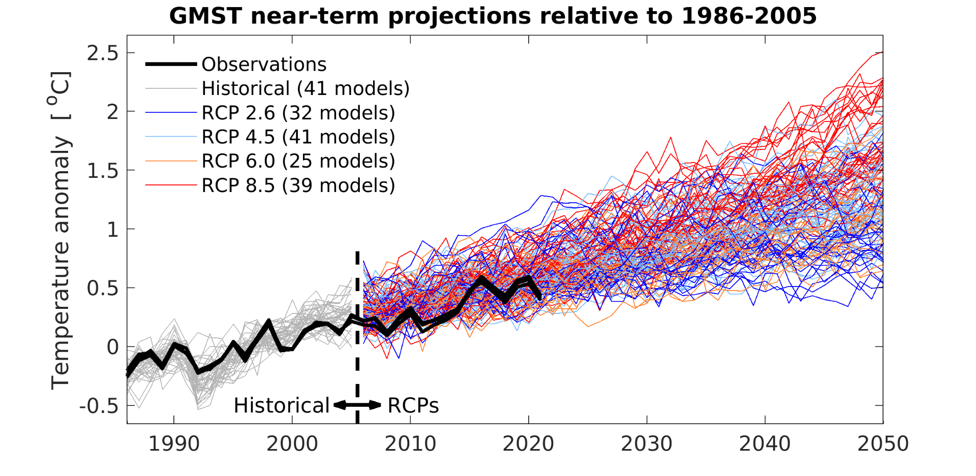
The first panel shows the raw ‘spaghetti’ projections, with different observational datasets in black and the different emission scenarios (RCPs) shown in colours. The simulation data uses spatially complete coverage of surface air temperature whereas the observations use a spatially incomplete mix of air temperatures over land and sea surface temperatures over the ocean. It is expected that this factor alone would cause the observations to show smaller trends than the simulations.
The second panel shows the AR5 assessment for global temperatures in the 2016-2035 period. The HadCRUT5.0 observations are shown in black with their 5-95% uncertainty. Other observational datasets are shown in blue. The light grey shading shows the CMIP5 5-95% range for historical (pre-2005) & all future forcing pathways (RCPs, post-2005) relative to 1986-2005; the grey lines show the min-max range. The dark grey shading shows the projections using a 2006-2012 reference period. The red hatching shows the IPCC AR5 indicative likely (>66%) range for the 2016-2035 period.
The observations for 2016-2021 fall in the warmer half of the ‘likely’ range. 2016 was warmed slightly by the El Nino event in the Pacific. The years 2015-2021 were all more than 1°C above an 1850-1900 (early-industrial) baseline. In AR5 it was assessed that 1986-2005 was 0.61K warmer than 1850-1900 using HadCRUT4. Subsequent updates to the global temperature datasets have increased this value meaning the green axis has been moved a little lower.
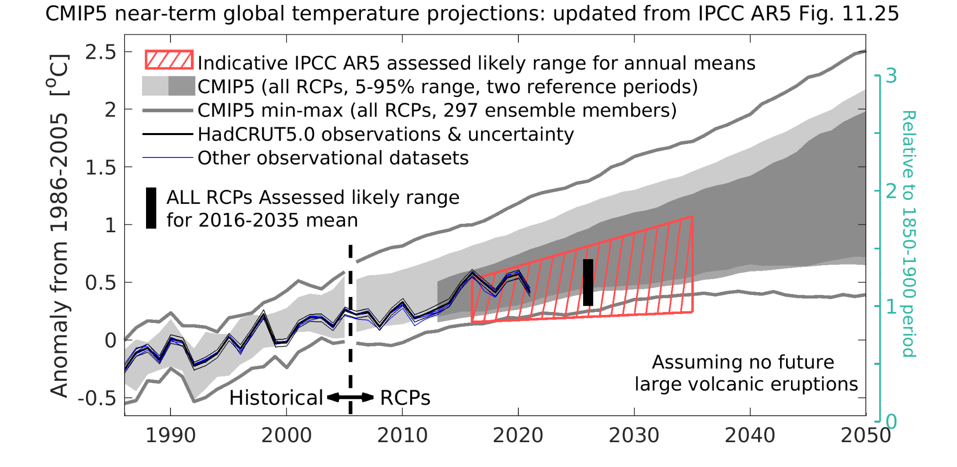
One interesting question to consider is: given post-2012 temperature data and scientific studies which have appeared after AR5, would the overall assessment (black bar & red hatching) be changed? In AR5 the assessment was that temperatures would be 0.3-0.7K above 1986-2005 for the 2016-2035 period average (as shown by the black bar). My personal view is that the upper limit may remain the same (or increase slightly), but there would be an argument for raising the lower boundary to 0.4K, mainly because of improved understanding of the effect of missing temperature data in the rapidly-warming Arctic.
There are several possible explanations for why the earlier observations are at the lower end of the CMIP5 range. First, there is internal climate variability, which can cause temperatures to temporarily rise faster or slower than expected. Second, the radiative forcings used after 2005 are from the RCPs, rather than as observed. Given that there have been some small volcanic eruptions and a dip in solar activity, this has likely caused some of the apparent discrepancy. Third, the real world may have a climate sensitivity towards the lower end of the CMIP5 range. Next, the exact position of the observations within the CMIP5 range depends slightly on the reference period chosen. Lastly, this is not an apples-with-apples comparison because it is comparing air temperatures everywhere (simulations) with blended and sparse observations of air temperature and sea temperatures. A combination of some of these factors is likely responsible.
UPDATES:
11th May 2022: Graphics updated for 2021 global temperature data
4th May 2021: Text tweaked to comply with IPCC legal requests to say that these updates are ‘based on’ rather than ‘updated from’ IPCC figures. These graphics are (obviously) not official updates by the IPCC itself. (sigh)
25th January 2021: Graphics updated for 2020 global temperature data from HadCRUT5
9th September 2020: Page updated for 2019 global temperatures.
9th July 2019: Entire page updated for 2018 global temperatures.
21st February 2018: Entire page updated for 2017 global temperatures.
23rd January 2017: Entire page updated for 2016 global temperatures.
22nd February 2016: Update to Fig. 1.4 from IPCC AR5 added.
26th January 2016: Entire page updated for 2015 global temperatures.
2nd September 2015: Updated figure to use HadCRUT4.4 up to July 2015 and added link to Cowtan et al. (2015).
5th June 2015: Updated using data from HadCRUT4.3 up to April 2015, and the new NOAA dataset.
2nd February 2015: Cowtan & Way 2014 data added.
26th January 2015: Entire page updated for 2014 temperatures.
27th January 2014: Page created.
Your update of Fig 11.25 should use the Cowtan and Way uncertainty envelope as this data series is now widely preferred to HadCrut4 for the evaluation of recent temperature trends, for obvious reasons. HadCrut4 should be shown as a dotted line without the uncertainty envelope, to emphasize its deprecation.
Hi Deep Climate,
I don’t think the Cowtan and Way uncertainty envelope covers all the uncertainties that the HadCRUT4 envelope covers.
They have a reduced coverage uncertainty due to the kriging, but as far as I know (happy to be corrected, I know their data set is in a state of continual improvement), they don’t propagate all the uncertainties in the HadCRUT4 gridded data through their analysis so they’re likely to underestimate the total uncertainty.
Cheers,
John
Also would be good to have CMIP5 5-95% envelope for 2 reference periods, as in the version of the chart.
Could you include a link to the CMIP5 data you’re using? Thanks.
The CMIP5 data is most easily downloadable from the Climate Explorer (climexp.knmi.nl by selecting all members and then calculating global mean before downloading).
cheers,
Ed.
Would downloading the global mean from KNMI also give the uncertainty envelopes? I did download KNMI and calculated mean and envelope for RCP4.5. But I had to download all model series to do that. Or am I missing something here?
Perhaps you could post the consolidated CMIP5 data as you provided to Schmidt et al. Or better yet just post the data as charted (i.e. CMIP5 model mean with uncertainty envelopes, assessed likely range).
Also, AR4 has a very good feature where data to reproduce each chart was made available. Is that available for AR5?
Many thanks!
it is a great help for me or other users.
Hi Deep Climate,
The plotted 5-95% future ranges are here.
The red hatched box corners are:
[2016: 0.133 0.503]
[2035: 0.267 1.097]
I don’t think there is such a data feature for AR5. Where is the AR4 one?
cheers,
Ed.
I misremembered a bit – it’s not for all figures.
However AR4 WG1 Fig 10.5 (scenario projections) can be reproduced from GCM model means found here:
http://www.ipcc-data.org/sim/gcm_global/index.html
I found these easier to work with than KNMI, because they are exactly as used in AR4 (can’t get KNMI to match up exactly for various reasons), and also are already merged with 20th century hindcasts.
I don’t think a similar page for AR5 GCM mean output exists yet.
Oh and many thanks for that – I’ll use it to replace the RCP4.5 I have.
I would like the historical envelope too please (at least from say 1980 so as to cover the 1986-2005 baseline period).
Nice to have would be min-max and an ensemble mean or median, but don’t bother if you don’t have these easily at hand. Thanks again!
Ed,
Please stick to using HadCRUT4. Cowtan & Way are SkS activists and it is far from clear that their GMST timeseries is to be preferred to HadCRUT4 even over shortish timescales. And their co-authorship of a recent paper (Cawley et al. 2015) that multiplied by a factor it should have divided by, thereby wrongly strengthening their argument that TCR had been underestimated in another study, does not inspire confidence in the reliability and impartiality of their temperature dataset.
For a full spatial coverage comparison, I think using NCDC MLOST and UAH and RSS TLT data alongside HadCRUT4 would be preferable. Ideally one would compare the TLT data with model projections having a similar vertical weighting profile – do you know if and such data has been produced for CMIP5 models, at grid-cell or global resolution?
Cowtan & Way are SkS activists
So what? You’re associated with the Global Warming Policy Foundation. Do you think people should discount what you do because of that? I don’t, but it appears that you think they should.
And their co-authorship of a recent paper (Cawley et al. 2015) that multiplied by a factor it should have divided by,
Oh come, that’s pathetic. It was a stupid mistake. For someone who works in this field, it should be patently obvious that Loehle’s calculation was complete and utter nonsense. That Cawley et al. made a silly mistake when discussing what would happen if Loehle had used all external forcings, rather than CO2 only, doesn’t change that Loehle’s calculation was garbage. That you would focus on Cawley et als. silly mistake, while ignoring Loehle’s calculation completely, does you no favours. Maybe people shouldn’t ignore your work because of your association with the GWPF, but should ignore it because of your very obvious and explicit biases. Maybe consider that before harping on about the impartiality of others.
Matt is convinced that nic has lost the argument.
Nic Lewis,
I could hardly be described as an activist. You’re welcome to go through all my postings at SKS and point out instances where I have pushed a particular policy agenda. I am an Inuk researcher from northern Canada who has devoted my life to studying the cryosphere with a side interest in some climate related items – certainly not an activist. I write for skeptical science on issues related to the Polar Regions and my aim is to help better inform people on these areas that are often discussed in the popular media.
Secondly, and more importantly, you have yet to demonstrate any issues with Cowtan and Way (2014) and yet you repeatedly berate it. You have been multiple times asked to defend your views but you have not put forward any sort of credible technical reasoning. Now you have resorted to attacking the credibility of the authors because you’re not capable of attacking from a scientific perspective.
You’re welcome to your opinions, of course, but you will be asked to defend them when they’re not based on fact. Once again – I am very open to having a discussion with you on the technical merits of the CW2014 record. Will you avoid the topic – as you have each and every time I asked for such a discussion?
“For a full spatial coverage comparison, I think using NCDC MLOST and UAH and RSS TLT data alongside HadCRUT4 would be preferable. Ideally one would compare the TLT data with model projections having a similar vertical weighting profile – do you know if and such data has been produced for CMIP5 models, at grid-cell or global resolution?”
Well Nic, NCDC’s MLOST is actually more susceptible to coverage bias than HadCRUT4 because its coverage in the northern regions is even poorer. You can see that very clearly in this document:
http://www-users.york.ac.uk/~kdc3/papers/coverage2013/update.140404.pdf
Aside from having less coverage, there is also evidence that the GHCN automated homogenization algorithm is downweighting several Arctic stations because they’re warming rapidly in contrast with the boreal cooling over eurasia. This has been verified by some of the people at GHCN who we contacted on the issue.
As for the remote sensing datasets – I am unsure of which record is preferable but when you look at the disagreement between the RSS, UAH and STAR groups it is necessary that more effort is done to reconcile these differences. Secondly, the satellite series will undoubtedly miss some of the Arctic warming because it is characterized as being most intense in the near-surface as a result of ice-feedbacks. This is something that analyses such as by Simmons and Poli (2014) have picked up and this is also an area where I do believe that the use of UAH by our record in the Hybrid approach could underestimate some warming (potentially).
All these issues aside – using CW2014 or BEST with your approach to climate sensitivity raises the numbers by ~10% and you have yet to provide a technical argument why these two records should be excluded.
Nic,
I fully agree with you since otherwise you can’t actually compare recent data to the AR5 figures. Hadcrut4 is( or was) the official temperature data the IPCC.
HadCrut4.5 is also the only temperature series based on actual measurements rather than interpolation into the Arctic (but not the Antarctic) which then boosts the global average slightly.
Yes, indeed. This is not an apples-to-apples comparison to what was published in the AR5 Technical Summary. That one used 4 datasets: HadCRUT4, ECMWF, GISTEMP, and a NOAA dataset. Interestingly, it did not use RSS or UAH. The terrestrial datasets used gridded data to extrapolate temperatures for areas where there is sparse or non-existent data; for example over the oceans. RSS and UAH cover these areas.
Hi
For statistical downscaling of GCM models and comparison between methods please read this page:
https://agrimetsoft.com/statistical%20downscaling.aspx
Cheers
” That you would focus on Cawley et als. silly mistake, while ignoring Loehle’s calculation completely, does you no favours.”
Far from ignoring the shortcomings in Loehle’s method, I wrote in my original comment on Cawley et al 2015 at The Blackboard:
“Some of the points Cawley et al. make seem valid criticisms of the paper that it is in response to – Loehle (2014): A minimal model for estimating climate sensitivity (LS14; paywalled). I’m not very keen on the LS14 model for global temperature changes over the instrumental period, on Cawley et al.’s revised version thereof, or on their alternative “minimal” model. They are all cycle-based curve-fitting approaches, without what I would regard as a properly justified physical basis.”
The shortcoming in Loehle’s model have absolutely no relevance to my comment here, as you must surely realise.
[snip]
That all five authors of Cawley et al could overlook such a basic and gross error is very worrying. A combination of comfirmation bias and carelessness seems the most likely explanation to me. As I wrote, that does not inspire confidence in the Cowtan & Way temperature dataset, whatever its merits may be.
I don’t discount what people associated with SkS produce, but I do scrutinise it carefully. As this case shows, peer review cannot be relied upon to pick up even obvious, gross errors.
[snip]
Oh, and this is rather over-stated (I was going to say nonsense, but I’m trying to reign this in slightly 🙂 ). The model in Cawley et al. is essentially an energy balance model with a lag that attempts to take into account that the system doesn’t respond instantly to changes in forcing, and with a term that mimics internal variability using the ENSO index. It is a step up on a simple energy balance approach. You’re right about LS14, though. That is just curve fitting.
Hi Nic & ATTP,
Please try and keep the discussion scientific! I have edited and snipped some comments from both of you which strayed too far off topic. All papers should be judged on their merits rather than author lists.
I have retained HadCRUT4 as the primary global datatset as they use no interpolation/extrapolation, and included the other major datasets for completeness. All sit inside the HadCRUT4 uncertainties (using this reference period).
cheers,
Ed.
New reader Ed and very much enjoying the science you’re addressing here. First comment – I share Nic Lewis’s view that Cowtan and Way dataset should not be used because C&W have recently been shown to be practitioners of poor quality science and so it would be prudent to be sceptical of all their science, at least for the time being.
C&W were authors (with others at SkS) of a paper that was researched, written, presumably checked, and then published, containing a substantive and integral error in workings/calculations that rendered their published conclusions wholly unsupportable. Nic Lewis noted the error at Lucia’s Blackboard. Bishop Hill picked it up which is how it came to my attention.
Robert Way’s twitter feed had 4 tweets about the published paper on 15 Nov 2014 that read:
“Last year, this rubbish (WB – he’s referring here to the Loehle paper) was published in an out-of-topic journal that contained the author on its advisory board 1/4
Beyond the 4-month timeline from receipt to published, clear statistical errors showed it had not been scrutinized enough during review 2/4
Reimplementing their analysis showed a number of methodological flaws and assumptions to the point where a response was necessary 3/4
Enter Cawley et al (2015) who show how fundamentally flawed Loehle (2013) was in reality #climate (4/4)”
Hubris.
Judith Curry has posted before about her commenters (denizens) giving Way a break because he is young but she’s noted he has choices to make about how he wants to conduct his science career. Based on his election to be involved with SkS, his unnecessary sharpness in comments to Steve McIntyre at ClimateAudit and his tweets, I am of the opinion Way is leaning warmy in the manner of other unreliable warmy scientists a la Mann, Schmidt, Tremberth et al, and as a consequence I should be skeptical of all of the science with which he is involved and I should remain so until he and his co-authors publish a corrigenda acknowledging their error and correcting it.
I think it’s reasonable to take the following position:
1. the C&W dataset was created by scientists who have at least once publicly concluded x when their own workings show y, and the scientists did not even realise their workings showed y before they went to press (whatever the reason they engaged in a low quality science activity).
2. it is reasonable to consider that if they have done it once then they may have done it twice i.e made a substantive error with their dataset.
Ignoring their dataset at this time is defensible, and probably even prudent.
My two cents.
Hi WB – welcome to CLB!
Am sure we all agree that mistakes do happen – I have published an erratum in one of my own papers and I believe a correction to the Cowley paper is happening.
I prefer to discuss scientific issues here – the data and methodology is available for CW14 so it could be independently checked if someone wants to. C&W have also been very open to point out that 2014 is second warmest in their dataset. And, the results are well within the HadCRUT4 uncertainties.
I see no reason to assume there is a mistake in CW14 until shown otherwise – their involvement with SkS doesn’t matter to me. In the same way, I don’t assume that Nic has made an error because he is involved with GWPF.
Cheers,
Ed.
Thanks Ed, I do like the science and I try my hardest but I am a commercial lawyer in the private sector (IT industry) so I view the practice of climate science through that legal professional prism.
I don’t actually agree with you that ‘mistakes do happen’ because to me that’s an incomplete statement. I think you mean ‘mistakes do happen but the people who made those mistakes in piece of work B should not have an unfavourable inference drawn against them about piece of work A, C, K etc so long as they issue a corrigenda, or perhaps have their work retracted’.
I think that’s what you mean. And I think that is the common approach in academia/govt sector pubic service, which is, after all, where climate science is practised. But here in the private sector ‘mistakes do happen’ is called ‘failure’ and we most definitely draw unfavourable inferences about the people who fail and about their works – all of their works.
You are only as good as your last case/deal/contract/transaction.
We put workers on performance management if they’re not reaching their KPIs, we sack them if they still can’t reach their KPI’s. We do that because at the end of the line we’re vulnerable to getting sued if we deliver an inferior defective product or a lousy service. That threat of litigation tends to concentrate our minds on not delivering inferior/defective goods and services. Hence we rid ourselves of under performing staff.
In climate science (i.e academia) there never seems to be any adverse consequence to mistakes. Your attitude of presuming C&W work is good until it is proven bad is collegiate and generous. I can’t share it cos it’s just not how private sector folks work – I presume everything C&W do, have done and ever will do will be mistaken until it is proven right by a trusted source.
Who I trust is quite another matter but I’ll start with Steve McIntyre and thrown you into the pot alongside Judy Curry 😉
“Like all people, Albert Einstein made mistakes, and like many physicists he sometimes published them.”
– Scientific American.
http://www.scientificamerican.com/article/what-einstein-got-wrong/
Wonderful. The lawyer who would have fired Albert Einstein. Gets you off to a great start, scientifically speaking.
Hi Ed,
First comment here, but I’ve been reading your excellent blog for a while..
You have earlier made a good point of comparing apples to apples (as much as possible), eg Hadcrut4 vs masked CMIP5.
I have been wondering, is it fully right to compare observational Global surface temperature indices with CMIP5, since the indices are composites made by roughly 71% SST and 29% 2m land air temperatures, but CMIP:s are 100% 2 m air temperatures?
I have played with data from KNMI Climate Explorer and made a CMIP5-index that should be an equivalent to the global temperature indices. I downloaded CMIP5 rcp 8.5 means for tos (temperature of ocean surface) and land-masked tas (2 m air temperature) and simply made an index with 0.71tos+ 0.29 tas.
For comparison I chose Hadcrut4 kriging (Cowtan & Way) since it has the ambition of full global coverage.
I also applied a 60 year base period (1951-2010) for anomalies. The reason is that there might be 60-year cycles involved that affects the surface temperatures by altering the Nino/Nina-distribution. For example 1910-1940 was a warm period, 1940-1970 cool, 1970-2000 warm, etc.
The use of a 1986-2005 base may cause bias, since it consists of 15 warm and 5 cold years, which anomaly-wise risks to push down the surface index. I avoid this by using a 60-year base, a full cycle with hopefully balanced warmth and cold.
Well, the result is here:
https://docs.google.com/file/d/0B_dL1shkWewaNFVPdHpkRDZUMU0/edit?usp=docslist_api
The observations fit very well to the model index. I did not bother to make standard confidence intervals, instead I simply put a “fair” interval of +/- 0.2 C around the CMIP means. I have also included the average anomaly for 2015 so far.
Other comparisons, apple-to-apple, fit equally well, eg:
Crutem4 kriging (C&W) vs land mask CMIP5 tas
GistempdTs vs global CMIP5 tas
ERSST v4 vs CMIP5 tos
If I have made some fundamental errors, please correct me.
I am just a layman with climate science interest… 🙂
Hi Olof,
You make an excellent point, and a very nice graphical demonstration. How much difference does the use of land+ocean simulated data make in your data, compared to just the global 2m temperature?
Coincidentally, a paper is about to be submitted by a team of climate scientists on this exact topic. There are some subtleties with defining such a land+ocean global index to exactly compare with the observations because of how the models represent coastlines, and because of a changing sea ice distribution, but your approach is a good first step.
Watch this space for our estimates of how much difference we think it makes!
cheers,
Ed.
Ed, the difference between my composite global index and the standard global 100 % 2 m tas is right now (2015) ca 0.1 C, and the difference is increasing. Here is the graph:
https://docs.google.com/file/d/0B_dL1shkWewabVZ4dzR4cEE4Uk0/edit?usp=docslist_api
The CMIP5 tos (green) has a clearly lower trend than ocean mask 2 m tas (yellow). This makes sense in a heating world since water has a higher heat capacity than air. As a result the composite global index (brown) runs lower than the standard global 2 m tas (blue). By coincidence the global index is very similar to the ocean mask 2 m tas.
I dont know in detail how KNMI explorer masking handles sea ice and seasonal variation, that could give some error in this kind of crude estimates.
However, I am looking forward to a scientific paper and a good blog post on this interesting issue…
Hi Ed, I am hugely appreciative of your updates on Fig 11.25. I also prefer HadCRUT4, but like to see the model comparison using a masking for HadCRUT4 observations.
In terms of truly global surface temperature datasets, I am liking ERAi; dynamical infilling is preferable to statistical infilling IMO. I haven’t seen ERAi global temps yet.
In terms of ‘who’ writes the papers, I agree it doesn’t matter — but if someone routinely makes mistakes or appears to be driven by motivated reasoning, then I check their results more carefully.
Hi Judy,
I agree that masking (& also blending) is preferable when comparing with HadCRUT4 (see the recent Cowtan et al paper).
The issue for any overall assessment (such as figure 11.25) is that a different processing of the simulations is required to match the characteristics of each of the N observational datasets, which would give N different ensembles to somehow visualise. AR5 took the decision to use ‘tas’ everywhere and show all the observations on the same figure. The recent Cowtan et al paper chose to focus on HadCRUT4 only. But, there is no perfect choice.
The data for ERAi is not yet complete for 2015 – it normally runs a couple of months behind – but will be interesting to see what it says.
Do you have particular people in mind that routinely make mistakes and/or have motivated reasoning?
cheers,
Ed.
Regarding ‘motivated reasoning’, I am concerned by climate scientists who make public statements to the effect that ‘urgent actions are needed to reduce CO2 emissions’ and call other scientists who disagree with them ‘deniers’.
I don’t ignore the papers of such authors, but I find they need careful checking, auditing, and interpretation.
Why not use this:
https://www.jstage.jst.go.jp/article/jmsj/93/1/93_2015-001/_pdf
see fig 13 and 14
JRA-55 was not available when AR5 was produced, but I will add the various reanalyses when the data for 2015 becomes available.
Also see my reply to Judy Curry on the use of ERAi.
cheers,
Ed.
What with phase changes and the like being so important to the climate, I must say the comparison I’d like to see is absolutes with absolutes (both within the CMIP5 models and with obs).
Hi Simon,
You can see the absolute global temperature comparison at another post:
http://www.climate-lab-book.ac.uk/2015/connecting-projections-real-world/
cheers,
Ed.
Thanks, I hadn’t seen your recent paper. My interest was in how the range of absolutes in the base runs impacted on model evaluations using out of sample comparisons, rather than the rather narrow issue of the use of anomalies and selecting reference periods.
Despite the comfort you take from the lack of correlation between forecast increase vs absolute temp, as you observe they clearly aren’t independent, with those above actual having (what looks like significantly) lower increases. Mauritsen et al doesn’t help a lot since the issues are inter model (remembering that it is these increases that give the backbone to the scenario limits used by IPCC).
Hi Simon,
The arguments in the paper about the simple physics and feedbacks also help globally (see the Appendix), but the regional issues and the linearity of the feedbacks are also important.
cheers,
Ed.
The simple model doesn’t really help with evaluating the output of different models against actual temps. At the margin if you are a modeller it may not matter what the absolute temp is for estimating temp increments. Put this aside. The issue is that we have a range of models that are producing a range of increments in temp that are then being used to assess the uncertainty in model space and from that used to assess uncertainty in future global temps for policy purposes. In evaluating the fitness-for-purpose of the models to use for policy you are particularly interested in the range (aka uncertainty) and what is driving it.
Now it turns out that the models that produce this range are running at different temperatures, and that there appear to be systemic differences, such that the hypothesis that each model is drawn from a the same model space appears to break down. This suggests some poking around in the features of the various models and to see if it points to models that should have less weight put on their output.
The issue is also germane to how the CMIP5 models are performing against actuals in the short run, and whether there is again any systemic difference between those that model a hot world vs those a cold. Which brings me back to some of the earlier comments in this thread.
It seems to me that the absolute temps the models run at is an important variable to include in any evaluation of model performance, not just because of he intuitive reason, but also because there’s possibly some gold in them there hills.
It’s just that I haven’t seen any literature that deals with it. Are you aware of any?
Ed could you expand on what you think these results in the light of 2015 being an El nino year might mean?
El nino is maybe the best understood source of inter-annual internal variability, clearly 2015 is one of the stronger examples of this ( along with 1998). In 1998 the El nino pushed obs to the top end of the model ensemble. As you point out this year we dont even make it to the median point of the ensemble with this extra kick from Mother Nature. While obs sit more comfortably in the midst of the model ensemble, this years data point only seems to further emphasize just how ‘unreal’ to top end of the model ensemble is in this (apples-to-pears/all the other caveats) comparison.
Hi HR,
One key point is that 2015 is equivalent to 1997 in terms of timing relative to the ENSO phase. 2016 will likely be warmer, just like 1998 was – see this recent post:
http://www.climate-lab-book.ac.uk/2016/expectations-for-2016-global-temperatures/
So, it will be interesting to see where 2016 finishes within the ensemble. The warming from 1982 to 1997 to 2015 is about 0.2K/decade.
Cheers,
Ed.
thanks for pointing to that post. Even if we have more to come from 2015/2016 El nino the point I made still seems to hold. From your analysis we can expect 0.1/0.2oC more in 2016 from El Nino. This still keeps us at the median point rather than the top end of the ensemble. The reason I push this is because often it can seem that in the climate discussion can be quite polarized, Nic Lewis/ATTP here is a good example, but largely the real difference exists at this top end. Skeptics have the top end unrealistic, consensus have it plausible. The analysis here seems to give some support to the sceptics at the very least. Maybe more honestly it means both positions are reasonable.
Hi HR – if you read the AR5 text describing the assessment for these figures (end of chapter 11) you will see that the IPCC said that the very top end of the projections was less likely for the near-term. 2016 looks set to be above median and boosted by El Niño which is consistent with that assessment. I think the very low end is now also looking slightly less likely.
Ed.
Hi Ed,
I really like how you just load the new data, from the same sources, into the figure from the last AR5. Seems to me the most valid way to do the comparison, not jumping on the latest data fad like Cowtan and Way. I hope you continue to extend this comparison, just as you have don here, as more observations become available.
I’m more interested in what I call the Climate Climbdown Watch. Look, the reality is that no sooner does a new projection get made, then the observations start bouncing along the bottom of the big envelope representing the spaghetti diagram of the individual realizations. In fact in the figure above, from the 1998 El Nino on backwards, has the observations bouncing along the TOP of the envelope in the hindcast, then bouncing along the bottom in the forecast period. It took the biggest El Nino ever by some measures, the 2016 El Nino, to just barely get to the mid-point of the envelope.
The red bars, as you point out, are where the IPCC expects the actual temperatures to occur through 2035. The black bar represents the likely region, and you’ll note the black bar penetrates through the bottom of the envelope. The real question is, when will the community admit that something like the top half of envelope needs to be deleted from the projections. The observations simply do not support that we will ever get into the top half of the envelope. I guess I fail to see support for your assertion that you see evidence here we can eliminate any of the low end of the CMIP projections.
I´d love to see the CMIP5 projections for the RCP8.5 only, versus incoming data, because RCP8.5 is used in most impact papers, in estimates of the cost of carbon, etc. RCP8.5 is deviating a lot from actual emissions (which have been almost constant since 2013), and it has so much CO2 concentration beyond 2050 the Carbon sinks are overwhelmed.
I´ve been trying to force the scientific community to understand this is a serious issue, because if the high concentrations and temperatures are used, the cost of carbon is probably exagerated. Coupled to what may be a high TCR estimated range the end result is that a problem we can handle with a bit of common sense is so hyped and exaggerated the proposed cures will be worse than the disease.
Can somebody please explain why there appears to be a significantly different result shown in this post to that arrived at by Christy in his recent testimony to Congress.
In effect, this post shows a close relationship between the models and observations, whereas Christy shows that models show roughly double the warming trend of the observations.
Surely both analyses can’t both be right.
You tube vid set to the relevant part of Christy’s testimony
https://youtu.be/_3_sHu34imQ?t=1504
Yes – there is a detailed description of why Christy’s graphs are misleading here:
http://www.realclimate.org/index.php/archives/2016/05/comparing-models-to-the-satellite-datasets/
Note that his misleading graphs are for satellite temperatures of the middle atmosphere, whereas this page shows surface temperatures, so they should not be compared directly anyway.
Ed.
HIs graphs in the video link I showed are labelled as comparing TMT for both models and observations.
As I understand it, according to AGW theory, the troposphere should be warming faster than the surface anyway, so one should expect the satellite measurements to show more warming than the surface. This is not the case.
I have read the realclimate article.
I think the choice of baseline is largely arbitrary, but models and observations are calibrated to coincide at 1979. The main point is to compare the trend of anomalies and the difference between models and observation so his approach looks reasonable to me.
It is not clear what smoothing approach he is using in the video, so not clear if that criticism still stands. The chart is labelled as 5-year averages.
I think it is a moot point whether you include the statistical spread in the charts. Whatever, even the adjusted RC charts show the satellite observations are largely outside or on the boundary of the 95% confidence bands.
This is a very different result to that shown above.
So, I think the discrepancy boils down to why is there such a large discrepancy between the surface temps and the satellite temps? If theory predicts that the troposphere should warm faster than the surface (hansen et al 1988), and the data shows otherwise, then theory has significant problems.
Why might this be?
Yes, the upper atmosphere seems to be warming less than the average of the CMIP5 models. But, there are a lot of issues here which make interpreting this far more complicated than you might imagine:
1) Observations – there are still large uncertainties in the satellite-derived temperature observations. They undergo numerous corrections to go from the microwave emission data to estimated temperature, sometimes relying on models to do so. Also, the stratosphere is actually cooling more than the models suggest which may also be influencing these estimates of upper atmospheric warming.
2) The amplification of surface warming at altitude is mainly in the tropical regions. At higher latitudes the reverse is expected – the upper atmosphere is expected to warm much less than the surface. So, just comparing the global means does not test the amplification issue properly (but see point 1).
3) If there is less amplification than expected, then that might mean that the lapse rate feedback is less negative, and so the climate may be more sensitive to GHGs than anticipated (but see point 1).
4) The graphing issues do matter, especially the baselines (e.g. https://www.climate-lab-book.ac.uk/2015/connecting-projections-real-world/) – picking a single year for calibration is simply wrong.
Ed.
To answer your points:
1) Surely the range of uncertainty in the satellite data has to be lower than the surface temps, which are subject to all sorts of interpolation and UHI effects.
2) As I understand it Christy’s charts are for the Tropical Mid-Troposphere – i.e. focusing on the area identified by Hansen as most sensitive to AGW. So he is focusing on exactly the right area.
3) I don’t understand this point at all. AGW theory states that the TMT should be most sensitive to increasing CO2. How can less warming indicate higher sensitivity to higher CO2. It seems to be counter intuitive. Please explain further.
4) As I understand it, Christy is comparing anomalies, not absolute values. So, the choice of baseline just impacts the distance of the anomaly from the baseline and nothing else. So, largely arbitrary. I agree the baselines of the different datasets should be aligned. So, for instance if the baseline was for sake of argument 15 deg C, the anomalies for each data set would vary against that baseline. So if, the predicted temperature in say 1980 was 15.1 deg C, and that for 2035 was 16.3 deg C, the difference in anomaly would be 1.2deg C. If the baseline was 14.5 deg C, and the predicted temperatures in 1980 and 2035 were respectively 14.6 and 15.8 degrees, the difference in anomaly would still be 1.2 degrees. So, what is the problem in changing baseline?
However, as I see it, there is a problem with focusing solely on anomalies in the real world. The level of ice melt for instance, is dependent upon the actual temperature of the sea (in the case of sea ice) or air temperature in the case of land glaciers. Similarly, plant growth and the level of water evaporation is dependent upon the actual temperature (and humidity), not some anomaly to an arbitrary baseline.
There does seem to be significant variation in the measures of absolute temperatures over time. In my view this needs to be addressed.
There is an excellent set of explainers here on this topic: http://www.climatedialogue.org/the-missing-tropical-hot-spot/
1) Definitely not – the range for the satellite estimates is far larger than for the surface and the number of corrections required is large! Carl Mears from RSS discusses that here: https://www.youtube.com/watch?v=8BnkI5vqr_0
2) OK – you also need to use tropical surface temperatures as well then. The explainers link above discusses that comparison.
3) See the explainers link above.
4) The paper on which the post I linked to before has a discussion of why the reference period matters for interpreting model-observation differences. It also discusses the absolute temperature vs anomaly issue: http://journals.ametsoc.org/doi/abs/10.1175/BAMS-D-14-00154.1 (open access)
Ed.
Hi Ed,
Any idea when or if you plan to update the CMIP5 & observations graph above now the El Nino is complete and temperatures are returning to where they were beforehand?
Many thanks.
Hi Magoo – I update the page every January/February when the full annual data is available. The last point is currently for the annual mean of 2016.
Cheers,
Ed.
Hi Ed,
I was just reading your comment above about how surface data is more accurate than satellite data, yet when I look at the +/- error margins for the temperature datasets in the IPCC AR5 for 1979–2012, the satellite datasets have a smaller error margin. Why is that?
Land Surface (table 2.4, pg 187, Chapter 2 Observations: Atmosphere and Surface, WGI, IPCC AR5):
CRUTEM4.1.1.0 (Jones et al., 2012) 0.254 ± 0.050
GHCNv3.2.0 (Lawrimore et al., 2011) 0.273 ± 0.047
GISS (Hansen et al., 2010) 0.267 ± 0.054
Berkeley (Rohde et al., 2013) 0.254 ± 0.049
Satellite (table 2.8, pg 197, Chapter 2 Observations: Atmosphere and Surface, WGI, IPCC AR5):
UAH (Christy et al., 2003) 0.138 ± 0.043 (LT)
RSS (Mears and Wentz, 2009a, 2009b) 0.131 ± 0.045 (LT)
Many thanks.
Maybe data can be more precise and less accurate. Or completely wrong even 😉
Are you the Magoo from climateconversation.org.nz
Now that 2017 is in the bag, will you be updating the graph?
Done!
Dear all
Greetings,
I’ve studied your explanations and learned many valuable tips, thanks.
I have a suggestion:
If you want to compare the effect of CMIP5 models and select the best one for your case study according to the RCPs data, I think it will be good to do your comparison between downscaled data of CMIP5 models under RCPs scenarios (2006-2017) and the observation data (station) during (2006-2017), through the efficiency criteria’s. With this comparison you can understand that during 2006-2017 which model has a better feedback with the reality that it happens. Then with the selected model you can use the future data.
I’ve developed a software in my website that it can do the process with different statistical downscaling methods. As well you can compare every period that you want with historical run, or RCPs data, etc. It has different downscaling methods such as QM. I invite you to visit it, maybe useful for you.
http://www.agrimetsoft.com
With kind Regards,
Nasrin
Thanks for putting this together and making it available. I noticed that the last figure, which “updates Fig. 1.4 from IPCC AR5” only has data up to 2015. Any more current versions of this graph?
Hi Ed,
I saw the figure below from the new IPCC SR15 SPM 2018 that compares climate models to observed temperature:
http://report.ipcc.ch/sr15/pdf/sr15_spm_fig1.pdf
There’s a stark difference between this graph and your one at the top of this page (and fig. TS.14 from the AR5). Which graph is correct, and why do you think they differ so much?
Many Thanks.
Hi Magoo – no climate models are shown for the historical period in the SR1.5 figure. The orange shading is a statistical fit. Thanks!
Having clicked on the first link you have provided, I remain totally bewildered by the origin of the black bar in figure 2.
Panel 3 on the link shows, I believe the spread of various model projections for the defined period, and then the black bar appears ‘unsupported’ at the end.
The hatched region to me should be centred on the model weighted mean and the black bar should represent the mean of this hatched region. Otherwise what is the use of so many model runs that are not used to centralise the projection?
The visual implications of the spaghetti of projections is thrown away to be replaced by what appears to be a more realistic suggestion that over the next twenty years or so nothing is expected to happen globally by reference to 2014-2018 global means we have already experienced. Why? Because of significant details outside of model parameters that cancel the bulk of positive forcings?
Does the hatched region and black bar mean suggest that the bulk of models are incomplete (positively biased) and lack the necessary details to successfully capture future global temperature trends without resorting to some overriding correction?
I would have thought that coupled, full system models would already have provision for all known loading factors.
Hi Geoff,
Thanks for the comment – I agree the explanation of the black bar is not necessarily clear from the figure alone. There is a lengthy discussion of where the black bar comes from in the final section of Chapter 11 of AR5:
http://www.climatechange2013.org/images/report/WG1AR5_Chapter11_FINAL.pdf
along with the reasons for the assessment. Please have a read – I am happy to answer specific queries on that 2013 assessment which was made based on data until the end of 2012.
Thanks,
Ed.
Hi Ed,
I noticed you updated last year in February 2018
Is there an update planned for 2019
Hello, Ed. Will you be updating the graphs this month?
The website ‘RealClimate’ has a page with similar graphs and has updated their content for 2018 if you are interested. See http://www.realclimate.org/index.php/climate-model-projections-compared-to-observations/
Any chance of an update on the graph soon Ed? Many thanks.
Many thanks for continuing to play this “straight”, and adding observations a year at a time to the projections from the CMIP models. Please do not give in to the temptation to change the comparison to be to anything other than what the IPCC put in their report as the projections. Anything else opens this up to charges of moving the goalposts, which is the last thing you want to do.
I wouldn’t call it ‘straight’, there hasn’t been an update this year and we’re almost half way through the year – the graph is usually updated in February. The temperatures must be dropping right out the bottom of the model predictions by now.
Hello Ed
Thank you for the update above on Figure 11.25a,b from IPCC AR5.
I wish to ensure I examine the correct files. For example, I noticed that the HadCRUT 4 file specified in the AR5 document ends in 2010, so I am assuming HadCRUT4 must mean HadCRUT.4.1.1.0 because 4.1.1.0 ended in 2013 and therefore would cover the 1986 to 2012 period of assessment.
To help me review the different observational datasets used would you please provide me the exact version of files used in both analysis and any URLs for the following:
1) the four observational estimates used in the original comparison i.e., the Hadley Centre/Climate Research Unit gridded surface temperature data set 4 (HadCRUT4): Morice et al., 2012); European Centre for Medium range Weather Forecast (ECMWF) interim reanalysis of the global atmosphere and surface conditions (ERA-Interim): Simmons et al., 2010); Goddard Institute of Space Studies Surface Temperature Analysis (GISTEMP): Hansen et al., 2010); National Oceanic and Atmospheric Administration (NOAA): Smith et al., 2008).
2) for HadCRUT4.5, Cowtan & Way, NASA GISTEMP, NOAA GlobalTemp, BEST that you used to revise Figure 11.25a above?
Based on the observational datasets, both graphics side by side, is the discussion in AR5 on “Hiatus” still a valid discussion? It looks like the Hiatus has all but disappeared into a gentle slope in your revised figure.
For the revised data/Figure how many CMIP5 simulations were above and below GMST trend?
Originally AR5 provided this detail: “an analysis of the full suite of CMIP5 historical simulations reveals that 111 out of 114 realizations show a GMST trend over 1998–2012 that is higher than the entire HadCRUT4 trend ensemble” (Box TS.3, Figure 1a).” “whereas during the 15-year period ending in 1998, it lies above 93 out of 114 modeled trends (Box TS.3, Figure 1b;)”
Thank you.
Carlton
Hi Ed,
Any particular reason why you have gone silent on this page?
Simply a lack of time. Now updated. Thanks. Ed.
Hi Ed,
Thanks for updating this. Always interesting. Why is it that you don’t update the last figure, IPCC AR5 Fig. 1.4? Isn’t it just simply a matter of putting three black squares in, representing the last three years of HADCRUT 4.4? As you said starting this page, tracking actual observations against these projections is useful.
The main reason is that I didn’t make the original graphic, which means it is hard to update accurately, i.e. positioning the black dots. For the other ones on this page I can simply rerun my code with updated datasets.
Thanks a lot !!!
Gooooood job !!!!
Any chance you will update these charts to add in 2019 actual observations? Many of us continue to find them useful.
Why do spaghetti plots like this show multiple RCP’s for the period from 2005 to present? Do we not know which RCP we were on during that period? (Maybe I am slowly coming to understand that that an RCP isn’t just a projection about future CO2 concentrations but also includes a range of possible heat forcing rates–W/m^2–associated with a given atmospheric CO2 conc?) Thanks.
Hi Ed,
Always keep an eye on your updated charts.
Are you planning a 2020 update this year
Best wishes
Neil
Ed,
Just spotted this year’s update
Thank you once again for your hard work
Neil
Ed,
We often here concern expressed that global temperatures should be kept below “1.5 degrees above pre-industrial levels”
Your graphs refer to a base line 1986-2005. What is the 1.5 pre-industrial limit when re-expressed to your base line temperature?
Neil
I see that models dat overcool Pinatubo aerosols, overheat the current decade.
Interesting that empirical global temperature rose when the entire world economies were shut down due to COVID. It would seem that cutting CO2 use has virtually no effect on global temperature.
Thanks again for this year’s update
Hi Ed,
Are you providing an update this year
Neil
Hi Ed,
An update through to 2025 would be very much appreciated
Neil