Are you a user of global temperature data? If so, have you ever thought about the meaning of the word “mean” in “global mean surface temperature”?
I’m guessing that for most people the answer to the second question is “no”. “Mean” is such a ubiquitous concept that we don’t think about it much. But let me try and persuade you that it might need a little more thought.
Guest post by Kevin Cowtan, University of York
We commonly represent temperature data on a grid covering the surface of the earth. To calculate the mean temperature we can calculate the mean of all the grid cell values, with each value weighted according to the cell area – roughly the cosine of the latitude.
Now suppose you are offered two sets of temperature data, one covering 83% of the planet, and the other covering just 18%, with the coverage shown below. If you calculate the cosine weighted mean of the grid cells with observations, which set of data do you think will give the better estimate of the global mean surface temperature anomaly?

If you can’t give a statistical argument why the answer is probably (B), then now might be a good time to think a bit more about the meaning of the word “mean”. Hopefully the video below will help.
Why is this important? Over the past few years there have been more than 200 papers published on the subject of the global warming “hiatus”. Spatial coverage was one contributory factor to the apparent change in the rate of warming (along with a change in the way sea surface temperatures were measured). We successfully drew attention to this issue back in 2013, however we were less successful in explaining the solution, and as a result there are still misconceptions about the motivation and justification for infilled temperature datasets. The video attempts to more clearly explain the issues.
We couldn’t find a good accessible review of the most relevant parts of the theory, so Peter Jacobs (George Mason University), Peter Thorne (Maynooth), Richard Wilkinson (Sheffield) and myself have written a paper on the subject, published in the journal Dynamics and Statistics of the Climate System. Methods and data are available on the project website.
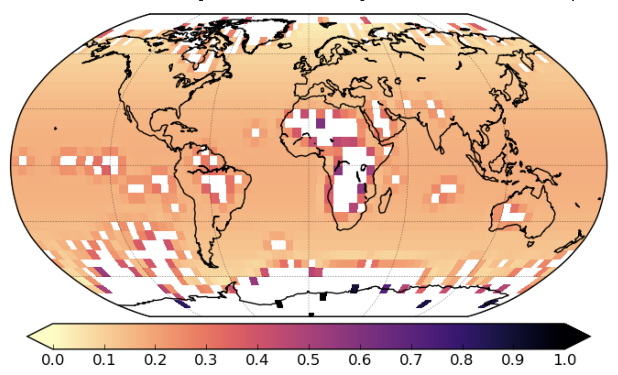
Having watched the video, you may be interested in how the HadCRUT4 gridded observations are weighted by infilling or optimal averaging methods to estimate global temperatures. The weights are shown in the figure below. Note that while the Arctic is the principal source of bias (because rapid Arctic warming means δDunobs is large, equation 13 of the paper), it is the Antarctic which is the principal source of uncertainty because large weights are attached to grid cells containing single stations. As a result infilled reconstructions show more disagreement concerning Antarctic than Arctic temperatures.
“he Arctic is the principal source of bias (because rapid Arctic warming means δDunobs is large”
Does this mean that the large unobserved areas of Africa are less significant because the temperature change there has been small?
Nice, well done! The video is very clear in its explanation of the issue (especially the real reason for infilling at the end).
That’s right. Africa, like Antarctica introduces noise due to the size of the area. But it doesn’t contribute as much to persistent bias as the Arctic because the changes in Africa have been less different from the rest of the world.
Africa coverage varies quite a bit from month to month, so there is a δf noise contribution for Africa as well.
Really we need a way to plot change in temperature and change in coverage contributions to coverage bias as a function of location, but I haven’t worked out a good way of visualizing it. I haven’t seen the product rule representation of coverage bias written down before, so I think that is probably an area where there is could be some interesting work to do.
Ed (and Kevin) – this did raise my eyebrows a bit, particularly, Figures 9 and 10 and then Table 1. Thank you VERY much for the video – helps greatly.
Now, this paper pleads for process improvement. So my questions:
1. Are the institutions listening (UK Met, NOAA, NASA, EU, Japan)?
2. Any input or comment from Berkeley?
3. This “adjustment” will enrage the denial community beyond belief. Any way to address and to diminish their “outrage”?
James: This paper is not really aimed at the contrarian community, so what they think is irrelevant. It’s also not really aimed at the temperature providers – they are aware of all this already.
The target audience for the video is temperature data users – scientists publishing papers using historical temperature data, who need to make rational and informed choices about what data to use and how. The paper is a little more advanced, and will hopefully be a useful learning resource for researchers who are starting to explore temperature reconstruction algorithms.
Terrific video, thanks! It would be nice to see it expanded to show how temperatures from ships’ logs are averaged in, when the ships aren’t in the same locations from one month to the next. Again, thanks!
I think about averaging, or “the mean” in the way I have described here:
https://moyhu.blogspot.com/2017/08/temperature-averaging-and-integrtaion.html
The average is indeed the integral divided by the area. And the integral should be found by the normal methods of numerical spatial integration. These generally amount to finding an interpolating function which gives a value for every point on earth, and integrating that. The interpolator is derived somehow from the observations. Some object to the interpolation, but there is no choice. If you speak of a global mean, it has to be global, even though you infer from a finite sample.
The grid methods described are a special case. The interpolating function is piecewise constant, being within the cell, the average of observations within that cell. If there are none, it is assigned the average of the cells that do have observations. This is the effect you get if you simply omit.
The cells without data are the obvious weak point, because assigning the average of the rest might be inappropriate, as at the poles, for example. You have two choices:
1. Make a better assignment
2. Make the average more appropriate.
The reduction of cells shown here is the latter. You make the cells a better representation (statistically) of the blank region. I think option 1 is more straight forward. You can average by hemispheres or latitude bands. But better still, you can use some other formula to interpolate in the extra-cell regions. Just from neighbors, or by kriging, or whatever.
My preference is to use a systematic division of the space which doesn’t leave gaps – an irregular triangular mesh connecting observations. You interpolate within linearly from the corner nodes. But other good interpolation schemes do about as well. Using spherical harmonics (a different idea again) also works about as well.
I think about averaging, or “the mean” in the way I have described . The average is indeed the integral divided by the area. And the integral should be found by the normal methods of numerical spatial integration. These generally amount to finding an interpolating function which gives a value for every point on earth, and integrating that. The interpolator is derived somehow from the observations. Some object to the interpolation, but there is no choice. If you speak of a global mean, it has to be global, even though you infer from a finite sample.
The grid methods described are a special case. The interpolating function is piecewise constant, being within the cell, the average of observations within that cell. If there are none, it is assigned the average of the cells that do have observations. This is the effect you get if you simply omit.
The cells without data are the obvious weak point, because assigning the average of the rest might be inappropriate, as at the poles, for example. You have two choices:
1. Make a better assignment
2. Make the average more appropriate.
The reduction of cells shown here is the latter. You make the cells a better representation (statistically) of the blank region. I think option 1 is more straight forward. You can average by hemispheres or latitude bands. But better still, you can use some other formula to interpolate in the extra-cell regions. Just from neighbors, or by kriging, or whatever.
My preference is to use a systematic division of the space which doesn’t leave gaps – an irregular triangular mesh connecting observations. You interpolate within linearly from the corner nodes. But other good interpolation schemes do about as well. Using spherical harmonics (a different idea again) also works about as well.
I have seen Clive Best has been working on these problems. His results come very near Cowtan and Way.
To James Owen. I am sceptical to much of the “settled science” (on forcings and feedbacks), so perhaps you place me in the “denial community”. But I don`t get mad about adjustments, if it is done to gain knowledge.
Kevin,
All the statistical problems of time dependent temperature coverage disappear if you work in 3D rather than in 2D (lat,lon). Temperature measurements in 3D just sample the surface of a sphere whose surface area is always 4PI.R^2. Yes there are sampling errors but you automatically optimise coverage.
http://clivebest.com/blog/wp-content/uploads/2017/03/Grid-gif.gif
P.S. I am happy to send you (or anyone else) the code.
Hi Clive.
I think it’ll give pretty much the same results for recent coverage, but not for early coverage, because the information content of a single observation is not capped. The pathological case where I believe GLS does the right thing but your approach (if I’ve understood it) will get it wrong would be the example from the video of one hemisphere fully sampled and the other represented by a single observation.
The real test would be to run the simulation and look at the errors in the reconstructed temperatures, or alternatively from theory using equation 8 – we checked that these give identical results using multivariate normal data generated using the correlation matrix, so either test should be sufficient for idealised data.
(Real data and real stations produce further caveats, but the point of the paper was explain why naive methods are wrong even for the ideal cases.)
From the paper:
“The goal is to identity the simplest function that yields a substantially better estimate than the area weighted mean of the observed cells, without interpolating temperatures into the unobserved regions.”
Well, in effect your method produces one whether you like it or not.
GLS relies on the minimization of the square of the Mahalanobis distance of the residues. This also applies to the missing data points if allowed to assume the values that would minimize the Mahalanobis distance of the residue extended to use the full rank of the precision matrix. This full set of residues once added to the values of the resolved component (extended to the missing data points) gives the corresponding interpolation.
Importantly reapplying the GLS estimator to a mix of actual and interpolated data using the full rank precision matrix is the same as applying just the observed data using the precision matrix with its rank reduced.
The modified weightings in the reduced rank estimation are just a measure of the effect of the observed values on the interpolated ones.
If it is not clear how this works, please leave a comment; and at any rate I hope to have something to say on why this approach happens to work in this case but that the GLS formula used by the GTA estimator is a bit of an abuse of purpose and logic of the GLS estimator.
Best Wishes