Inspired by National Geographic’s climate change evidence graphics, I made my own global temperature polka-dot visualisations.
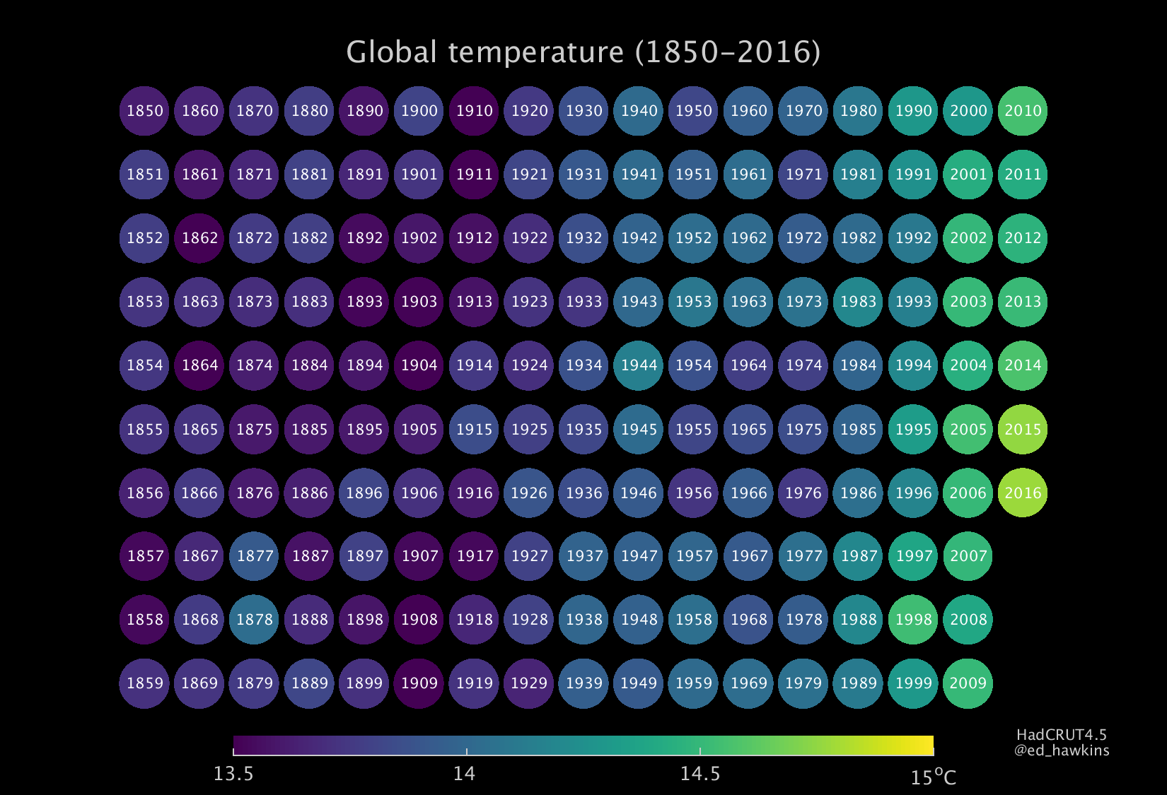
In the spirit of experimentation, here are three types, successively getting more complicated. After comments from several people I have made both portrait & landscape versions. I would be interested to know which works best for you.
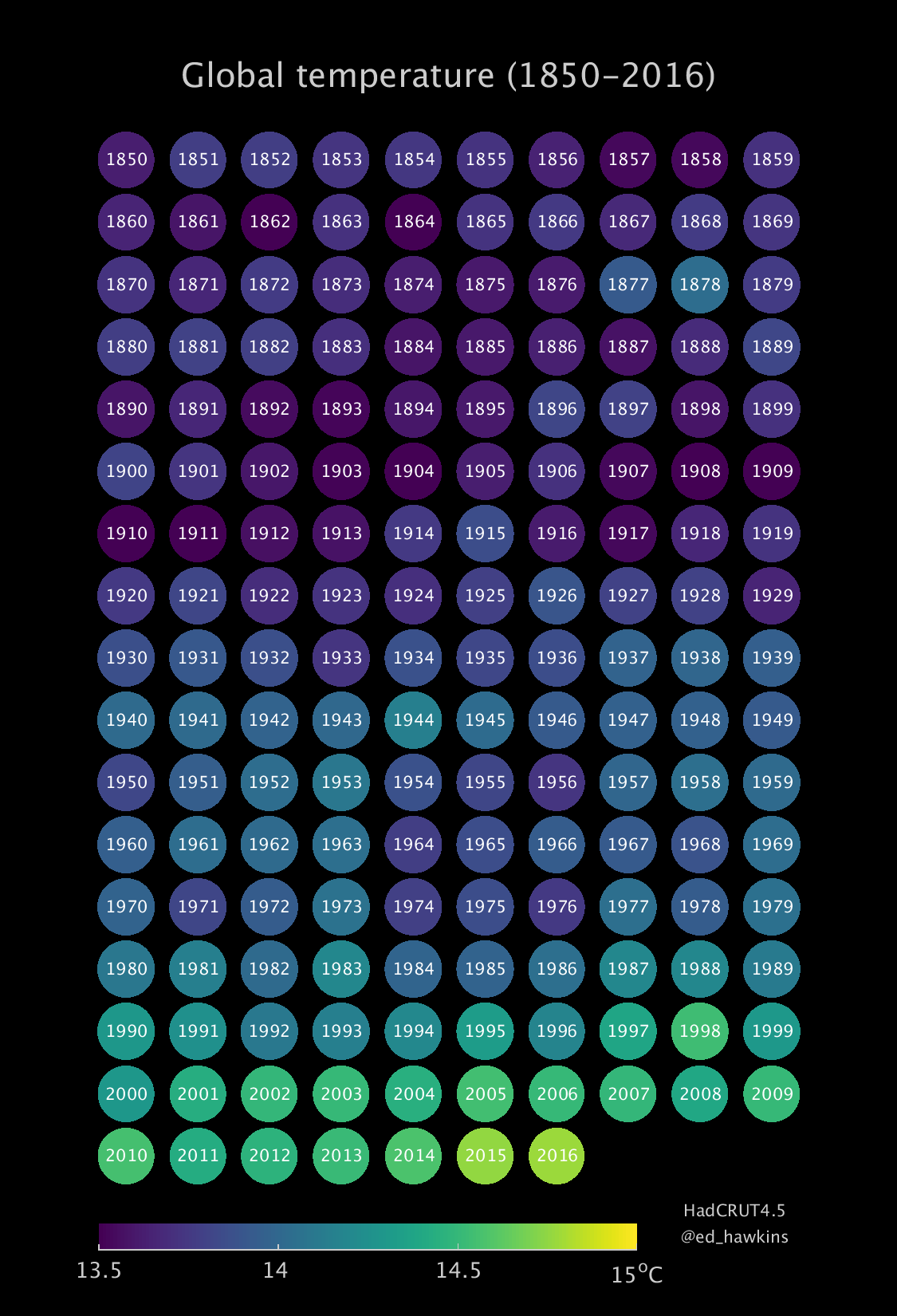
Firstly, global mean, annual mean temperature from 1850-2016:
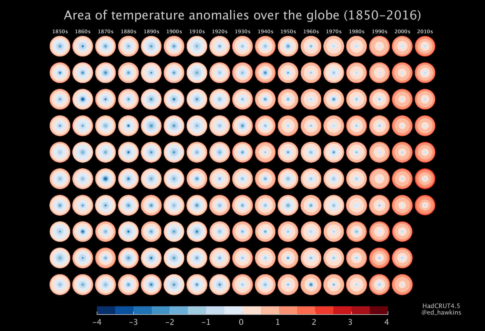
For more advanced users, the second version shows the fraction of the annual mean observations that show different amplitudes of cool or warm anomalies (relative to 1961-90), highlighting that not everywhere is similarly warm/cold at the same time. This could also be used for past & future projections.

And, for even more advanced users, the third version shows the same fraction of observations, but scaled by the surface area that we actually have observations for, highlighting how our knowledge has improved. Remember that it is likely that our observations underestimate the actual temperature change.
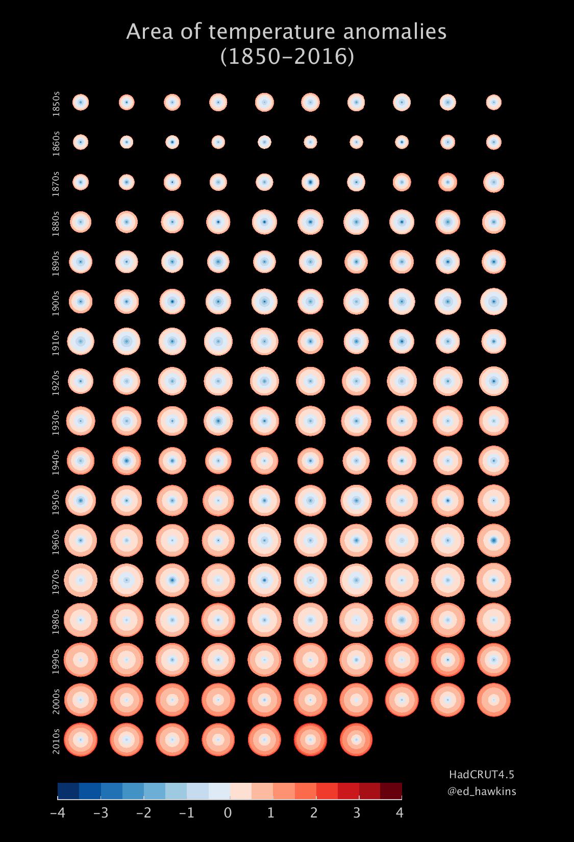

All these graphics use the HadCRUT4.5 gridded temperature dataset.
Thanks. These graphics really bring home what is going on. They should be posted to all politicians.
They should be posted to all young people too because young people eventually become politicians. They also have the need to procreate just like they have the need to eat and sleep; and as the world population continues to expand this trend will continue. Everyone wants to buy a bigger home, SUV and go on a bigger vacation so this is very much a problem of the human condition.
Reading left to right and working your way down is much more intuitive – it’s how (most of us) read. Thanks for doing these
Vertical works better for me….
I like the horizontal format because the key/color reference at the bottom is longer, easier to read.