Scientists can’t do everything by themselves. We need to engage the millions of citizens who are passionate about knowledge to help solve scientific mysteries and improve our understanding of the world around us.
There are many ways that anyone with a computer can help – volunteer to rescue old weather data or loan your computer’s CPU to simulate the climate, for example.
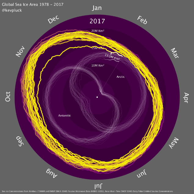
Those with more technical knowledge might also contribute by communicating climate change in novel ways. Recently, Kevin Pluck (a software engineer) created a global sea ice spiral which gained widespread attention on social media – here he tells Climate Lab Book how he did it.
Over to Kevin…
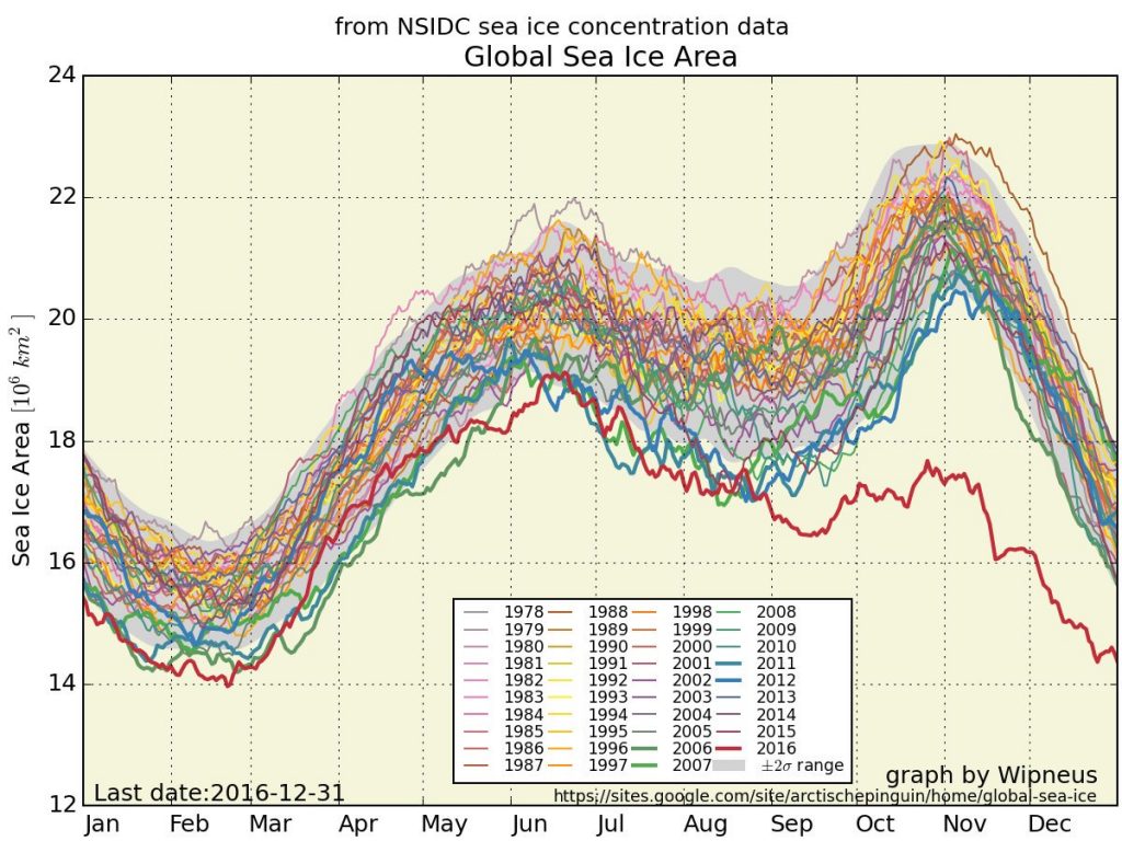
On January 2nd I came across this graph by Arctischepinguin for global sea ice area and stopped in my tracks.

This should be an important news story, it’s about the world, the planet we live on simply melting in front of our eyes.
Inspired by the global temperature change spiral I wondered what those data would look like plotted on a circle. I had been experimenting with a language called Processing and figured this would be a worthwhile project. I downloaded the data files and explored their contents. It was a simple task to parse the file and filter out missing values – just needed to plot them on a circle.
After much tinkering I was able to produce my first draft and posted to reddit. After speeding it up, I posted to both reddit and twitter, where it was picked up by the UNFCCC twitter account followed by a piece in the Daily Mail. I also got an email from the office of Al Gore asking permission to potentially use it in his talks. This was very exciting.
At the end of January I updated the spiral to include a scale, a running low record tick mark and more subtle scale markers, posting it on twitter and reddit once more, where it reached their front page gaining 1.6 million views.
During a lunch time run I had the idea of adding two further spirals; the ice area of the Arctic and Antarctic, as it would show what makes up the global value. It took a while to perfect but once I had added a ‘radar scan’ type line with ‘comet tails’ to aid visuals, I posted it to be critiqued.

Although I did get some helpful comments it grew and had a life of its own. You can find the source code for all the above here.
I have also experimented with the monthly NSIDC images, creating animations of the differences between the sea ice cover of 1979 and 2016 for the Arctic and the Antarctic (source code).
The most important news story in the world needs clear and compelling visualisations, and I hope that these help communicate what is currently happening at the poles.
I enjoyed the triple Arctic/Antarctic/global sea ice area dynamic visualization very much. My only caveat, and it is a very general one, is that far too many people seem unable to interpret a simple XY plot of a single variable. Your illustration may be too complex for many of them to follow.
The beauty of Wipneus’ stacked, colored, annual time series of daily global ice extent and area is that even the least knowledgeable viewer can see just how anomalous the last year has been.
As an aside, both of your graphs should put a stake in heart of the “but Antarctic ice is at record highs” denier meme, but it turns out it doesn’t even have a heart.
Thank you.
When I first put the spiral together I was concerned about how people would be interpreting it but was pleasantly surprised by the feedback. A few where confused where they thought that the inscribed area was the key. The reddit community of scientists helped out in explaining it very clearly, my favourite comment was this one: https://np.reddit.com/r/weather/comments/5rc46z/update_for_global_sea_ice_area_spiral_for_jan_31/dd69l6t/?context=1 (ELI5 = Explain Like I’m 5 – which also is a very good subreddit: https://www.reddit.com/r/explainlikeimfive/)
I agree that Wipneus’ graph certainly can be clearly understood but unfortunately is not very compelling.
I like the way it slows down at the end. That certainly adds some necessary drama. I wonder if its possible to make that last line go red before fading back to yellow? How that is dealt with in subsequent years remains to be seen, assuming you will continue to update this?
Thanks for your suggestion but, unfortunately, red on purple after video compression ends up very blurry.
I will most certainly be updating it, follow me on twitter (@kevpluck) to get them when released.