One possible criticism of global temperature datasets is that before around 1900 the observed data is too sparse to reliably infer changes in global temperature. Although we cannot travel back in time to take extra measurements to fill the gaps we can test whether the available observations are enough.
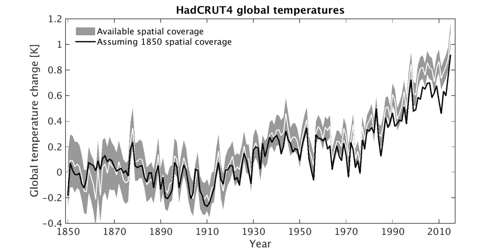
As a simple example, the figure below shows the standard HadCRUT4 global temperature dataset (white line with grey shading representing the uncertainty). The black line shows what global temperatures would look like with the same sparse coverage as 1850, the first year in the dataset.

The variations from year to year are well represented, even with the reduced spatial coverage, and the long-term trend is also lower. This highlights that the historically available coverage is preferentially missing regions of faster change. Climate model simulations show the same effect. And, it is also likely that we are still missing regions of relatively faster change (e.g. the Arctic) with modern spatial coverage.
This all points to the conclusion that we are actually underestimating the observed change in global temperatures since 1850 due to the sparse availability of historical observations.
Technical notes: This analysis used HadCRUT4.5. Annual averages were created for all grid points with 6 or more months availability of data for that year. Each year was then masked with 1850 coverage, meaning some years in this analysis end up with slightly worse coverage than 1850. The global average is calculated as the mean of the northern and southern hemispheres separately, as used by HadCRUT4. Time series presented relative to 1850-1900.
Nice analysis. I like these resampling approaches. Tweeted this, but these use same approach and might be of interest:
http://journals.ametsoc.org/doi/abs/10.1175/1520-0477(1995)076%3C1179:ASRPOT%3E2.0.CO%3B2
http://link.springer.com/article/10.1007/BF01094017
Ed,
I think what you really should do is to analyse just those stations which have continuous coverage back to 1900. That way you compare like with like. For Ocean temperatures it is more difficult, but perhaps you could restrict just those 5×5 cells to known shipping routes. I might even do this myself!
I have the upmost respect for Hadcrut data analysis, but am concerned about others then extrapolating data into the arctic where we know the resultant analysis boosts apparent warming.
The underlying problem is goes back to exactly what we mean by ‘anomalies’. These are derived relative to a 30 year monthly average temperature at each station. This simply has no meaning for example at the north pole, because each year simply consists of just one day and one night, not seasons. Likewise in Siberia temperatures range from -50C to +30C in one year. So if the minimum temperature in Vladivostok rises by 2C means for less than if the maximum temperature in Delhi rises by 2C. Therefore all anomalies are not equal and to take a global average of such differential changes does not measure the average temperature of the earth. Rather it measures the regional and seasonal distribution of heat.
Sure this changes with increased CO2 forcing but the response is dynamic to maximise entropy rather than simply warm the planet.