An update to the NOAA global temperature estimates has generated a lot of media excitement, based on a paper by Karl et al. in Science. How do the new estimates compare with other global temperature timeseries?
Overall, the updates to the NOAA temperatures for an individual year are relatively small (most are less than 0.05°C, both warmer and cooler), but Karl et al. highlight that for the recent decade there is a tendency for the corrections to push temperatures warmer, so increasing the linear trends over certain short periods often discussed in terms of a ‘slowdown’ or ‘hiatus’. Carbon Brief, Doug McNeall & RealClimate all have excellent analyses of what this means.
The figure below compares trends in the HadCRUT4.3 global temperature estimates with the new NOAA data. Both of these use similar corrections to the recent SSTs and neither perform any infilling of missing data. As discussed by Karl et al., for the recent 2005-2014 period, the trends are both positive, but NOAA evidently has a larger warming. However, there are still interesting features in the atmospheric circulation over the last decade to study and better explain: e.g. the strengthening of the Pacific trade winds and strong cooling over north Eurasian land areas.
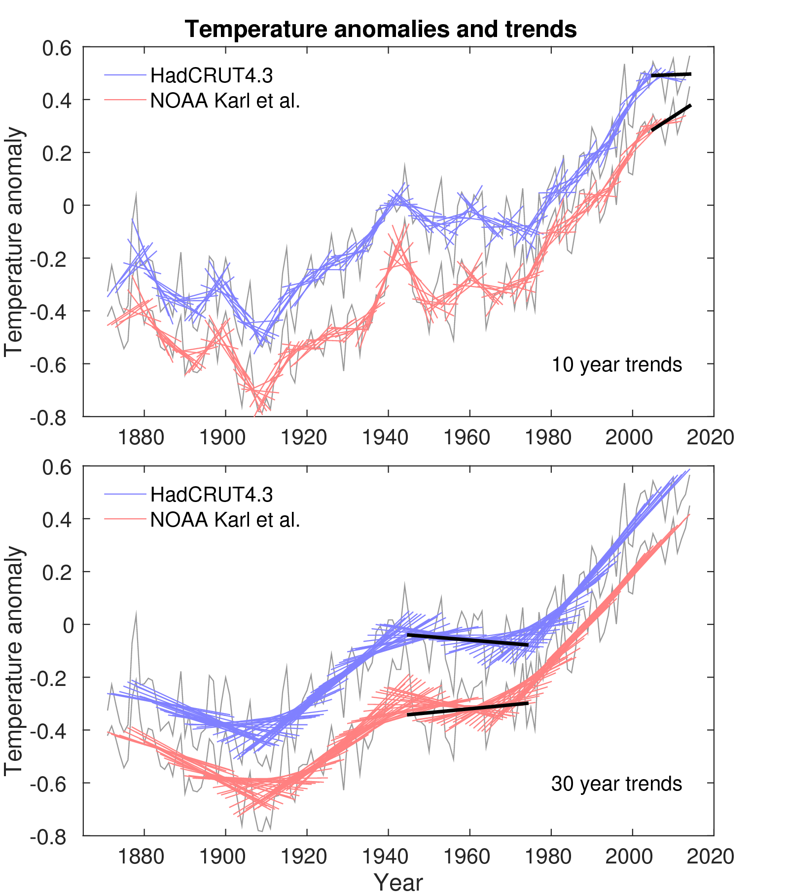
However, there are other (more?) interesting features in the global temperature datasets. For an earlier 1945-1974 period, HadCRUT4.3 shows a cooling, whereas NOAA shows a warming. This period is often assumed to have a relatively large cooling influence from the increase in aerosols, competing with the warming from greenhouse gases. This difference amongst the observational estimates is important because the strength of aerosol cooling is an important uncertainty in determining how much of the observed warming is due to greenhouse gases. The 1940s are also very different, with NOAA showing a marked peak around the WW2 period where the SST observations are particularly challenging.
There is clearly more work needed to fully explain periods of cooling & warming. This involves continuing to examine and refine the observational estimates including improving the corrections and additional data rescue, as well as better understanding the interactions between aerosols & clouds and the Earth’s energy balance. And, the warming from 1910-1940 is still not fully understood, although it is likely to be partly natural variability, partly a recovery from volcanic eruptions, and partly greenhouse gas induced.
Natural variability is still an important component of how our climate system evolves, and that is not going to change. And, the observed warming is still lower than the mean of the CMIP5 simulations, although within the range of expectations.
There is a widely-held theory that warming trends also simply have to with “heat island” effects, i.e. the original gauges have become “walled in” more and more by surrounding building structures who themselves either emit heat due to their heating inside (office buildings etc.) or due to heat storage effects, receiving sunlight and re-radiating it as infrared at all times of day, even at night. This should be notable in the different pace at which temperatures “rise” in unadulterated and adulterated gauge environments, yet I have not seen a study “worth its salt” in that area.
Hi Dermot,
In fact, the very first global temperature estimate by Callendar (1938) considered this issue by splitting the stations into urban and rural and found very little difference. There have been many, many studies since. Also, the temperatures measured over the oceans are increasing, where there is no urban heat island. Sea ice is melting, and sea levels are rising – all consistent with a warming planet. In the UK, we have the long Central England Temperature timeseries which is adjusted for the urban heat island effect and still shows a warming.
cheers,
Ed.
Dermot whilst Urban Heat Islands are “known knowns” as Anthony Watts has clearly demonstrated in an exhaustive study of US meteorological station sites the big picture remains of a warming World in terms of surface temperatures and ocean heat content.
For an overview try;
http://ds.data.jma.go.jp/tcc/tcc/news/tccnews39.pdf
http://ds.data.jma.go.jp/tcc/tcc/products/gwp/temp/ann_wld.html
There is absolutely no question that we live in a warming(currently) World. The key question is “attribution” in terms of the anthropogenic component, through emissions or aerosols, land use, deforestation, urbanisation etc. That is a somewhat more difficult one IMHO.
As we accumulate more resolved data over observed oceanic cycles we should be in a better position to quantify the importance and ramifications of the “Anthropocene”.
Just my take.