When comparing global temperatures estimated from observations with climate model simulations it is necessary to compare ‘apples with apples’. Previous posts have discussed the issues of incomplete observational data, but a new paper by Cowtan et al. quantifies the influence of different observational data types. Continue reading An apples to apples comparison of global temperatures
Monthly Archives: July 2015
Back-of-the-envelope attribution of global temperature changes
Many of those skeptical about the causes of climate change suggest that the complex global climate models (GCMs) often used to make attribution statements are not trustworthy. Here I highlight that GCMs are not needed to roughly attribute nearly all of the observed warming (at least) to changes in greenhouse gases. Continue reading Back-of-the-envelope attribution of global temperature changes
Climate Communiqué
Today, twenty-four UK learned and professional societies express their joint views on the risks of climate change and the opportunities for innovation to address those risks.
The signatories include societies of physical scientists, engineers, medical scientists, social scientists & artists, amongst others. This is the first time such a broad range of professional bodies have issued such a unanimous text.
Climate communiqué
The scientific evidence is now overwhelming that the climate is warming and that human activity is largely responsible for this change through emissions of greenhouse gases. Continue reading Climate Communiqué
New viridis colour scale
Below is a simple example of using different colour maps to show the same UK mean temperature data for both normal vision and a simulation of colour blindness.
Viridis is a new colour map developed for Python (MATLAB code here) with lots of nice features, including removal of artificial perceptual boundaries which jet suffers from.
Which do you prefer?
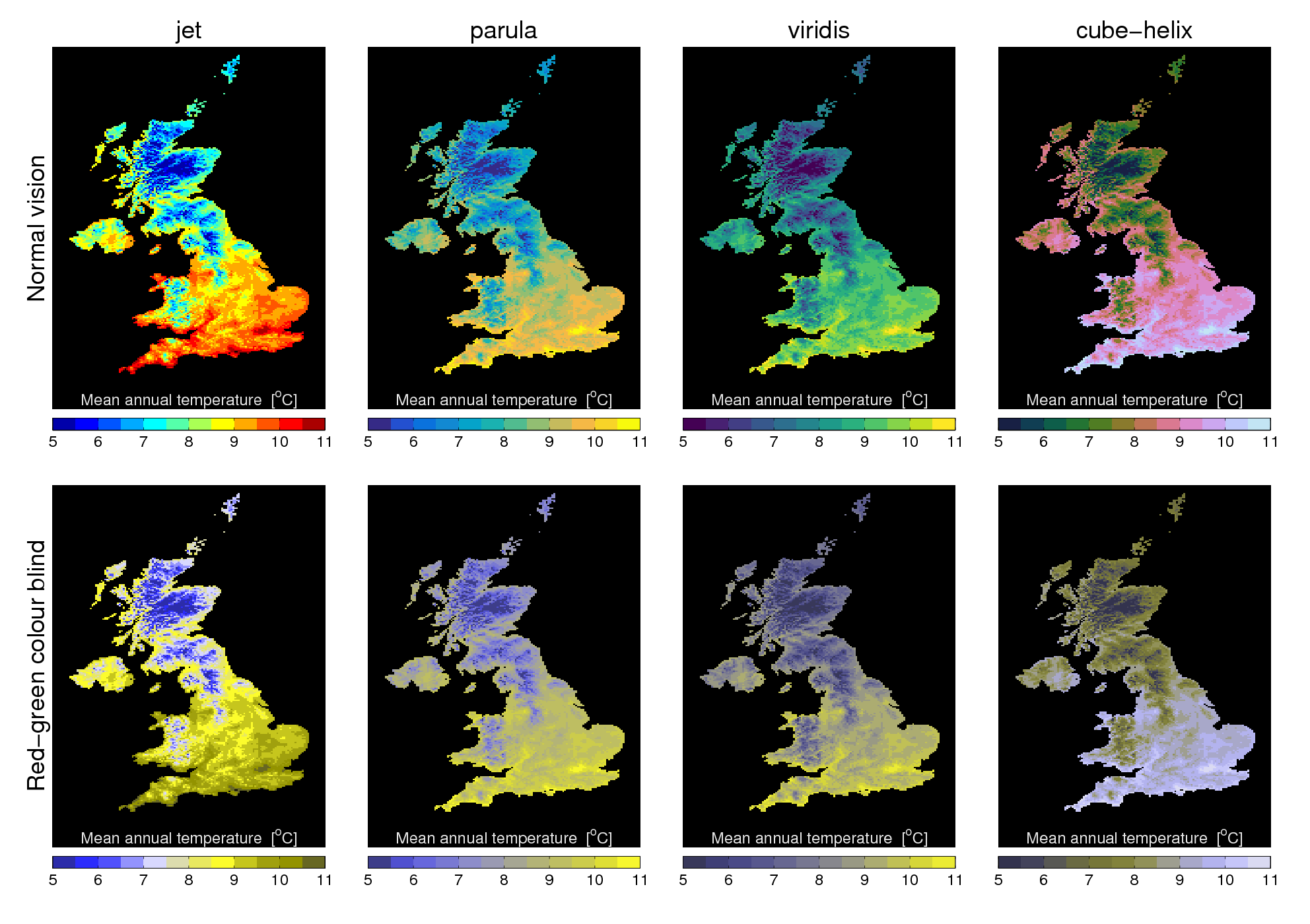
[This post continues our #endrainbow campaign to reduce use of ‘rainbow’ colour scales like jet.]