“In the last few years the warming trend of the earth has stopped” is a common type of remark these days. Is that indeed the case, and can we conclude that the projections for the rest of the century are being overestimated? And if so, how come that large parts of Europe are expected to have the warmest year recorded in 2014? There is a chance that the global mean temperature will also be the highest in the series.
Guest post by Geert Jan van Oldenborgh, KNMI
The increase in the global mean temperature has slowed down
The most common measure of global warming is the global mean temperature. This has a somewhat unusual definition: over land is the the air temperature measured at 2 or 1.5 meters above the surface (T2m), over sea it is the temperature of the top meter or so of the ocean, sea surface temperature (SST). (The values over sea ice are either not considered or interpolated from land stations.) The reason is a practical one: there are many more observations of SST than of the temperature of the air above the water and oceans cover 70% of the globe. The difference between SST and T2m is small and does not change much, so as long as we consider anomalies it does not make much difference.
The old argument that the world is no longer warming was that the global mean temperature has ceased to increase after 1998. There are two ways to interpret that claim. The first is that there has been no warmer year than 1998. That year was about a quarter of a degree warmer than the trend of about 0.16 K/decade due to an exceptionally strong El Niño in 1997/1998. However, that record was broken in 2005 and 2010 (see Fig.1) by weaker El Niño events, so the argument is no longer correct. A confusing circumstance is that one old dataset, HadCRUT3, systematically underestimated the contribution of the Arctic, which showed strong warming since 1998. Due to this bias, this dataset kept 1998 as the warmest year. This has been partially corrected by the inclusion of a lot more Arctic stations in the new UK Met Office dataset, HadCRUT4.
The second, better, interpretation of the argument that the earth is no longer warming would be that a trend line starting in 1998 would be zero or negative. However, this is not the case: a linear trend starting at the peak in 1998 still gives a positive trend of 0.07 K/decade. The new argument therefore is that the temperature has not risen over the last 10 years. This is indeed correct, both the GISTEMP series and the HadCRUT4 dataset in which missing areas have been interpolated by Cowtan & Way show a trend of 0.00 K/decade over 2005–2014. To investigate further why the trend has been zero since 2005 it is useful to consider the land and ocean separately.
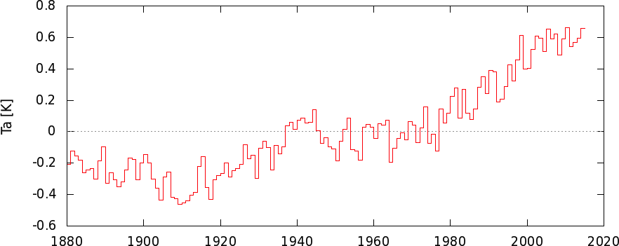
The land temperature has risen over the last 10 years
The land temperature is arguably most important to investigate the effects of global warming: that is where most people live. The long-term trend 1970–now is about 0.22 K/decade. This is higher than the global mean temperature because the relative humidity is lower over land. Another difference is that the variability is higher, σ=0.15 K. However, these variations have shorter time scales, there is almost no year-to-year persistence over land. The most important source of variability is (winter) weather over Siberia and North America. These are large regions with large temperature anomalies, caused by random weather fluctuations with characteristic time scales much shorter than one year, as far as we know. The other important factor is El Niño or La Niña, these explain about 30% of the variance, with a half-year delay. In Fig.2 one sees that 1998 and 2010 are above the trend line: both of these followed El Niño events. The years 2008 and 2011 followed La Niña events and are below the trend line.
Because most variability is on short time scales, the annual mean land temperature follows the CO2 concentration as a proxy for the total radiative forcing very well, see Fig.2b. A correlation as high as this one between two variables that are not trivially connected is very rare in the climate system.
The trend in the land temperature has been lower than the long-term average over the last 10–16 years, but is not zero. These lower values do not differ significantly from the long-term trend: the long-term trend is within the 95% confidence interval of the short trends. The same holds for the compensating periods in which the trend has been higher.
It has also been shown that extremely high land temperatures keep on occurring more frequently over the ‘hiatus’ time – for example, Seneviratne et al (Nature Climate Change, 2014) show that the percentage of the land surface affected by heat waves has increased strongly since 1997.
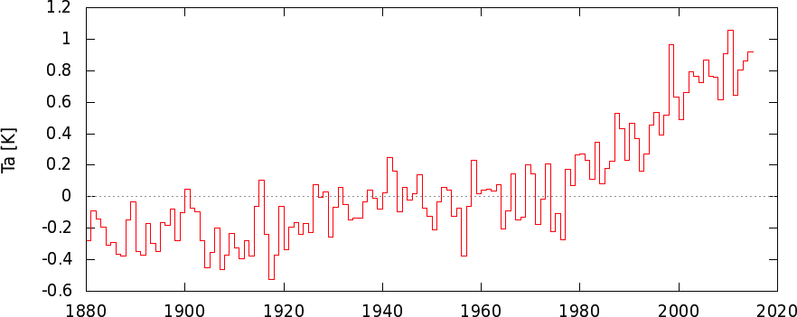
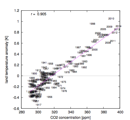 Figure 2: (a, top) the anomaly of the annual mean land temperature (GISTEMP, NASA/GISS). The value for 2014 is an estimate based on the January-October observations. (b, bottom) as a function of the CO2-concentration.
The sea surface temperature rise has stalled
The other 70% of the planet’s surface shows different behaviour. The variability is somewhat smaller, σ=0.12 K, but it exhibits a lot more persistence. Examples are the long period of cold SST at the beginning of the twentieth century and the prolonged warm temperatures relative to the trend in the 1940s, see Fig.3a. A much weaker version of these occurred the last decade: 2001–2006 were well above the trend line and 2007–2013 below (except 2009 and 2010, which had average temperatures relative to the long-term trend, see Fig.3b). This makes it possible to find a start date that gives a very low trend up to 2014: this is the case over the period 2002–2014 . Last year it was even easier, but the very weak El Niño (El Niñito?) that has been active since the summer of 2014 has increased the global mean SST somewhat. Combined with the background trend this implies that SST will be record high in 2014. Of course the trend leading up to 2002 was higher than the long-term average.
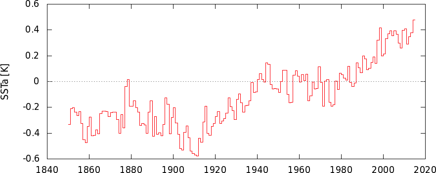
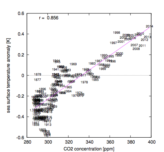 Figure 3: (a, top) the annual mean global mean sea surface temperature (HadSST3, Met Office). The value for 2014 is an estimate based on persisting the anomaly over January-October. (b, bottom) as a function of CO2-concentration.
Patterns
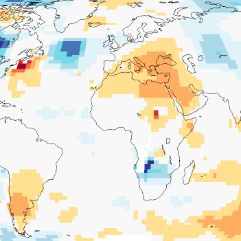
The pattern of temperature changes over the last 10 years has changed substantially since the ‘hiatus’ debate started a few years ago. At that time it was clear that the transition of a period dominated by El Ninõ at the beginning of the ten years to a period with largely La Niña at the end played a major role, partially compensated by the strong warming of the Arctic. In Fig.4a these areas are visible as the big blue (cooling) wedge on the Pacific Ocean and the large purple (heating) areas in the Arctic. The last 10 years this pattern has changed considerably. Because two El Niño years dropped out at the beginning of the 10-year period the wedge on the Pacific has all but disappeared, but so has the very strong warming of the Arctic (Figure 4b). The patches over North America and Siberia are mainly driven by random winter weather and have therefore also changed position. This shows how large the influence of random factors is on 10-year trends and how little can be learned by studying them.
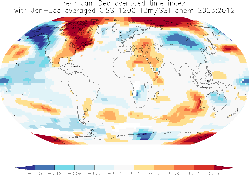
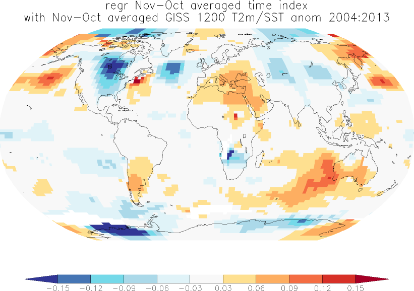 Figure 4: (a, top) trend [K/yr] in the SST/T2m temperature (GISTEMP 1200, NASA/GISS) 2003–2012. (b, bottom) the same for 2005-2014 (minus two months).
Deep ocean
In theory, the most important measure of the warming of the earth is the amount of heat absorbed by the ocean. Satellite observations have shown us that over the last ten years, the earth has received more energy in the form of solar radiation than it is has emitted as reflected solar radiation and thermal radiation. This imbalance is caused by the increased concentration of greenhouse gases and changes in aerosol concentrations. At longer time scales, this heat is mainly absorbed by the ocean, simply because the oceans contain a lot of water that has a large heat capacity. The atmosphere has very little heat capacity, the warmth does not penetrate far into the solid earth and the land and sea ice just cannot absorb enough heat while heating and melting to balance the influx of extra heat. In all, the ocean absorbs over 90% of the heat.
This was the basis of the previous ‘hiatus’ discussion, when the increase of ocean heat content seemed to stagnate from 2003 to 2010. However, this was only the case in the upper 700m of the ocean. Taking the deeper layers into account shows a continuous heating trend (Fig.5b). Since then, the rise of upper ocean heat content in the top 700m has also resumed, as expected (Fig.5a).

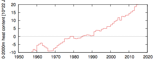 Figure 5: Ocean heat content. (a, top) 0-700m, observed reasonably well with XBTs since the 1970s. (b, bottom) 0-2000m, only measured well since 2005 with Argo floats, the curve before that is a 5-yr running mean of more sparse observations, mainly oceanographic sections. The value for 2014 is an estimate based on data up to September. Source: NODC.
Conclusions
The ‘hiatus’ in the global mean temperature rise of the earth over the last 10 years is not a very sensible way to study global warming. Trends over such a short period are influenced heavily by (winter) weather over North America and Siberia, and by El Niño and La Niña. Over land the trend has not gone down to zero and 10-year trends are compatible with the long-term trend within the large uncertainty margins. Over sea there is also strong persistence from year to year, making the probability to obtain 10-year trends that are very different from the long-term trend very large. The best measure of whether global warming continues is the ocean heat content below the surface. This measure shows a very consistent rise, which is also expressed in sea level rise.
On top of the rising trend of the land temperature, much of Europe had warm weather for large periods this year. These two factors together, the long-term trend and a short positive fluctuation, caused the record-high temperatures that are expected this year.
With thanks to Andreas Sterl and Robert Mureau for very useful comments.
The plots shown can be reproduced on the Climate Explorer.
“The ‘hiatus’ in the global mean temperature rise of the earth over the last 10 years is not a very sensible way to study global warming.”
“The best measure of whether global warming continues is the ocean heat content below the surface.”
For years, climate scientists have been presenting global warming as global average surface temp. Look at the papers by Hansen or the IPCC reports etc.
Now that it’s not doing what you want it to do, you suddenly decide that this is not a good way to measure things.
This is not how science works.
It all depends on the timescale. For long-term trends the global mean temperature is fine. For short time scales, like ten years, the signal-to-noise ratio is too high to say much, and you have to find another quantity with a better signal-to-noise ratio. Ocean heat content is so directly related to the energy balance of the earth that it in principle a good indicator, but only since 2005 are the observations good enough to use it on short time scales. This is exactly how science works.
I’m confused, really.
Please explain how/why ocean heat content observations (measurements ?) are not ‘good enough’ for short time scales, but are good enough for long time scales (is 10 years a short time scale? … is 60 years, per figure 5, a long time scale?)
When you say ‘noise’, do you mean that the precision of the observations (measurements?) is not statistically viable, or do you mean that there is not enough representative data, or do you mean something else?
What I meant is that in the global mean temperature series, a 10-yr trend is not a good estimate of the long-term trend. This is because random fluctuations around the long-term trend caused by El Niño, the weather and other natural variability are as large as the trend over that short time scale. The quality of observations and coverage are good enough these days in interpolated datasets to not worry too much over.
If you take trends over longer time periods the random fluctuations are averaged out but the trend signal increases, so that the signal/noise ratio improves.
The ocean heat content is more difficult to measure, but has much less natural variability as it is directly related to the radiative imbalance at the top of the atmosphere: most of the excess heat retained by higher greenhouse gas concentrations has to be absorbed by the ocean. Therefore a 10-yr series of the 0-2000m ocean heat content is enough to estimate the long-term trend (assuming nothing much happens below that, which is a reasonable assumption). In contrast, the amount of heat in the upper layers of the ocean can vary more by exchange to deeper layers due to El Niño, the Atlantic Overturning Circulation and other processes.
Geert thanks for the article.
You say the gmt is good for the long term trend, I dont exactly know what you mean by ‘long term trend’. I don’t really see a single long term trend, one could see the last 150 years or so as a series of phases, warming (1910-1940), stall (1940-1970s), warming again (1970s-1990s) and slowdown again (~2000-now).
All of which are explained by a variety of different physical processes. Multidecal phases, all with different trends and all with a mix of different explanation. In some cases with competing explanation. What single long term trend is there?
Geert, I thought further about long term and short term trends and it makes me think you are being too prescriptive here.
The long term trend is just a trend, if you want to gain insight(attribute) that trend then you need to understand the system on all time scales. An obvious example comes from scientists who have studied the few years that follow volcanic eruptions to gain insight into radiative forcing, this work has contributed to the consensus view of the long term trend. Nobody argues this is just a few years we cant make sense from that. Now we have ~15 years were some metrics have changed in any interesting way. It shouldn’t simply be dismissed as noise, we should be able to learn from it and apply that understanding to the longer trend.
First stop being pretentious and call a pause a pause.
Second as one of the first people to refer to the pause (A word I chose in an attempt to get the slowdown into the wikipedia article), the pause refers to the failure of the IPCC prediction of between 1.4 and 5.8C in global surface temperatures.
You cannot say the “pause” is not happen, because it refers to the failed prediction of this global surface temperature.
So, please stop trying to deny the pause. Because what you are really doing is denying that the predictions have failed.
The proper scientific approach to take now is this:
1. Decide what criteria you want to predict
2. Make your new prediction
3. Wait to see whether that is substantiated by the facts
4. Then you can claim you understand the pause.
[Editor: Please stay on topic. This post is about the observations – you can discuss the models-observations comparison here: http://www.climate-lab-book.ac.uk/comparing-cmip5-observations/ ]
Your the one who’s gone off topic. The pause means the discrepancy between the predicted warming and the lack thereof.
If someone had predicted the ocean would warm or any of these other measurements, then fine, that would be an on-topic subject. But when talking about the pause, the only test that matters is prediction versus outcome.
Hi Mike – this post is very clearly discussing the recent observed trends in temperatures. You have chosen to define the word ‘pause’ differently from climate scientists. As I said, the comparison with model simulations is clearly interesting, and that is done elsewhere on the blog.
Ed.
No, you have chosen to redefine the concept of the pause using a strawman argument to mean something it doesn’t mean and then attack your definition.
The pause doesn’t have any meaning except the discrepancy between what was predicted and what occurred.
If you don’t use the definition commonly agreed, then who knows what we are talking about? What about “Inter-glacial pause” or There’s been no global warming (for 100millions years).
Sceptics invented the concept of the pause, and therefore I think you should respect that and use our definition not one you would have liked us to use.
We’ll have to agree to disagree. There are two issues: (1) what has happened in the observations and why do the trends change over time, and (2) how do these observations compare to the models. It is perfectly acceptable to discuss (1) without (2), whatever you may believe. Geert Jan defines what he means by hiatus very clearly so you should stick to that discussion, else your comments will be deleted.
cheers,
Ed.
I agree with Mike on this one. “The Pause” is only being discussed here because the models predicted continued warming.
Had the models predicted that there would be no warming, “The Pause, Hiatus, whatever” would not exist as a topic.
Since no one knows for sure if warming will resume – perhaps we are at the end of the Interglacial – no one can say for sure – to call the deviation from model predictions A Pause of Hiatus is a matter of speculation not observation.
Until warming resumes the “Hiatus in the rise in temperature” is not an observation, it is a speculation. You are speculating that what comes next will be more warming.
From the beginning of discussions about the hiatus ( the word hiatus was used starting in June 2008 , best as I can tell) the focus of the serious debate has been over the comparison between models and observations.
http://rankexploits.com/musings/2008/what-weather-would-falsify-the-current-consensus-on-climate-change/
http://rankexploits.com/musings/2008/ipcc-projections-overpredict-recent-warming/
more here
http://rankexploits.com/musings/category/global-climate-change/page/11/
Mike hasnt changed the definition.
The usage of the term “hiatus” was coined by the IPCC in the AR5 report I believe. They do not call it a “pause”.
I don’t think it helpful for a discussion around global warming to rely on semantics.
I think it would help the debate enormously if we were to add the word “estimate” after “trend”. So for example in these statements:
“However, this is not the case: a linear trend starting at the peak in 1998 still gives a positive trend of 0.07 K/decade. The new argument therefore is that the temperature has not risen over the last 10 years. This is indeed correct, both the GISTEMP series and the HadCRUT4 dataset in which missing areas have been interpolated by Cowtan & Way show a trend of 0.00 K/decade over 2005–2014.”
Trends estimated over 10 years are incredibily uncertain and so even
if the point estimate is 0.00K/decade then the “true” trend can still be
strongly positive.
It’s about time that climate scientists started to include credible uncertainty
estimates on their trend lines – see box in Chapter 2 of WG1 IPCC 5th assessment report.
I am not a native English speaker, so I may be off the mark here. I use the word “trend” for the best estimate of the change with time (or another quantity) over a specified time interval, and “long-term trend” for the underlying change. The first is indeed an estimate of the latter, good or bad. If you use the word “trend” for the underlying quantity, what would you use for the change over a specified interval?
Concerning uncertainty estimates: yes, I agree wholeheartedly, if using the short-term trend as an estimator of the long-term trend. However, as far as I understand this is not the “hiatus” argument, which is that the trend stopped in 1998 (or 2001 or 2005). The short-term trend since then is thus explicitly not seen as an estimate of the long-term trend (which is not explained). Your analysis only makes sense if the null hypothesis is that global warming is continuing, which a 10-year pause does not disprove. However, the argument seems to be that we have to prove that global warming has not stopped, so the null-hypothesis is that the long-term trend has somehow suddenly stopped, and we cannot disprove that one either from the series, so have to pull in other evidence such as the ocean heat content, sea level rise, satellite observations of the radiative imbalance.
Be sure to tell the politicians to forget the 2C target then.. 😉
Realclimate’s take on Ocean heat content as a measure:
Ocean heat storage: a particularly lousy policy target http://www.realclimate.org/index.php/archives/2014/10/ocean-heat-storage-a-particularly-lousy-policy-target/#sthash.fPhqPTNy.dpuf
The New York Times, 12 December 2027: After 12 years of debate and negotiation, kicked off in Paris in 2015, world leaders have finally agreed to ditch the goal of limiting global warming to below 2 °C. Instead, they have agreed to the new goal of limiting global ocean heat content to 1024 Joules.
The decision was widely welcomed by the science and policy communities as a great step forward. “In the past, the 2 °C goal has allowed some governments to pretend that they are taking serious action to mitigate global warming, when in reality they have achieved almost nothing.
I’m sure that this can’t happen again with the new 1024 Joules goal”, said David Victor, a professor of international relations who originally proposed this change back in 2014.
And an unnamed senior EU negotiator commented: “Perhaps I shouldn’t say this, but some heads of state had trouble understanding the implications of the 2 °C target; sometimes they even accidentally talked of limiting global warming to 2%. I’m glad that we now have those 1024 Joules which are much easier to grasp for policy makers and the public.”
This fictitious newspaper item is of course absurd and will never become reality, because ocean heat content is unsuited as a climate policy target. Here are three main reasons why.
1. Ocean heat content is extremely unresponsive to policy.
– See more at: http://www.realclimate.org/index.php/archives/2014/10/ocean-heat-storage-a-particularly-lousy-policy-target/#sthash.fPhqPTNy.dpuf
I do not see the disagreement.
Geert in a comment above “It all depends on the timescale. For long-term trends the global mean temperature is fine. For short time scales, like ten years, the signal-to-noise ratio is too high to say much, and you have to find another quantity with a better signal-to-noise ratio.”
And Stefan in the RealClimate post is even more scathing of the “hiatus” argument.
“Victor and Kennel appear to have been taken in by the rather overblown debate on the so-called ‘hiatus’, not realizing that this is just about minor short-term variability in surface temperature and has no bearing on the 2 °C limit whatsoever. In this context they may have read the argument that ocean heat content continues to increase despite the ‘hiatus’ – which is a valid argument to show that there still is a radiative disequilibrium and the planet is still soaking up heat.”
@Paul
This is exactly ‘how science works’.
Step by step improvement. And be honest to take all steps into account.
My thoughts exactly!
Re-examining the hypothesis is an important step in science. In climate science, all I see is a re-examining of the data (e.g. this article).
One of possibilities for the pause is an incorrect hypothesis. Why is this possibility never seriously examined?
Which hypothesis would you like to be re-examined? That CO2 in the atmosphere heats the surface? You would be very cold without greenhouse gases in the atmosphere, so the fact that the mean temperature at the surface of the Earth is well above its radiation temperature already gives enough evidence for that. Radiation physics is fairly well-established — you would not have a weather forecast without it. You need pretty strong evidence to overturn that whole body of knowledge. A fluctuation of the global mean temperature well within the range of natural variability does not constitute that kind of evidence.
I am still at a loss to understand whether CO2 concentration is a leading or following indicator. Some of the charts seem to show that the temperature increases long before the CO2 concentration increases. Could someone straighten me out?
There are others who can probably answer this better than I can, but I’ll give it a go. If you’re thinking of the ice core data and, in particular, those that show Milankovitch cycles, then that is a different process. The basic idea there is that variations in our orbit around the Sun change the Solar insolation, in particular can produce quite a large change in solar flux at high Northern latitudes. This leads to some melting of the ice sheets and hence some warming. This warming then releases CO2 (the atmospheric CO2 concentration does depend on ocean temperatures). This increased atmospheric CO2 then amplifies the initial warming, which releases more CO2, etc. There will also be other feedbacks such as water vapour, lapse rate, clouds. Ultimately, this process produces an increase in temperature of about 8-10 degrees at the poles and about 4-5 degrees globally. The process then reverses, again as a result in changes in solar insolation due to orbital variations.
So, basically, CO2 does not need to be the trigger; it can be an initial change in temperature due to orbital variations that initiates the process. However, CO2 is a greenhouse gas and any change in the atmospheric CO2 will produce warming or cooling.
One can extend this a little too. The relationship between atmospheric CO2 and ocean temperature is that a 1 degree increase in ocean/sea temperature will increase atmospheric CO2 concentrations by between 10 and 20 ppm. This is consistent with the Milankovitch cycle which shows a change in CO2 concentrations of about 100ppm and a change in temperature, globally, of 4 to 5 degrees (or 8 – 10 degrees at the poles). Today, however, the CO2 concentration has increased by 120ppm in just over 100 years, while the temperatures have increased by less than 1 degree. Therefore, the CO2 increase cannot be simply due to a change in ocean temperature. It is due to our emissions. In other words, our emissions are driving the temperature change; the temperature change is not driving the change in atmospheric CO2.
Hi Geert
One which springs to mind is the hypothesis that it is 95 % (sic) certain that humans have caused the global temperature increase since 1950. In fact come to mind how one would one begin to validate or invalidate such a claim.
It’s a scientific result, not engineering. Basically you consider all the different processes that contribute to warming. Anthropogenic, Solar, volcanoes, internal variability and you determine the range of warming that each could produce. The result is that the most likely anthropogenic contribution could be anything from half the observed warming to double. Solar and volcanoes could have produced anything from between about 15% cooling to 15% warming. Internal variability is similar. When you combine it all, you find that the most likely anthropogenic contribution is just over 100%, and there is only a small chance (less than 5%) that natural external influences (Solar, volcanoes) and internal variability could have produced more than half the observed warming. Therefore 95% certain that anthro contributed more than 50%.
The main point though, is that this is a scientific result. We can’t really validate it in some engineering sense. Maybe the correct statement is “Given our understanding of the processes that influence our climate, we are 95% sure that anthropogenic influences have produced more than 50% of the warming since 1950”. So, I guess, there’s a chance that something we haven’t considered and don’t yet understand is contributing. There are two problems with this. Firstly, why would we possibly consider this more likely than our best understanding. Things can change in the future, but you don’t dismiss our current understanding just because our understanding might change. Secondly, you also have to explain what’s wrong with our current understanding. If it is dominated by something else, why is the anthropogenic influence so very different to what we expect?
ATTP
I would suggest what you are doing is in fact extrapolating through our ignorance of the system. I would also suggest Science at least in the Popperian sense is attempt to avoid this this type of extrapolation. In so far as a hypothesis is proposed a non-trivial prediction is made and this prediction is tested for validity. The process allows nature to be the final arbiter of the validity of the hypothesis.
The statement concerning the cause of the late twentieth warming is non testable in the sense outlined above. Given the science is aware of the depth of its ignorance with regard to the climate system, imo IPCC statements like this should be dosed with heavy disclaimers along with the disposal of the use of faux statistics.
Editor: please define what you mean by “faux statistics”, else the sentence will be deleted.
[small snip – please stay on the scientific topic- this is a science blog.]
regards
Hi Ed
Thank you for your both interesting and informative blog.
By “faux statistics” I mean the application of quantitative likelihood scales as used by the IPCC. However please feel free to snip both this comment and the sentence if you deem it off topic or against blog policy.
cheers
http://www.interacademycouncil.net/File.aspx?id=27678
[Quote]
A quantitative likelihood scale (Table 3.3) is used to represent ‘a probabilistic
assessment of some well-defined outcome having occurred or occurring
in the future.’ The scale ranges from ‘virtually certain’ (greater than
99 percent probability) to ‘exceptionally unlikely’ (less than 1 percent
probability). [/Quote]
“The land temperature is arguably most important to investigate the effects of global warming: that is where most people live.”
That sounds awfully weak, especially given your entire piece is built around defining, as narrowly as possible, the position of the “hiatusists” readying it for a strawman knock over.
IMO a person looking at this fairly would wonder where all the vaunted heat has gone since CO2 has increased unabated. And would then challenge the model lets and the CO2 sensitivity calculators to go back to the drawing board. Instead like a stock prognosticator you try to do post facto explanations. However, plausible this all might be, one has to remember AGW causes until this time also seemed plausible. Obviously a lot is missing in understanding, but the breathtaking over certainty unfortunately has become a habit
The heat is exactly where it should be, in the ocean (Fig.5b). No problem there. The surface of the ocean does not warm in lock-step with the total heat content, but varies around it, sometimes heating faster, sometimes more slowly or not at all for a few years. There are many reasons for that (see , but they all boil down to natural variability in the climate.
Another thing. Have we finally pinned down what exactly IS natural variability? We are in an interglacial period…do we not know what the expected rate of warming should be?
Based on previous inter-glacials, I think we would expect – in the absence of effects present today but not in the past – to be cooling.
As I mentioned in the post, the two largest factors on the year-to-year time scales are El Niño and La Niña (usually the oscillation is called ENSO) and winter weather over the large land masses of North America and Asia, but other factors also play a role. Basically just the weather. Same as with the seasonal cycle: in general it cools towards winter, but sometimes you get a few warm days in autumn by a random weather fluctuation. This does not indicate that winter will not come.
According to NOAA by their land based thermometers 2014 is headed towards being the warmest year on record. But according to satellite measurements 2014 is nothing special in regards to temperature:
Why 2014 Won’t Be the Warmest Year on Record.
October 21st, 2014
http://www.drroyspencer.com/wp-content/uploads/Yearly-global-LT-UAH-RSS-thru-Sept-2014.png
http://www.drroyspencer.com/2014/10/why-2014-wont-be-the-warmest-year-on-record/
That is a very serious discrepancy, yet there has been no great desire among climate scientists to resolve it. It would be like physicists simply accepting two divergent methods for measuring lengths, and different groups of physicists using which measured length they like.
In such a scenario don’t you think there would great skepticism in calling physics an “exact” science?
Bob Clark
A post on why the temperature of the lower troposphere is lower than the near-surface temperature this year is forthcoming. Basically because they measure different quantities, as many commenters have already said. Stay tuned.
Mike Haseler should be encouraged to use the word “pause”.
A pause is defined as ” a temporary stop in action or speech”
By using the term he recognises that the pause in global mean temperature is temporary and will return to the long term warming trend in due course.
I posted my understannding of the historical reason for the current AGW debate here:
https://chiefio.wordpress.com/2014/11/29/comment-on-hiatuses-in-the-rise-of-temperature/#comment-60132
@-Robert Clark
“According to NOAA by their land based thermometers 2014 is headed towards being the warmest year on record. But according to satellite measurements 2014 is nothing special in regards to temperature:
That is a very serious discrepancy, yet there has been no great desire among climate scientists to resolve it.”
Because the exact cause of the ‘discrepancy’ is known.
As the post above explains the global mean temperature is the combination of land based thermometers and sea surface temperatures.
Satellites derive a measure of the lower troposphere temperature from a combination of different microwave sensors. This is not the surface temperature of the land or oceans but an estimate of the temperature of the air in a column around two and a half miles high. Much of the time the satellite data is the temperature above the low cloud layer.
This large volume of the atmosphere stretching well above the surface is much more sensitive to ENSO variations. As the graphs of LT temperatures at the Dr Roy Spencer site show, 1998 was far above the long term average, by much more, at least 2sigma, than surface temperatures reflect. The satellite data because it is of the lower troposphere, NOT the surface, shows the ‘discrepancy with the surface measurements because of the much stronger influence of the ENSO conditions.
This cause of the discrepancy is even accepted by the most skeptical…
http://wattsupwiththat.com/2010/05/14/satellite-temperatures-and-el-nino/
…. there are some very interesting empirical relationships correlating ENSO with satellite and surface temperatures. Satellite TLT data is measured at 14,000 feet and seems to get exaggerated relative to surface temperatures during El Niño events. Note the particularly large exaggerations during the 1998 and 2010 Niños below. UAH (satellite) is in red and Had-Crut (surface) is in green.
[graph]
Looking closer at the 1998 El Niño, it can be seen that both UAH and RSS 14,000 ft. temperatures were highly exaggerated vs. normalised Had-Crut and GISS surface temperatures.
I don’t agree with the idea the cause of the discrepancy is known. Dr. Roy Spencer is a leading expert on the satellite measurements. He is of the opinion that the satellite measurements are more accurate than the land temperature measurements. Many climate scientists also refer to these satellite measurements to judge global temperature variations. I doubt they would be referring to them if they thought they were simply wrong.
Again, we have a scenario where some climate scientists regard the satellite measurements as valid and others regard the land-based ones as valid. And there has been no attempt to reconcile them.
Bob Clark
“He is of the opinion that the satellite measurements are more accurate …”
His opinion depends on the argument that he is making.
Spencer on RSS
“my UAH cohort and boss John Christy, who does the detailed matching between satellites, is pretty convinced that the RSS data is undergoing spurious cooling because RSS is still using the old NOAA-15 satellite which has a decaying orbit, to which they are then applying a diurnal cycle drift correction based upon a climate model, which does not quite match reality.”
http://www.drroyspencer.com/2011/07/on-the-divergence-between-the-uah-and-rss-global-temperature-records/
I notice that the two satellite datasets are not considered. Is there a particular reason for this?
My opinion is the two satellite datasets are not considered because they are off-topic. This article refers to the “hiatus” in relation to global mean temperature.
Yes, the reason I did not consider the satellite datasets is because they measure a different quantity, the temperature of the lower troposphere, than the surface datasets. This datasets reacts differently to El Niño (stronger) and to Arctic warming (weaker) and therefore necessitates a separate treatment. I have done the calculations but not yet written it up.
(Just noticed that this was already noticed above. Maybe that shows it is very obvious.)
The comment was directed to your blog, but I thought I had the correct answer so I replied.
I am looking forward to seeing your treatment of the TLT data. There appears to be a lot of confusion around the difference between the surface data and the TLT data, I even saw one website average them together which I suspect is not a valid treatment.
I’ll try to post it after a few colleagues have reviewed it, which I prefer to avoid mistakes. I do not think there’ll be anything new in it though.
It is obvious that they were not referred to or that they are not relevant? VERY many, I would even say a majority, of climate scientists refer to these satellite measurements to judge variations in global temperatures. In that sense they are very relevant.
That they disagree with the land-based measurements is a serious discrepancy that needs to be resolved.
Bob Clark
Carl Mears of RSS made this comment on his blog:
“A similar, but stronger case can be made using surface temperature datasets, which I consider to be more reliable than satellite datasets (they certainly agree with each other better than the various satellite datasets do!).
http://www.remss.com/blog/recent-slowing-rise-global-temperatures
If the satellite datasets are considered reliable by some, why do the UAH and RSS datasets differ from time to time?
I consider the satellite datasets relevant in their own right, but I don’t think they are measuring the same thing as the surface datasets.
Bob talks about “disagreement” between surface temperatures and those of the lower troposphere (at least that’s what I think he’s referring to when he talks of “satellite temperatures”.
For on thing, they are measuring different things. For another, there is little “disagreement”. The lower troposphere has higher peaks and lower troughs, but apart from that they line up pretty well with surface temps.
http://blog.hotwhopper.com/2014/10/a-reality-check-of-temperature-for.html#reality2
@-Robert Clark
“I don’t agree with the idea the cause of the discrepancy is known. Dr. Roy Spencer is a leading expert on the satellite measurements. He is of the opinion that the satellite measurements are more accurate than the land temperature measurements.”
That would be the Dr Roy Spencer of the Christy and Spencer UAH record that for several years showed a cooling trend. Eventually other scientists discovered they had been subtracting a correction for orbital decay they should have been adding…
It may have taken so long to detect their error because they have NEVER provided the code for the computer model of the atmosphere they use to derive a LT temperature. The UAH statellite record has gone through many corrections, I think it is up to about version 13 now, HADCRU is only at 4…
@-“That they disagree with the land-based measurements is a serious discrepancy that needs to be resolved.”
It is resolved by the fact that they are measuring the temperature in different volumes of space.
Apples and Oranges.
The land based thermometer record is of the layer of air within 2 yards of the ground. The satellite record is of the average temperature of the column of air from the ground to around 2 miles up.
Put some keywords into a science search engine and you will find considerable research into why these two different volumes show a discrepancy, especially during El Niño events.
However without looking up the answer two obvious reasons would be;
1) the surface shows less variability than the lower troposphere because the thermal inertia of the land is much greater than of the 2 mile air column so reduces the temperature swings induced by ENSO conditions.
2) the highly exaggerated satellite LT temperatures during an El Niño event are an example of the tropospheric hotspot. It confirms that in the tropics, when the surface warms, the troposphere warms faster and more, even if this is difficult to detect in the smaller, slower warming trend during the period of accurate satellite records!
I am a bit confused here. If 10 or 15 years of dense thermometer and or 100% coverage satellite measurements is to short a time period for an accurate understanding, how is 9 years of very low density sampling accurate in the oceans?
I think this is because the oceans absorb about 93% of the excess energy. The surface temperatures are only associated with a small fraction of the excess energy. (and by excess, I mean the difference between the incoming energy and the outgoing energy). Therefore a small change in the fraction going into the oceans can have a big impact on the surface temperatures. Hence the surface temperature shows much more variability than the ocean heat content. Therefore, to get a reliable sense of how the surface is warming you need to consider a period that is long enough that this variability doesn’t dominate. This is typically around 30 years. The lower variability in the ocean heat content data means that a shorter period (a decade or a bit less) can be used.
I agree.
And I suspect the satellite (RSS and UAH) datasets might need more than 30 years to show a clear trend because of variability.
Yes, the satellite datasets seem to show even more variability than the surface dataset. I’m guessing that that is partly to do with how difficult it is to take the measurements, than because the tropospheric temperatures are intrinsically more variable than the surface.
Ocean Heat Content is all well & good.
However, how accurately can it be measured & over what timescale?.
Also, let’s convert those big, scarey Joules into a concept understandable by the majority, what’s the temperature of the ocean increased by?
Then how much will this increase atmospheric temperatures by?
An additional concern, is how reliable are any of the temperature indices?
[snip – if you have specific concerns about a dataset then please describe them rather than make unsubstantiated comments]
With the 3000 Argo floats, the ocean is pretty well-sampled doen to 2000m depth. This excludes the areas under the sea ice, as the floats cannot surface and phone home there. Both observational and representation uncertainties are nowadays smaller than the trend. The trend in ocean temperature depends strongly on depth, at the surface it is 0.12 K/10 yr since the 1970s. This translates to a higher trend over land, the long-term average land temperature trend is 0.22 K/10yr. The uncertainties on the global mean surface temperature anomalies are about ±0.1 K (95% uncertainty range), again much smaller than the trend since the 1970s.
Hope this helps.
“Hope this helps”
I don’t think it does.
Adam asked:
1. What is the accuracy of the ocean heat content measurements?
2. What do the heat content numbers correspond to in terms of degrees?
You have failed to answer either of these questions.
The issue is Adam’s questions do not make any sense – the ocean holds a lot of water and on average the temperature rise is insignificant on human timescales.
However the temperature rise is not even, it tends to be concentrated in the upper part of the ocean. Geert gave some figures for the surface of the ocean.
Dear Paul, Dear Adam,
There was a recent review of global ocean heat content estimates which has some plots showing estimated uncertainties in ocean heat content (Fig 14).
http://onlinelibrary.wiley.com/enhanced/doi/10.1002/rog.20022/
Time series of ocean heat content, ocean temperature change and other derived measures are available from NODC:
http://www.nodc.noaa.gov/OC5/3M_HEAT_CONTENT/
Cheers,
John
“This has been corrected by the inclusion of a lot more Arctic stations in the new UK Met Office dataset, HadCRUT4.”
This should read *partially corrected*. The bias can not be fully “corrected” until a more defensible estimate of missing areas (especially over Arctic sea ice) is incorporated.
[Agreed – fixed in the text]
Agreed.
As an aside, I do hope HadCrut finally adopts to an interpolation method to deal with data gaps, hopefully some time in 2015. But the incorporation of Arctic stations is also very important, and indeed makes Cowtan & Way analysis better than it would be otherwise. A great example of synergistic scientific progress!
I don’t think they will adopt such a scheme, and I think they are right. It is worth having a variety of datasets which do things very differently, so that when they largely agree (as they do now), it gives extra confidence in the results.
Ed.
“when they largely agree (as they do now) …”
a) They don’t agree on the short-term trend. Cowtan and Way does not even fit the very definition of “hiatus” in AR5, as I have already pointed out.
b) Dodd et al (2014, Nature Climate Change) consider 5 methods of Arctic temperature estimation. The Met’s Morice is a co-author, so the Met may eventually consider this. Also, CRU’s Tim Osborn pointed to this paper as “progress” on this issue.
c) The current HadCrut method assumes that Arctic data gaps match the average of NH observations. One can imagine any number of schemes to improve this, including slightly more complex averaging methods, as well as the various interpolation methods.
Geert you offer people the opportunity to go to climate explorer and look at the data from there.
I did this ostensibly to look at the different land temperature series as in your fig2. Unfortunately I cant copy links to the climate explorer outputs using my devise but I’m having trouble reproducing a land-only series from the monthly observations that shows continuing temperature rise in the way that your graph 2a . They all show a slowdown/hiatus after 2000.
In fact the skepticalscience trend calculator which is idiot proof ( I hope) shows slowdowns in the land-only data from GISS and Berkeley as well.
http://www.skepticalscience.com/trend.php
Geert I further checked on the wood for the trees website which lists 5 separate land only datasets. All of them show the hiatus/slowdown unlike your fig 2 which shows continued warming. Any chance you could explain how fig2 came about?
E.g.
http://www.woodfortrees.org/plot/crutem4vgl/from:1970
Thanks
I thought that the trend never reached zero, it is just lower than the long-term trend. This statement was based on the GISTEMP series, which interpolates data-sparse areas and thus has large random errors but smaller systematic errors.
However, thank you for pointing out that CRUTEM4 and NCDC do show negative trends over land, e.g., over 2004-2013. Looking at the maps it is not entirely clear to me where the differences are. There are badly sampled areas with strong positive trends in Canada and Siberia, but it would take more time than I have available right now to figure out whether this is enough to explain the globally averaged trends are so different. I’ll update this as soon as I have figured it out. Please let me know if you get there first.
Instructions: go to climexp.knmi.nl, follow the link “Monthly climate indices” in the right-hand menu, select one of the land temperature series. A new menu will appear in the right-hand side, “Investigate this time series”. Follow the link “Correlate with another time series”, select “Time”, and for annual mean [Jan] and [average] over [12] months. Fill out the start date of your choice and you’ll get the trend estimate. The uncertainty estimates assume all years are independent, which is a reasonable approximation for land temperatures.
The maps are made similarly: follow the link “Monthly observations” under “Select a field”, select the field of interest, follow the link “correlate with a time series” and select “regression”. If you register & log in the system will remember your choices on the pages, which saves a lot of time.
Geert,
You wrote:
“I use the word “trend” for the best estimate of the change with time (or another quantity) over a specified time interval, and “long-term trend” for the underlying change. The first is indeed an estimate of the latter, good or bad. If you use the word “trend” for the underlying quantity, what would you use for the change over a specified interval?”
I think this is an important distinction that gets lost in much of the discussion here, elsewhere and perhaps in the IPCC WGI publications.
I will risk adding another term for the measured change over a specified internal, I will call this the “gradient”. Which is what actually occurred as opposed to what we might have extrapolated from the underlying trend.
The gradient is the measured change and its significance is determined by the accuracy with which we can make measurements and how representative those are of the thing we are trying to measure. The significance is not dependent on the variability of the data and the gradient is not necessarily representative of a trend (some underlying tendency that we might believe exists and might persist).
The gradient may be used as evidence of some underlying trend but for short intervals the evidence will be weaker than for long intervals.
The question as to whether “there is a gradient?” is, in these terms, only a function of our measurement stategy. The gradient takes a value, and a confidence range, determined by the measurements and their methodology without making allowances for other factors like ENSO, weather, autocorrelation, or long term persistence.
To me the question as to whether a gradient is significant, i.e. real, is something which we may have a great deal of confidence in. This gets confused with our relative uncertainty as to the trend (long term or underlying).
I am not familiar with AR5 but I am fairly confident that AR4 WGI Ch3 which deals with observations does correct for autocorrelation (uses an AR1 model) which to my mind is correct for the characterising the trend but not for the observed gradient which answers the simpler question as to whether a temperature rise is observable within experimental error.
To be honest I am never entirely sure as to the meaning of confidence intervals unless the statistical model used is explicitly stated.
Thanks for publishing your article here.
Alex
The Cowtan & Way extrapolation of the HadCrut temperature data set shows in fact that there was no “hiatus” as defined in IPCC AR5 (let alone a “pause”), since the 1998-2012 linear trend slope was exactly the same as that for 1951-2012 (0.11 deg C/decade).
The observed recent warming hiatus, defined as the reduction in GMST trend during 1998–2012 as compared to the trend during 1951–2012</b. [Emphasis added]
Just noticed that Stefan Rahmstorf makes the same arguments but expressed better here.
A Dutch version of this blogpost has been posted at http://klimaatverandering.wordpress.com/2014/12/22/hiaten-in-de-temperatuurstijging/