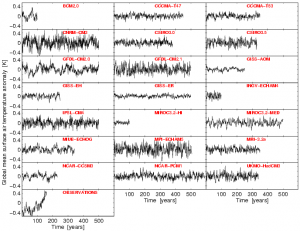
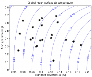
I am often surprised at how different climate models can be. Shown below is the annual mean, global mean surface air temperature from control runs of 21 of the AR4 GCMs, along with the observations (HadCRUT3). The spread in the magnitude of variability is enormous, as seen by eye, but also the timeseries have very different ‘memory’ characteristics. The second figure attempts to quantify these differences for the AR4 models by showing the total standard deviation against the lag-1 auto-correlation of the time series. [The timeseries are not all well represented by an AR(1) process, due to ENSO variability presumably, but it is still good enough for this purpose.] Anyone else find the range in behaviours in this global mean property surprising and/or interesting?
[Click for higher resolution versions]


Ed,
I find these control run temperature traces fascinating. In a sense they show modelled climate signal uncontaminated by the noise of prescribed external forcing, which is the other way around to the usual viewpoint.
There can be seen to be an implied hypothesis behind the second figure, in that the temperature trace is the output to a filter driven by white noise. A filter that accepts a noise flux and produces a temperature signal. It is tempting to wonder how much of a model’s climatic response to forcing is captured in such traces.
From the trace one can produce a frequency spectrum, a spectrum that implies the shape, but not the scale, of the filter’s characteristic impulse response function. From the impulse response function one can obtain a step response function. It would be interesting to know how well that would compare in shape to the the same model’s response to a step change in forcing, like the 2xCO2 experiement.
If these traces are largely the model’s response to stochastic changes in boundary forcings, at TOA and the surface. Isolating the response to the TOA flux noise, and determining the nature and amplitude of such noise is equivalent to determining an important aspect of the model’s climatic response to radiative forcing over the time span of the control run which is commonly a very long time. That aspect being the most linear component of that response, e.g. the response to small changes.
If the response is considered to be the largely result of TOA and surface forcings plus residual fluctuations in global mean achieved adiabatically, it would be nice to know how much of the temperature variance can be attributed to each. This goes to the thorny question of the magnitude, nature and effect of any TOA flux noise.
Given the extreme length of some control runs, which I believe are occassionally thousands of years, were the associated modelled boundary fluxes available it might be possible to attempt a covariance analysis to determine the way the temperature responds to the fluxes, and fluxes to temperature, using annual data for which the FDT is more likely to hold. Such might be possible given sufficient data where nothing is forced or prescribed and the natural fluctuations and their dissipation are brought to the fore. It would be interesting to know if analysis would show whether warm years tend to be followed by years with positive or negative TOA balance. Such analysis would surely be made easier given a control run particulary if uncontaminated by volcanoes, solar cycles etc.
To my way of thinking, the information content of such runs is in proportion to their purity, or banality, or depth of Ho Hum.
(I may prevent some confusion by saying that I regard any change in a boundary flux, whether prescribed, induced, or due to random fluctuations to be a forcing. In this view I consider it likely that there are significant TOA and surface boundary forcings of the order of say hundreds of milliwatts per square metre when averaged over a year. Also for there to be an annual white noise noise component component due to the happenstance of weather underpinning it.)
Sadly the readily available CMIP3 data seems devoid of boundary flux data, hopefully the CMIP5 data will be more forthcoming. I am aware that the analyses I have mentioned need lots of data and importantly data that has little in the way of prescribed forcings which in this case would include the seasonal cycle and hence the need for thousands of years of annual data. Should such data exists I think it would be well worth analysing.
Well that is I suppose the fluctionationist’s view point. That no matter the chaotic nature of the climate system it may yet express a considerable proportion of its variance in a way not readily distinquished from covarying stochastic fluctuations. There is in this the hope that the fluctuations and their response are sufficiently large and covarying to allow some insight into the temperature response to stochastic forcings over the decadal or perhaps centenial scale, gaining us some additional understanding of the likely repsonse to imposed forcings over similar periods. Gleaning such data from the real world seems tricky, wanting to know something as simple as the decadal boundary responses to a warm year would necessitate the study of not a handful of decades but of hundreds perhaps thousands. Such an opportunity may be available for modelled worlds and the data may be just those thousands of years of climatic not much happening that are the long term control runs.
Alex
Yes. But I would suggest you also plot the variability in N year trends as a function of time. That’s a real eyeopener too! (Actually, if you are interested, I can get back to showing those. I stalled a bit because… if I recollect properly, I was trying to see whether using the AR(1) fit tended to over or under estimate the variability in trends we see over repeat samples of models. I think I found that on average, it resulted in variances that were *too large*. But… for some models, they were much too small. I fiddled with some ARIMA etc. But I may recollect improperly.
The test is basically:
# Find a model with ‘n’ simulations. (Periods with slowly varying forcings are cleanest.)
# Compute the a trend, m, for each simulation– get ‘n’ trends.
# Assume residuals are AR1. Estimate the uncertainty in the trends for each of the n cases: n estimate of uncertainty in ‘m’. Call this s_m
# Find standard deviation in ‘m’ over all ‘n’: Call this sigma_m.
# If AR1 “works” the expected value of E(s_m^2)= E(sigma_m^2).
But of course, so far we only have one sample.
If you have a very long data set (say a control run), you can repeat this using non-overlapping time periods. (Some care is required to make sure each result is independent.)
Suppose you had Q independent time periods. For that model you can now test whether E(sm^2)= E(sigma_m^2). (Of course, you can use any model you like for sm^2, but since ‘red noise’ is used so frequently, it’s worth doing that first.)
You can repeat for each model– and also repeat for the collection of models.
You can do other tests too. For example: we do have some data on lag 1 coefficients for the earth– even in periods with no rapid forcings. And much of the model simulations have periods with no rapid forcings. How do the magnitudes of lag 1 forcings compare? And so on.
Ed–
I thought you might be interested in these graphs:
http://rankexploits.com/musings/2011/slopeograms-just-the-figures/
This is the standard deviation in “N – month” trends computed for each model with more than 1 run. The number of runs was varied. The monthly data are from KNMI. I doubt if they are adjusted for any models possibly not having reached quasi-steady state during the spin up (what’s the terminology you guys use?) Ideally, these should only be done with runs that were initiated after an infinitely long spin-up.
I ginned this up when Kotsouyannis was discussing fractional differencing and long term persistence but concocted “slope-o-grams” because we expect the deterministic part of the response of a model to be variable over time and I only want the ‘random’ part to influence the graphs. (Some models do look like they have strong fractional differencing -i.e. long term persistence Others don’t . What that means for the earth– I have no idea! )
Hi Lucia,
Interesting. You could do this with the long control runs too presumably to get rid of the trend complications? I could make the CMIP5 global mean temperatures available if you want – just email me.
Looks like you can see the effects of ENSO in the different models you show?
cheers,
Ed.
Denis Koutsoyannis(sp?) used “climacograms” which showed the variability about the mean. I was trying to point out some issues with his method of diagnosing fractional differencing. These arise from the existence of a trend. I concocted “slope-o-grams” to mitigate this problem somewhat. The “slope-o-gram” gets rid of trend implications — at least if the trend is linear. I have some math here:
http://rankexploits.com/musings/2011/slopeogram-miscellaneous-points/
Notice that I only discuss slope-o-grams solving a problem climacographs have with a constant trend. (I don’t remember if I looked at “shapely” variations in expected temperature. I know I wasnted to show Denis something simple first.)
But yes– using control runs would be better both for “slope-o-grams” and traditional “climacograms” provided you were convinced that they had been adequately spun up at the early part. I’m not sure if I didn’t do control runs because I didn’t have them back in Jun 2011, or if it just wasn’t convenient. But I do think that inadequate spin-up could cause difficulties in figuring out how the slope-o-gram decays at the very high time periods. (It will make the fractional differencing look ‘stronger’ that is ‘d’ increase. d=0 is white noise, AR1 and so on. Hope that’s not too confusing.)
But a first looks suggests some models might be ‘fractional differenced’.
Oh… you might like this graph here:
http://rankexploits.com/musings/2012/how-far-off-are-uncertainty-intervals-computed-using-red-noise/
Graph itself:
http://rankexploits.com/musings/wp-content/uploads/2012/09/RedNoiseEstimateModels.png
This graph could also be drastically more informative if we used control runs. But… it’s actually pretty informative about several things I don’t discuss in the post. (Like… for example, the behavior on the right hand side tells us something about claims in at least two published papers– on by a “warmer” on by a “cooler”.)
Oh– you have my email. I don’t know if I have yours. Just read mine off here and I’d love control runs!
I should add: not sure it’s ENSO. But some models do have distinct pseudo-cycles. I would go so far as to say some of those fail the laugh test.