Everyone sees colours slightly differently. With a multitude of colour options available to make complex climate-related maps & line-graphs, which do you choose? Which colour scale is best for you?
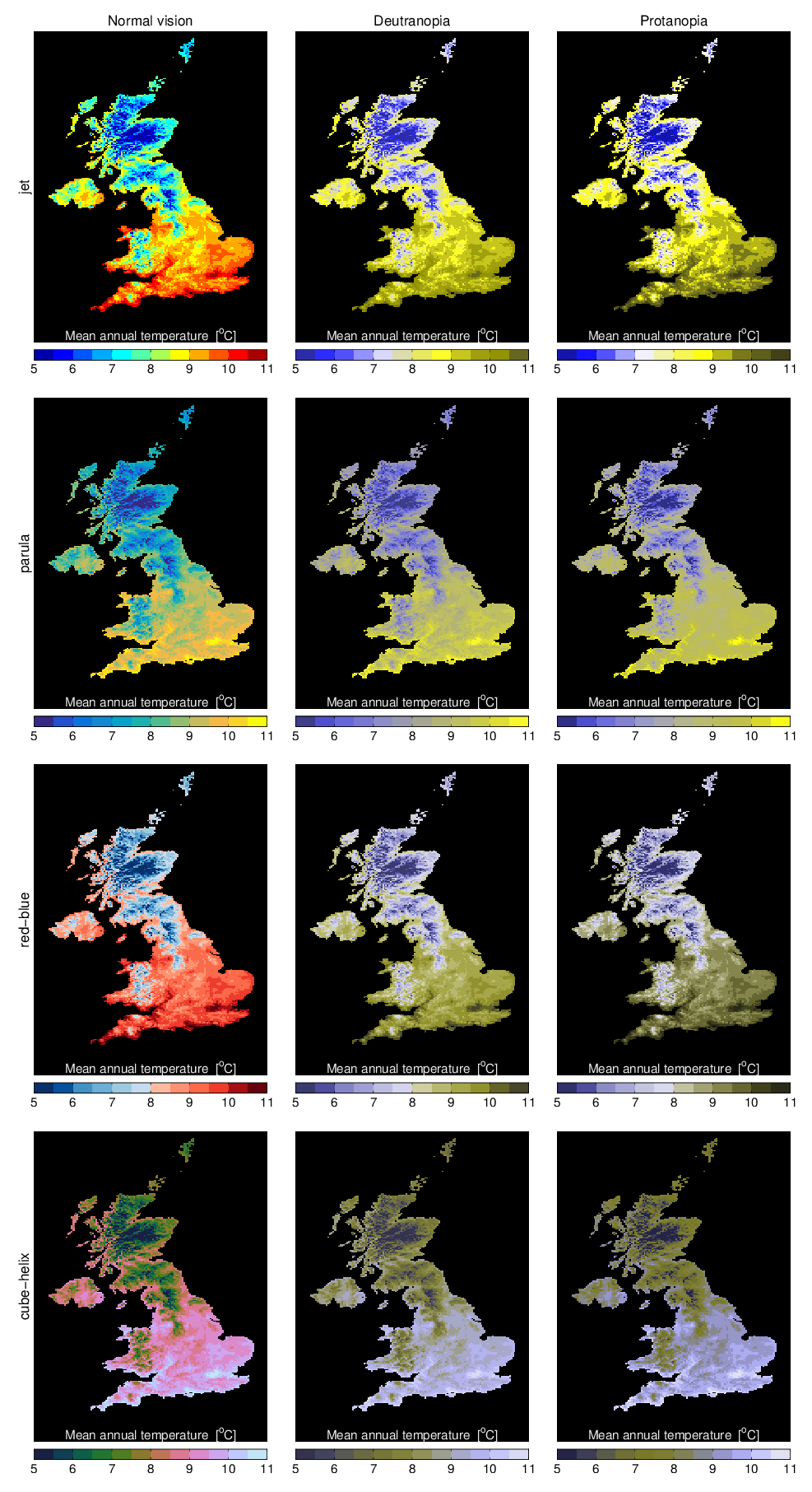
Below is an example for mean annual temperature in the UK, which ranges from around 5°C to 11°C. It is shown using four different colour scales (rows). Also shown (columns) are simulations of how those maps might appear to those with strong forms of the two most common forms of colour blindness, deutranopia & protanopia, which together effect around 8% of men and 0.4% of women. You will have a friend or colleague with colour blindness.
The four different colour scales are ‘jet’ (the current default in MATLAB), ‘parula’ (the future default in MATLAB), a red-blue colour scale, and ‘cube-helix’.
Am interested to know which colour scheme works best for you?
For example, I think the rainbow scheme (jet) artificially enhances certain regions and gradients because of the sharp differences in colour hue around yellow, and should not be used. The red-blue scheme, which is great for anomalies, might also overly enhance the boundary between red and blue at 8°C. Parula has less differentiation between colours but doesn’t artificially create boundaries where there are none.
My favourite is cube-helix for this case, because the colours are clear, and it has no obvious sharp boundaries. Other colour schemes are available of course, and which one is best will likely depend on the situation and personal preference.
Also, there might be issues with colour blindness for both jet & parula, as the colours blur together a little more. But, everyone will see colours differently, depending on monitors, the printer used, lighting conditions & and the strength of any colour blindness etc. As a rule-of-thumb, putting red & green in the same scale most easily causes confusion.
As a whole, scientists (including me) need to think more about which colour scale is most appropriate for each different type of plot, whether it be map, line graph or histogram. The choices for maps should be different depending on whether anomalies or absolute values are being shown, or whether the values are single signed or not.
The MATLAB code I wrote to simulate colour blindness is available for deutranopia and protanopia, based on Vienot et al.
Comments welcome!
Hi Ed,
I looked at your example graphs and it was immediately evident to me that I must suffer from a form of deutranopia. Surprisingly (or may be not) I liked best the graph (top middle) that shows how I would see a normal picture (top left). The bottom row looks particularly dull to me. The reason might be that in the original picture you have to some extent chosen already the right combination of colours, e.g. you might have avoided transitions from red to green.
My question to you is the following. Could you please do the inverse problem so that I can finally see for myself what I am missing!
Cheers
Thanks Peter – there is no way to completely invert the problem, but there are ways to help – these are generally called to ‘Daltonize’.
There are browser plugins available, and you can also upload images here:
http://www.colorblinds.org/
to produce enhanced images which should help increase contrast etc.
Interested to know how well this works!
cheers,
Ed.
Thanks for bringing this up Ed. I’m always on to my students about color bars, strongly influenced by the “Color Brewer” (http://colorbrewer2.org/) and that Eos article about “the end of the rainbow” (http://geog.uoregon.edu/datagraphics/EOS/). The plotting program I use (ferret) has a page of color palettes and suggested uses too: http://ferret.pmel.noaa.gov/static/FAQ/graphics/color_friendly_palettes.html
A related issue is the number of levels to include. I generally try to use the minimum number of levels to convey the information as I think contour plots should be there to give a general idea about a quantity, rather than fine grained information. Still, I accept that more levels (e.g. a continuous color bar) can make a visually striking image/help communicate sometimes…so long as you’re not expecting your reader/viewer to work out where is 30 ppbv, and where is 31 ppbv!
Thanks Paul – yes, the EOS article and ColorBrewer are very useful. We are about to publish an open letter on these issues!
cheers,
Ed.
Thanks for highlighting this, Ed. I’m colour blind and the colour coding of temp gradations has long caused me grief. From my own perspective, I find Parula to be the worse. CubeHelix is bad between 6-9. Jet is bad between 7-9.5. Red-blue is probably the best, surprisingly.
I remember this problem came up when writing this article…
http://www.theguardian.com/environment/blog/2013/feb/08/bbc-global-warming-attenborough-africa
In particular, I remember struggling with this Nasa Giss map…
http://www.giss.nasa.gov/research/briefs/rosenzweig_02/Figure2.pdf
I struggled to tell the difference between 1-3.5C and had to ask my wife for help.
I have struggled with Met Office/HadCrut maps, too…
http://www.metoffice.gov.uk/research/monitoring/climate/surface-temperature
Hi Leo,
That’s interesting that the HadCRUT maps don’t really work, as afaik the colours were chosen to be accessible (i.e. it is a variant of rainbow with no green). I’ll contact our people that produce them and let them know.
Also interesting that Parula doesn’t work for you! I’d be interested which of the Colorbrewer sequential palettes you find most useful. http://colorbrewer2.org/
Doug
Thanks, Doug.
I’d say “3-Class PuBu” was the worst of the multi-hue sequential options on that link you provided. And “3-ClassYlOrRd” the best, but still not ideal.
However, I think the real problems for me come when there are more than 3 hues. The map on that link only seems to use 3 hues, compared to the 5 presented on the “multi-hue colour schemes”? Or have I not used that tool correctly?
Best, Leo
Hi Leo,
You should be able to click the “number of data classes” box at the top to get more options. It goes up to 9 on the sequential palettes.
Thanks!
I still think “YlOrRd” works OK, as does “YlOrBr”. Worst are BuPu and PuBu. Also, it’s fine with most combos down at the bottom-right hand corner of the map around Florida, where the gradations are more in obvious blocks. But, regardless of the combo, I still struggle with isolated “counties” up in the top-left hand corner of the map around Kansas and Missouri.
Should we worry about colour scales that are distinguishable when printed too?
I remember fine tuning colour scales to look really clear on the screen only to find they were drab and poorly distinguished when printed. A bit of re-tuning to look ok, but then finding that they looked different again on another printer or when the printed journal article came out!
Don’t bother quite so much now, is print a thing of the past?! I still print PDFs but go back to the PDF if I need to zoom in for more detail.
From your examples and emulations of deutranopia and protanopia, I’d say the new parula scale looks worse. Not sure about the others, all seems to have deficiencies.
Oh, Red-Blue makes me almost wish i had protanopia, but I know some people see the lighter shades of Red better than I. But I think you’re missing one pretty obvious choice here, which would be using darker colours for the mid region increasing lightness towards, say 25% of the scale and then using the darkening red-blue scale. I’d suggest brown as the middle point, then via yellow to the positive side (redder and increasingly darker) and via shades of green or brown to the negative side. In the Cube-Helix here I have the same problem with the lighter reds as in the red-blue, and can see the borders better in the protanopia mode. This is not a trivial thing yes, at least there should be a 200 step scale that nearly everyone can decipher to represent percents… (but those with full color blindness would require separating 200 shades of gray, and I for one am not sure I could do it, so let’s leave that out.) So my solution would be to move the lightest parts of the scale out of mid range.
so something like this, wouldn’t know how this looks with protanopy: http://4.bp.blogspot.com/-cu9xjA2BXtA/VM2MBcstY1I/AAAAAAAAAf0/fcesXkSxFjI/s1600/edhawkingssample.png , oops should be ‘-kins’
Cut out the difficult middle range (with yellow-greens and green-yellows and what not, don’t even know the names for those) in the rainbow, made the ends with steeper gradient, added scales from midbrown (might be darker too) to each side. Could be nice. http://4.bp.blogspot.com/–vMq64WpHUk/VM2XHX3aKQI/AAAAAAAAAgE/K0tbHZFOO2o/s1600/edhawkinssamplerainbow.png
sorry for many posts, in the first scale i just reworked the rainbow on your previous post on this, this one is made from scratch, so this is more like what I meant. http://3.bp.blogspot.com/-BrgPYJEMqyg/VM3GZjnJAAI/AAAAAAAAAgU/a_lGAFtAhjg/s1600/edhawkinssamplerainbow.png
Hi jyyh,
Thanks for the comments and suggestions. Having a specific colour for the middle of the scale is certainly a good idea. However, the scale you suggest will still be awkward to interpret for those who are colour blind I think. And the yellow boundary will still appear more prominent than others, which is not ideal.
cheers,
Ed.
yep, I though that was pretty smooth transition through yellow but checking the actual numbers yellow band was a bit wider than the rest of them, as was the light green on the negative side. Tried to inrease lightness, and reducing saturation through the middle of these sections and ended up with two very light grays that I can’t resolve on the screen. This isn’t an easy task.
Sure when it’s not a question of anomalies almost any scale having continuous changes in brightness would do, but I can’t figure out how to make anomaly maps easy to read for those with full color blindess, especially if the intetion is to have a continuous scale. For segmented data, people could of course use textures and font size (f.e. +/- signs all over the map) but these wouldn’t fit in to many papers, and for continuous anomaly scales the resolution would be reduced. Might be a good practise to enter – and + to the centers or highpoints of these areas like in the meteorology maps H & L, but how to get That automated I won’t even begin to think.
cheers.
the result of that try is here…: http://2.bp.blogspot.com/-obNq1khMukY/VM7zebrLqkI/AAAAAAAAAgk/Jy3y1z7jOdI/s1600/saddlebrownmiddlerainbowthroughyellow%26green.png
Hi Ed,
I am color-blind, not sure what kind but have problems with many colors and not only red-green-brown. For me the jet-scale, although far from being perfect is still better than most other color scales that are existing as standard. E.g., the scale from jyyh from 2nd February is extremely bad for me. The middle part and the right part look exactly the same, the parts left and right to the middle as well.
I created for my figures my own color-scale, where I could distinguish all colors, and ironic enough I am now told by editors to use a color-scale, which is more appropriate for color-blind people.
Cheers,
Torben
Thanks Torben!
Are you able to post a picture of your colour scale? What do you think of the other scales in this post – do any work well for you?
Cheers,
Ed.
Sorry I’m late to this thread, which I just stumbled upon by accident. I’m either a protanope or severely protoanomalous – the much rarer and more debilitating form of red-green colourblindness.
I tend to use either ‘jet’ or ‘seismic’ in matplotlib. (‘seismic’ is an exaggerated divergent blue-white-red scale.)
Given that I’m often plotting data with incomplete coverage, jet means I can use white for missing, which I find works well for me and is intuitive for the audience.
But I can distinguish levels and deviations from zero better with seismic. However that means using grey for missing, which I can’t distinguish from some of the pinks on the red side of the scale. Or black, which is hard to look at.