A recent paper by Teuling et al. suggested the use of 2d colour bars for visualising climate fields. I thought I would give this a try – and Ryan Teuling was kind enough to provide the code to construct the colour bars.
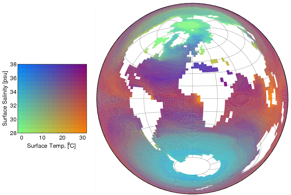
Often it may be helpful to show more than one variable on the same plot. The approach of Teuling et al. allows a 2d colour bar to be used for this purpose. Two of my interests are in ocean climate and uncertainty in future climate. My first attempt at this type of visualisation is to show both sea surface temperature (SST) and salinity (SSS) on the same plot (Fig. 1), with the data coming from the HadCM3 climate model. This figure demonstates the different gradients of SST and SSS, with ‘spicy’ regions in purple.
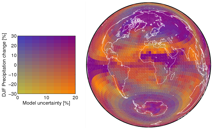
The second example is to show DJF precipitation change at the end of the 21st century and the uncertainty in CMIP3 model projections (Fig. 2). Am sure the colours could be chosen more optimally, but it gives a sense of what might be possible, with the brighter colours showing areas which are less certain.


I note that Fig. 1 shows all the light (low SSS) cold water collects at the North Pole, and all the heavy (high SSS) cold water collects around Antarctica.
Must be because the mass/gravity of Antarctica pulled it there.
😉