Previous posts have discussed climate variability in general, and modelled decadal trends in temperature specifically. However, I should have considered decadal trends in observations as well, especially as there is a long temperature record available for the UK.
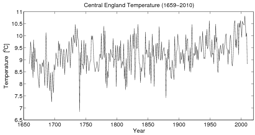
The annual mean Central England Temperature (CET) timeseries, which runs from 1659-2010, is shown below in Figure 1. There are many periods of warming and cooling temperatures, with an overall upwards trend.
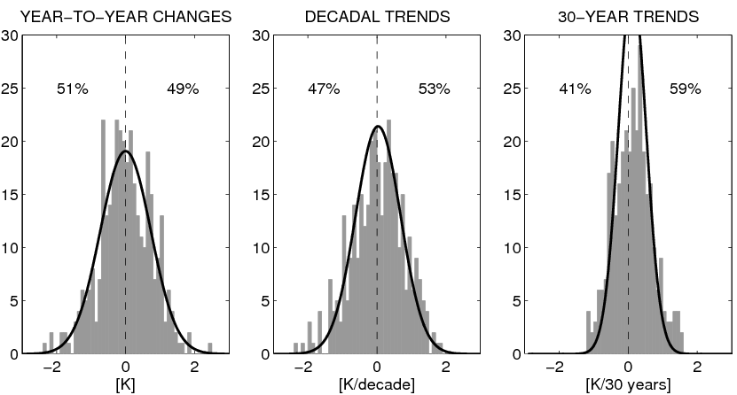
In Figure 2, the left panel shows a grey histogram of changes in CET from one year to the next; the middle panel shows the distribution of decadal trends in CET, and the right panel shows the same for 30-year trends. Using changes from year-to-year, there is no obvious difference between positive and negative changes, but for 30 year trends there are clearly more warming periods (59%) than cooling periods (41%).
The black lines show similar estimates from a single gridpoint in the UK from a 5000 year control simulation of the HadCM3 GCM, with no changes in radiative forcings. For single year changes and decadal trends, the two distributions are very similar, but there seems to be wider distribution of variability in the observations than the GCM for 30 year trends, for both positive and negative trends. This may be because the GCM underdoes the variability on these timescales, or because radiative forcings which influence the observations are inducing additional apparent variability. Additionally, periods of stronger warming than might be expected from the GCM (e.g. 1700-1730), are balanced by periods which cool more than might be expected.


Hi Ed
It is quite pleasant to see a non-anomaly based graph for a change.
When the DECC used to have one, they were stating that the late 21st century warming (80’s 90’s) was unprecedented, yet in a consultation exercise, very many scientists and others pointing out, in the actual graph above they presented (oddly truncated to 1800) that a similar length of warm period, and similar rate of warming was observed in the early part of the 20th century, making nonsense of their statements based on own data..
Sadly, the DECC just replaced the truncated plot with an anomaly plot, where this observation is lost….
Perhaps – the use of anomaly graphs, need to be explained to the general public and the media!
Ie. Many I don’t realise that the Y-axis is not actuall temps, but difference from the base line. (ie and the scale is tenths, not degrees)
Additionally they see a greater slope the graph, than if observing the century trends in say the CET graph above.
The problem with a 30 yr base line (wasn’t this an hisorical artifact – ie 30 yrs seem as stable climate period) is that following cyclical natural variations (ie oceanic oscillations, etc) the anomaly after a (base line period when on a cooling phase, becomes positive for a while, and presumably on a warming phase base line, the following anomalies become negative..
Poor explanation perhaps…
In the CET would be interesting to see an anomaly graph as if we were in the 50’s & 60’s based on an earlier base lines, (warming phase, and various increments, to put current anomaly graphs in perspective..
on topic.. with the observed overall warming trend since the 1600’s, statistically would the figures of 30 yr warming and cooling trends be expected…?
ie if it were a similar cooling trend, would you expect the figures to be reversed?
My point being that, 30yr warming %, being higher, than 30 yr % cooling figs, do not actually mean anything in themselves or explain anything.. ie in an overall upwards trend, you would expect this?
Ed, this is an interesting post (I came here via Bishop Hill). It does look as though the climate model underestimates variability on the 30-year timescale.
I wonder, though, about a couple of things:
(a) Even though you have a 5000 year simulation, your black curves look remarkably smooth, almost like perfect Gaussian. Is that what you get or did you fit the values to Gaussian distributions and plot those? Could you not show the raw histogram you get from the climate model?
(b) I’m not sure I understand why you changed the centering of the Gaussian (or histogram) – for the 30 year case. Granted, the observations have a positive bias – this is simply a reflection of the fact that the whole time series has a slight positive trend. But shifting the Gaussian kind of suggests that you know that that trend is due to anthropogenic effects. And the shift also lessens the disagreement between observation and model. At least some of the ‘wings’ of the distribution are due to fluctuations in pre-20th century temperatures.
Hi Jeremy,
Thanks for the comments! Two good points. In reply –
(a) yes, they are Gaussian distributions fitted to the data for visualisation – I could have shown the raw distributions, but I don’t think it would make much difference to the point I was trying to make.
(b) The trend does not have to be anthropogenic (though I think it probably is) – it could be natural forcings which are not varied in the control simulation used, e.g. solar. Also, the excess in the wings could be due to both natural and anthropogenic forcings which don’t vary in the control. The re-centering was just a simple way of overcoming this to look at the variability around the trend.
If I get time I could remake the figures with the raw distributions and only using the observed data up until say 1900, which would remove some of the trend. And, also without the centering.
Ed.
How long would the current cooling trend need to continue before you considered that previous warming probably wasn’t AGW and how long would the “pause” need to continue before the climate models, that are already way off in their predictions, were finally understood to be inadequate?
Put simply, could there come a time that warmests see cooling as anything other than natural forcing and warming as anything other than anthropological in nature?
Is there not an inherent bias here?