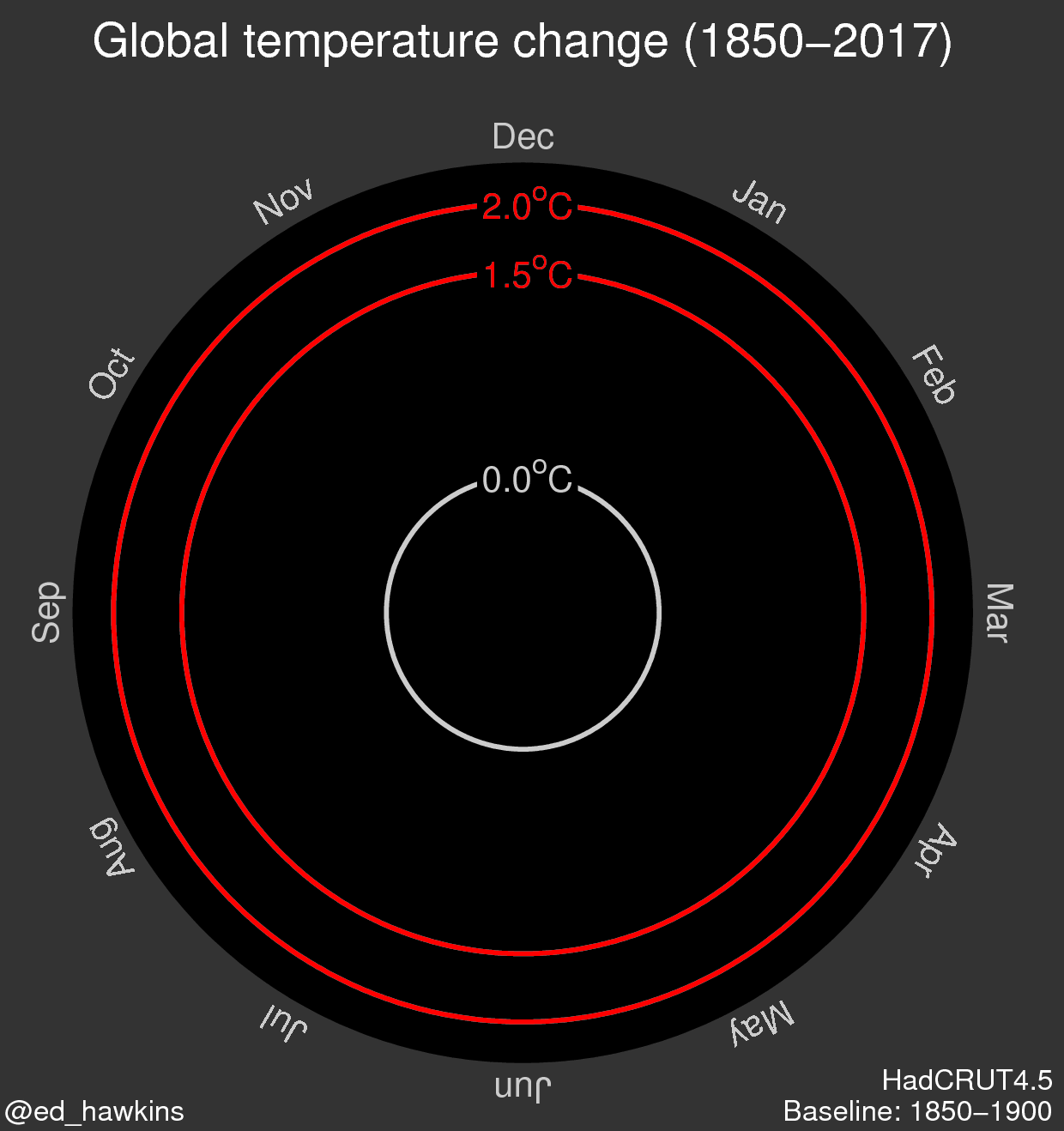
Just over a year ago I received an email from a colleague I had never met. Jan Fuglestvedt asked whether I had ever made a spiral version of my global temperature graphics. He ended by suggesting that this was ‘just a (crazy) thought’.
But, it was a Friday afternoon – what else was I going to do?
The following Monday I wrote a blog post about the animation and tweeted a link, expecting only some vague interest! Exactly a year later, the global temperature spiral tweet has been seen 3.4M times.
Spiralling global temperatures from 1850-2016 (full animation) https://t.co/YETC5HkmTr pic.twitter.com/Ypci717AHq
— Ed Hawkins (@ed_hawkins) May 9, 2016
Use of the graphic quickly spread: 2.6M views on IFLScience, with many, many uses in the media and by the US State Department. The original blog post has been viewed from over 200 countries. It has been used on both BBC and Channel4 News in the UK. On twitter, the graphic has been shared with millions by Bernie Sanders (twice) and by Golden Gate NPS. It has been used by senior policymakers and business leaders in high-profile presentations. And, it was even shortlisted for an award in graphical design.
The spiral concept has been extended to other aspects of the climate such as sea ice volume, and to interactive visualisations including carbon dioxide concentrations and emission budgets. It has even looked into the future. People have made t-shirts and have suggested 3d printing the graphic. And, you can watch a 3d version which also compares different global temperature datasets.
However, none of this prepared me for seeing a version of the graphic used during a segment on climate change (video clip) at the Opening Ceremony of the Rio Olympics. At that stage, the animation was probably seen by over 1 billion people worldwide!
So, why does this concept work so effectively?
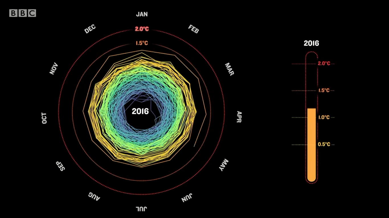
I have heard lots of ideas, but the animated aspect seems crucial, raising interest as the graphic evolves, with a ‘shock’ at the end with the 2016 segment. It makes people want to watch it again (and again). And, importantly, it has resonated with non-scientists who can quickly and visually understand the implications without having to interpret a ‘boring’ scientific graph.
There have been criticisms – does the human eye incorrectly interpret the change in area within the spiral rather than the change in radius? Possibly, but the clear labelling of the radius guards against this.
Many commentators used the graphic to suggest that global temperatures are ‘spiralling out of control’. I would disagree. The fact that humans are the dominant cause of the past changes means that we have control over what happens next. The positive message is that our choices now can dictate how the spiral evolves over the coming decades.
I would love to hear in the comments about where you have seen the graphic used during the last year!
So, how does the graphic look now, one year on? Temperatures in 2017 have remained very high for the first three months and slightly below last year which was boosted by a strong El Nino event.
Acknowledgements
Thank you to everyone who has liked, shared, discussed or used the graphic. Special thanks to Jan for sending me the original idea, and to your wife, Taran Fæhn, for suggesting it to you! We still need to meet in person. Also thanks to Simon Evans who shrank the size of the original graphic to a tweetable size which started the viral sharing on social media. As a tip to anyone making an animated gif using imagemagick, the option ‘-layers OptimizeTransparency’ might help! The HadCRUT4 global temperature data is publicly available.
Congratulations!
Have you considered running the satellite data set (over the shorter period available)? I know it also has calibration issues, but it appears to be less subject to adjustments that might introduce bias.
I haven’t used the satellite data yet, though would be nice to. However, the satellite data arguably has more adjustments than the surface data as the satellites are in complex, drifting orbits and measure microwave emissions at different times of day which then have to be converted into daily or monthly temperatures. The satellite global temperature datasets have gone through larger revisions than the surface data because of this.
Ed.
Channeling the spirit of Nightingale, per https://understandinguncertainty.org/nightingale
Nevertheless, it is an excellent, dynamic presentation. Nightingale didn’t have GIFs!
Thanks for this.
I remember watching it – shared by some EU green NGO – alone in the dark, again and again, shocked by how close we were from 1.5! Thank you for this. It’s still as striking in 2017.
Hi, I used your spiral in a meeting at a Fortune 500 company where I work, with business and technical leaders. I used it because it is short, makes a point that people get readily, and leaves you “hangin’.” I got the effect I was hoping for when at the end of the movement on the spiral, one of the VP’s uttered, “That’s scary.” It was the perfect way to end my presentation about why we need to be developing technical solutions to the “CO2 problem” – this matters!
Many thanks Laura – glad the animation was so useful!
Ed.