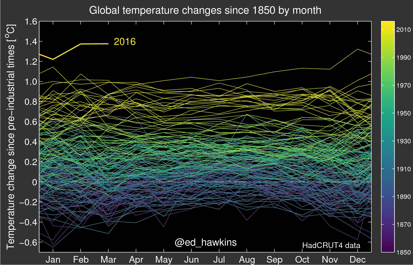
Technical details: Monthly HadCRUT4.4 global temperatures referenced to ‘pre-industrial’ (defined as mean anomaly from 1850-1900, which is 0.31°C below 1961-1990), plotted using the viridis colour scale to indicate year. I think the dark background works well for this visualisation. Views welcome!
Updated with March 2016 data on 29th April 2016
Hi Ed
I like it! Reminded me a bit of this approach:
http://www.scilogs.de/wblogs/gallery/16/3256-figure2.png
Axis labels are in German, but you’ll get it. Figure is by Dirk Notz and it shows the Arctic Sea ice monthly means; there are ten red values corresponding to the 10 lowest monthly means (most intense red = lowest value) and vice versa 10 blue values for the highest monthly values.
I’d be curious to see something like this for temperature. Might reveal the seasonality of the temperature increase a bit better than your figure, although I’m not sure how visible such a potential seasonality would be in global mean temperature.
Cheers,
Flavio
Thanks Flavio – I might try and make a sea ice version of this figure and a temperature one like Dirk’s! The seasonal signal is clearer in the land temperature version of this with winter warming more and having a higher variance.
Cheers,
Ed.
For those who have trouble seeing colors (and to untangle some of the spaghetti) it might be useful to also have a series of black and white graphs side by side, each one showing a decade.
Hi Ed,
Being a colour-blind artist I cannot tell what I am missing, but I love it. The dark background works for me. Your piece should be printed in high-res and framed.
V good. You just need to add the animation. 🙂
http://www.bloomberg.com/graphics/hottest-year-on-record/
Hi MikeH,
There is an animated version which was inspired by the Bloomberg one. That will be appearing elsewhere next week hopefully….
cheers,
Ed.
Hello Mr. Hawkins
Thank you for this very nice graph..
But I’m sorry to say I noticed a too very common mistake on your graph.
The 1.5°C and 2°C goals are set on the 1880 average temperatures.
But you used a different baseline for it.
It’s why for instance, we don’t see February 2016 cross the 1.5°C mark despite it was 1.58° C above the 1880 baseline.
Unfortunately, it’s a very common and misleading mistake.
Sorry to report this, but someone had to do it…
Please have a nice day
Jack from http://leclimatoblogue.blogspot.ca/
A French climate change blog 🙂
Hi Jack,
The only definition of the baseline for temperature targets that I know of is in Chapter 11 of the IPCC AR5, where 1850-1900 is used, as in these graphs. Where do you think the 1880 baseline is used? It is not in any UNFCCC document as far as I am aware.
Thanks,
Ed.
Thank you for the prompt reply.
I just learned something new again…
As far as I know, but I don’t know everything eh, temperature records keeping officially began in 1880 (in the US and in the British Empire) 1899 in the French Empire.
This website you probably know of http://data.giss.nasa.gov/gistemp/maps/
The temps used to make graphs begins in 1880 as no data previous to that is recorded…
Where do you get temp records from 1850? I need to find that.
Thank you very much Ed
Jack
I think the dark background works well for this visualisation
For those who have trouble seeing colors (and to untangle some of the spaghetti) it might be useful to also have a series of black and white graphs side by side, each one showing a decade.
I might try and make a sea ice version of this figure and a temperature one like Dirk’s! The seasonal signal is clearer in the land temperature version of this with winter warming more and having a higher variance.
Hi Cami,
I tweeted a sea ice version a few days ago:
https://twitter.com/ed_hawkins/status/719831049254133760
Cheers,
Ed.
I just wondered why you chose 1850 as a starting point?
I reposted your delicious graph and have been told off for ‘misleading data’ as the climate was apparently appreciably different between 1830-1850.
Thanks for any help on that,
Glyn
Very simple – the Met Office global dataset starts in 1850. The data quantity and quality is not as good the further back in time we look. We do not have enough data to make reliable global estimates further back. Also, the period between 1800-1850 had several very large volcanic eruptions which probably cooled the climate somewhat.
Ed.
Got it 🙂
This graphics work is amazing (and very much in the spirit of Edward Tufte). How does the GIF animation work? Is a new GIF image downloaded as each monthly data point (or year) is added?
Hi Larry,
I will update the animation as new data arrives, although probably irregularly!
cheers,
Ed.
That’s great, Ed. Keeping it up to date is important. But my question was actually about how the GIF functions, to load all that data in. Does it make repeated downloads from your server, or is all the data actually embedded in that small GIF file?
Hi Larry,
The gif has all the data embedded.
Ed.
Hello Mr Hawkins.
Brilliant idea to spiral map these event’s.
I think the visual would be of much greater use to other’s if it could be viewed side on or from any other angle seen side on as a vortex a helicoidal vortex, 1850 bottom present date top, even better 3 d environment to view from any angle.
Climate events on the spiral as it is are hard to match up with other data when they over lap bottom top in this visual type?
As most climatic events charted on your spiral are possible results of anthropological forcing in one form or other and previous to charted events, it would make it clearer if the visual allowed a view of the spiral climate layering bottom to top side on for other’s to match global event’s as precursor’s.
Matching the event’s would be easier if the data your spiral provides could be viewed in a 3d vortex = Just a thought 🙂 and thanks again for sharing it.
Ivor
very good = Just saw the vortex version .. Many thanks
I really like this and plan to use it in a presentation. I hope you will update it regularly.
Would it be possible to compare the warming to the growth in global population?
I have really fallen in love with this exercise.
We at Centre for Climate Change and Environment Management, Malawi, Africa are on the road doing the same as our main objective is “Climate Data Rescue and Digitization”
You are all welcome to participate o we move together.