Was last year really the warmest on record? As soon as NOAA published its official announcement in January, this question invaded the web feeding blogs, online newspapers and forums with passionate discussions. Relevant or pointless? The question is not so much knowing whether or not a new record was broken. Should 2014 rank second or third, this wouldn’t change the big picture: last year, temperatures on our planet continued the existing long-term positive trend. On top of that, the story is a bit thicker than the one single number obtained when averaging near-surface air temperatures in time and space. So, 2014: year of extremes or warm year in a changing climate?
Guest post by François Massonnet, Université Catholique de Louvain, Belgium / Catalan Institute of Climate Sciences, Spain
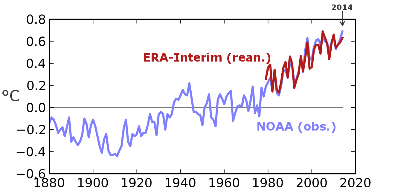
As often quoted, global mean near-surface temperature is only a first-order indicator of climate variability that sacrifices spatial information. The next best option is often to display maps of anomalies of temperature. However, this does not tell us how exceptional 2014 was compared to other years. To account for that, here is the ranking of 2014 in terms of annual-mean temperatures, according to the ERA-Interim reanalyses:
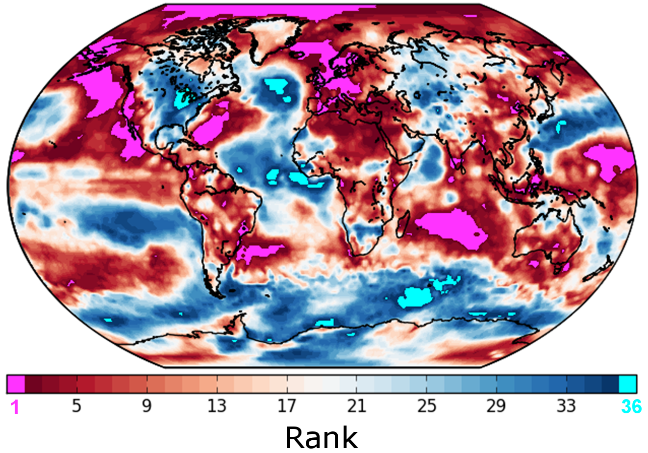
The year 2014 ranks first over about 7.4% of the surface of the planet. To evaluate how meaningful this number is, suppose for a moment that the 1979-2014 time series of annual-mean temperatures at every grid cell would be just noise, without any signal. Then, because any year is equally likely to be the warmest, about 100/36 = 2.8% of the map would place 2014 as warmest year over the 1979-2014 period. Note also that 2014 ranked last (coldest over 1979-2014) over about 1.0% of the planet. The map thus suggests that the occurrence of cold extremes are not incompatible with a global climate change signal; cold extremes just become less probable (while warm extremes occur by more than chance).
We now discuss in more details the story behind several of the pink and blue spots on this map.
Arctic – trends continue
Near-surface air temperature conditions, according to ERA-Interim reanalyses, showed positive anomalies on the annual mean of 2014 compared to 1979-2014 all over the Arctic Ocean (not shown here). Sea ice did not reach record levels this year, but its extent was still very low – it ranked 6th lowest since satellite measurements became available.
North-East Pacific – PDO switches to positive phase
California experienced a third year of drought conditions, affecting thousands. While anthropogenic influences have likely increased the odds of warm conditions coupled to dry conditions (see this recent study), internal variability could have contributed to amplify conditions. In 2014, sea surface temperatures actually displayed spatial patterns resembling the positive phase of the Pacific Decadal Oscillation (PDO; see here and here for an introduction):

The PDO exhibits large multi-decadal variability and had remained in its negative phase up to recently (Fig. 3). In 2014, it suddenly switched to its positive phase (and is still positive at the time of writing these lines). Positive phases of the PDO are associated to relatively warm conditions over North-West America (Mantua and Hare, 2002), but its impacts on precipitation are less clear. Also, how the PDO interferes with other modes of variability in the Pacific Ocean (in particular ENSO) is still a subject of active research.
Tropical Atlantic: low hurricane activity
Record temperatures in the western tropical Atlantic (Fig. 1) could have – in theory – favored an intense hurricane activity last year. However, 2014 displayed lower than normal activity, with “only” eight named storms (12 for the 1981-2010 climatology). Above normal vertical wind shear was pointed as one of the main factors explaining this relatively low activity. Strong wind shear advects heat and moisture away from the location of cyclone formation and is therefore hostile to their development. Note that one of the two major hurricanes of 2014, Gonzalo, extended exceptionally far north; its remnants caused three casualties in the UK.
Europe – warmer through all seasons
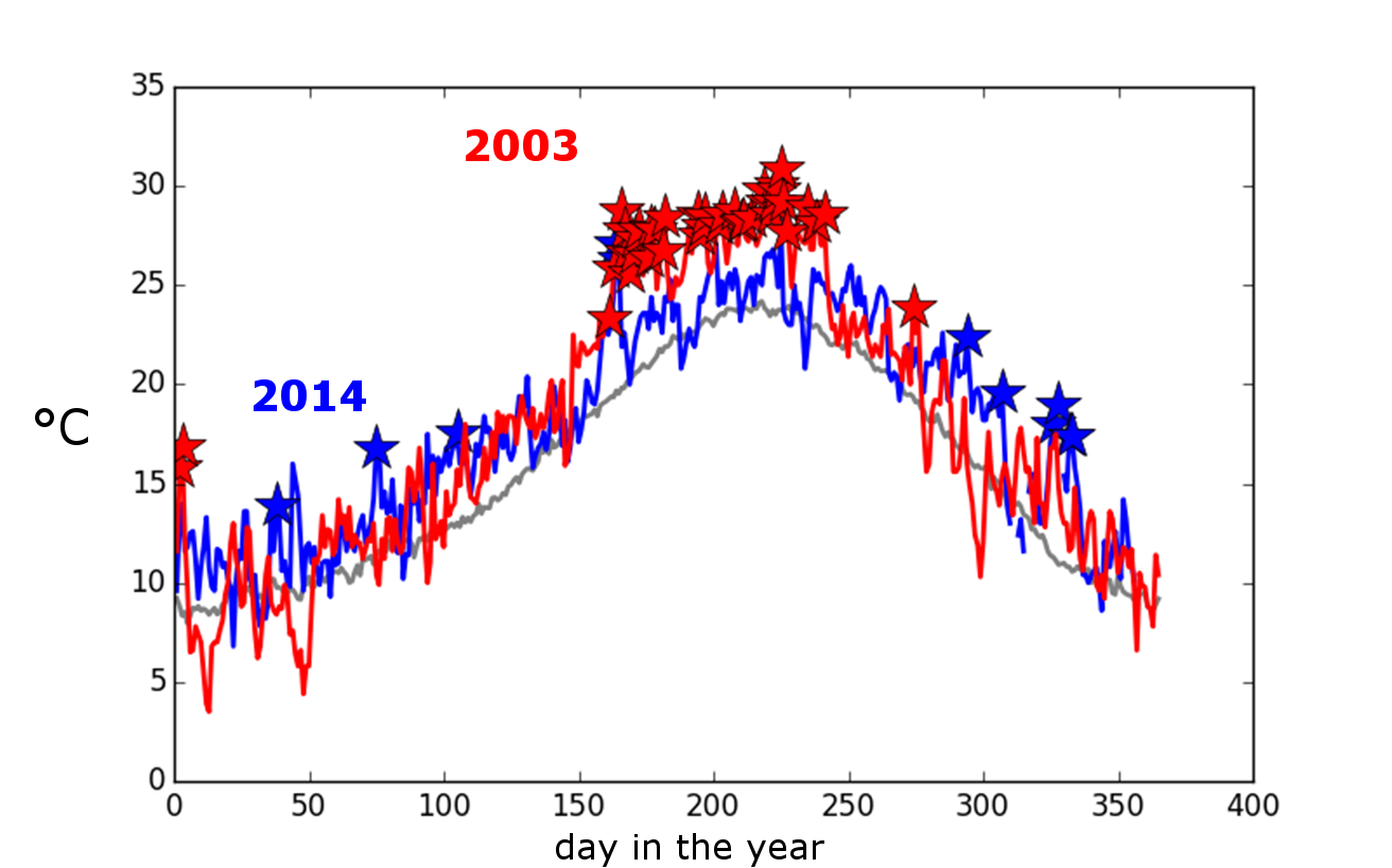
Several parts of Western Europe experienced record annual mean temperatures last year. In the UK, 2014 ranked first in terms of near-surface temperatures and fourth in terms of precipitation (see this complete report by the MetOffice). By mid-December, Paris had experienced a complete year without freezing conditions. This is the longest period in such conditions since measurements began in 1873. South of Europe also had a warm 2014: the plot below (Fig. 4), showing daily mean temperatures in Barcelona throughout the year, is representative of western-Europe conditions: no particular event such as a heat wave explains why 2014 ranked first in terms of annual mean temperature. As a point of comparison, look at the year 2003: prolonged warm conditions in summer contributed to make the annual mean value very high (in fact, 2003 ranks second behind 2014 in Barcelona). The context was different last year: near-surface conditions were warmer throughout the year, with records broken every now and then during the year.
Tropical Pacific: the non-El-Niño
In April 2014, all lights were green for the development of a strong, disruptive El-Niño (see here). Warm water masses had accumulated in the eastern part of the tropical Pacific basin, but it remained for the atmosphere (and winds, in particular) to respond to sea surface temperature conditions in order to definitely trigger the development of El-Niño. It turns out that the winds did never really pick up. The presence of relatively warm surface waters in the western Pacific could have caused an insufficiently large zonal gradient of sea surface temperature. Given the importance of tropical Pacific conditions on the global mean surface temperatures, this non-El-Niño probably prevented 2014 from reaching higher levels in terms of global temperatures.
Central USA: snowmageddon in Chicago
Mid-January 2014, the American mid-west and several major cities experienced harsh weather conditions, heavy snowfalls and record low temperatures. Southward excursions of the jet stream locked parts of North America in a cold pocket of air (Fig. 5). The root causes for this type of extreme weather are not yet fully understood. Arctic amplification was proposed as the culprit, but there is no consensus on that question yet (see Cohen et al. 2014 for a review).

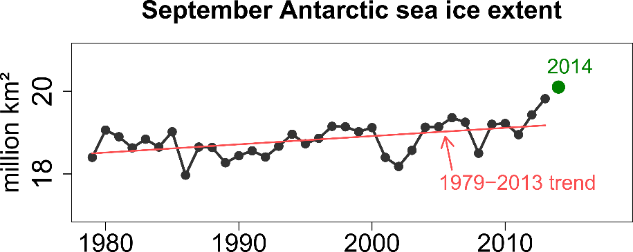
Antarctic: the all-time high record in sea ice extent
Antarctic sea ice extent reached the unprecedented value of 20.1 million km² on average for September (Fig. 5). The long-term increase in Antarctic sea ice extent over the past decades keeps polar scientists puzzled given the global warming signal (Fig. 1), but recent studies suggest that this positive trend is not incompatible with internal variability. Long-term trends in wind speed or in the freshening of the upper ocean have also been proposed as drivers for Antarctic sea ice variability, although this latter hypothesis has been questioned. Again, this branch of polar science is open and subject of active research. The 2014 anomalous winter sea ice conditions were closely linked to wind anomalies, but the distribution of mean-sea level pressure anomalies did not resemble typical known patterns.
Conclusion
The year 2014 can be seen as a normal year in a warming climate. Because of the warming trend, it is expected that extremes occur more than by chance (Fig. 1) while cold extremes may still exist, but become less likely. Besides the records described above, several other remarkable features are to be noted: CO2 concentration continued its monotonic increase, reaching unprecedented level of 398.6 parts per million on an annual mean basis. Global Sea Level Rise also broke a record by reaching about 57.5 mm above the 1993-2002 reference period. 2014 was also a local maximum of the total solar irradiance.
In some way, 2015 has already developed similar patterns as 2014. The east-west dipole in temperature anomalies in North America is persisting, with Montreal having experienced its coldest month since at least 1889, while California is still exceptionally dry. The PDO is still in its positive phase, but how long this will persist over time is not clear. As last year, El-Niño conditions are poised to develop and 2015 global mean temperatures may establish a new record.
With the present crash in the SOI the amplifying El Nino is looking very strong so yes we are on track for a record warm 2015 globally.
Regionally; weather should be strongly affected and hopefully California will get some much needed rains but not mudslides onto the PCH, which I witnessed in the second half of the nineties.
A fascinating post. Thanks.
Agreed
This is somewhat in jest, but I am of the opinion that the PDO strongly effects the GMST trend direction , and that the AMO is largely irrelevant regardless of the direction of its trend.
2015 to date: PDO down; GMST down accordingly; AMO irrelevantly up
The previous post discussed the relationship between Pacific variability and global temperatures…
http://www.climate-lab-book.ac.uk/2015/a-spectrum-of-global-temperature-trends/
cheers,
Ed.
Yes Ed, I read that one, but this post shows a graph of the PDO index steadily declining since around 1983, and I just think people completely miss this. They see the AMO fits the increasing GMST during that period, 1983 to 2013, and conclude the AMO must be playing some role in the temperature increase. I think it’s the PDO that is playing a role in that temperature increase; namely, the PDO is causing a lesser GMST increase.
And I think the way the temp bobbed strongly upward the moment the PDO headed for positive territory in 2014 bolsters what I’m saying.
Hi JCH,
Yes – I agree that the PDO is likely more influential on global temperature than the AMO.
cheers,
Ed.
“In conclusion, our analysis suggests that strong interannual and decadal variations observed in the average land surface temperature records represent a true climate phenomenon, not only during the years when fluctuations on the timescale of 2-15 years had been previously identified with El Nino events. The variations are strongly correlated with the similar decadal fluctuations observed in the Atlantic Multidecadal Oscillation index, and less so with the El Nino Southern Oscillation index. This correlation could indicate that the AMO plays an important intermediary role in the
influence of the Pacific ENSO on world climate; alternatively, it might indicate that variability in the thermohaline flow plays a bigger role than had previously been recognized. ”
Hi Ed,JCH the above from Berkeleyearth
http://static.berkeleyearth.org/pdf/berkeley-earth-decadal-variations.pdf
The Hadley Centre Central England Temperature was a record 10.95 C in 2014 but 2015 looks set to be much cooler. January was down 1.3 C, February down 2.2 C, March down 1.2 C, April down 1.2 C, May down 1.4 C on 2014. So 2015 ford not look like it will be a year of extremes here.
I really like the spatial ranking plot. Very cool. An interesting approach would be to use a long temperature series and do the analysis of % coldest/warmest for each year since 1880. Perhaps having two barplots for each year (coldest/warmest % of total area) then you can see the shift in extremes through time.
Robert; I think your suggestion has great merit, if we use past re-analysis data we may see an evolution of regional patterns within the context of “known” oceanic modes. This would at least be a step in “untangling” the internal drivers from additional forcings by our own , human, efforts(emissions, land use etc)
Go for it. 🙂
That was my thought. I guess geeks just like data presented in a new way.
I had a question about the blue blob in the N. Atlantic and the Western Europe pink. I had it in mind that W Eur was highly influenced by temps in the Atlnatic. If thats true why did 2014 look the way it did? Was that years ‘weather’ in W Eur being less influenced by the Atlantic? If so, why?
And is that blue blob the gyre, blocking heat flow from the Gulf? Is that why the Gulf was so hot as well?