In Weather this month, a paper by Colin Clark discusses temperature data from two rural stations in Somerset (UK). These two stations show a cooling trend over the last two decades which Clark suggests is opposite to that expected. The associated editorial suggests that this is a controversial finding.
What are the implications of these temperature observations?
Maintaining long temperature records is an essential way to monitor our climate. And, as discussed in the previous post, local measurements can show the same signal as a global average, but only when averaged over long time periods. But, how long is needed?
Clark (2015) reports on temperatures in rural Somerset from 1985-2014 (figure below). The two stations show an increase until 1994, and a small decrease in temperature since 1994. During the same period global temperatures have risen – but how likely is it that local temperatures would show such a decline?
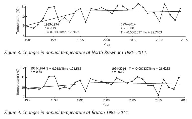
To briefly examine this, we use an example from a climate model simulation for the same period as the Clark observations. The simulated temperature at a single grid point (roughly representing central England) shows a cooling for the whole 1985-2014 period, but the same simulation shows a warming globally (left).
When looking at the longer-term (right), this local cooling is put into perspective: it is not unlikely that (simulated) temperatures at such small spatial scales will apparently move in the opposite direction to the longer term trends, both locally and globally. We see similar features in the observations also.

We must continue to improve our communication to highlight that our expectations are for greenhouse-gas induced warming over large spatial and temporal scales, and that we also expect that some locations will show a cooling over a couple of decades or more.
This should not be a surprise. One cooling location does not mean that the globe is cooling. But, we must, of course, keep monitoring to understand whether our expectations are consistent with what happens. Clark’s efforts in maintaining these stations are very welcome!
Here in Illinois the temperature trend over the last century is 0.0°F/decade for max temps and 0.1°F/decade for min temps. With such minimal warming would one expect weather extremes to increase, perhaps coming from other regions?
I’m not sure where you are getting your temperature data from, but a linear trend over 100 years is not a particularly good way to represent the recent history of temperatures in Illinois.
According to Berkeley Earth, average temperatures in Illinois rose by about 0.55C/1F from 1913-1938, then dropped by 0.37C/0.67F from 1938-1970, and have now risen by 1.1C/2F since 1970 (all of the above based on a 30-year LOESS smoothing function).
So warming over the past century in Illinois has been strongly nonlinear. The trend since 1970 is more linear, warming at about 0.27C/0.49F per decade.
A generally similar pattern can be seen in many individual Illinois stations, e.g. Urbana, which likewise had warming from the 1910s to 1930s, cooling from 1940s to 1970, and then warming. In such cases, just calculating a linear trend over the entire time period is not a particularly realistic representation of the region’s climate history.
The temperature data is from NCDC (part of NOAA). The ups and downs you mention are fluctuations in the longer-term trend which is quite small (obviously). At any rate, my question still awaits a reply….
As far as I understand an increase in extreme weather due to global warming can happen at any time, if an increase has not happened already.
You don’t give any info on where you are getting your trend data. Looking at the trend in just one location may not show much due to the large natural variability.
I was wondering about the apologetic tone of the editorial until I looked at the paper in question. Two stations with short temperature records of daily minima and maxima (1968-date and 1985-date), no details as to instrumentation, and a hand-waving analysis.
The short list of references is also instructive, containing two publications by Christy & Spencer, one by McKittrick & Michaels and one by Idso & Singer (the NIPCC!).
I suspect the editorial decision to publish was a form of preemptive affirmative action to forestall the often-raised claims by ‘skeptics’ that the peer-review process is biased against them.
See those jumps between the trend lines for different periods? I don’t like them. If you’re trying to represent the background climate then that means you believe that the climatic temperature has jumped at that point.
For global temperatures that’s nonsense unless you deny energy balance & the climate’s response time, and it’s a technique that’s often used to manufacture false hiatuses (hello GWPF!) or whatever short-term trend you want. Perhaps it’s realistic for air temperatures in a smaller geographic region, but I think it needs to be justified in detail and I don’t see that here. I also don’t see any discussion or calculation of uncertainty and significance is mentioned in that the calculated trends aren’t significant.
Looking in detail at individual weather stations can be interesting for local meteorology, but the suggested links to global climate are, like Ed showed, overreaching a bit IMO.
Interesting editorial.
I have no issue with them publishing the study, as long as the study met their standards.
The limitations of the study are clear, just two locations are not very significant over short timeframes.
I think the issue is that the large-scale conclusions of the paper don’t match what I’d expect to be the standards of a scientific publisher.
Ed shows that these results are not surprising scientifically, although they might surprise people’s intuition. I don’t know how the review works for Weather but it’s surprising that an editor didn’t pick up on how the paper suggests some kind of contradiction with well-known results but doesn’t actually test this. I’d expect that a scientific publisher should have standards that include making sure that statements in an article are justified by proper analysis.
This isn’t the case here though and even the editorial seems to fall for this when it says:
“[the stations] do not appear to show the trend of warming we should all expect to see due to [increased greenhouse gases]”, without testing what we’d expect to see. Ed’s post shows that this sentence would be better:
“[the stations] show local temperature changes consistent with models that nevertheless show global warming due to increased greenhouse gases.”
This leaves a very different impression.
The paper makes various allusions to rural temperature records suggesting that global warming isn’t happening. But why is a paper on U.S. stations (Gallo 1999) used as an example for this when that author also co-authored, in the same year, a global analysis (Peterson et al. 1999) which confirmed that rural stations see global warming?
I can’t find a clear statement of the publishing standards of Weather, although it does say that requirements for accuracy rest with the author. It looks like the author wasn’t careful enough when checking the accuracy of a lot of their statements.
Ed, you ask, “how likely is it that local temperatures would show such a decline?” and conclude that “it is not unlikely that (simulated) temperatures at such small spatial scales will apparently move in the opposite direction to the longer term trends.”
Perhaps you can quantify this better than showing a single simulation run — which one, by the way? — and show how many 20-year trends are negative, compared to the number of runs.
Hi HaroldW,
The simulation shown is member #2 from CSIRO Mk3.6 RCP4.5. All the members that I’ve looked at show a local 20-year cooling while global temperatures are warming at some point in the simulation, but this one happens to have that at the same time as the observed record.
Ed.
Thanks! I’ll take a look at them.
Over the 10 runs of that model, about 30% of the 21-year trends for that gridcell are negative, for trends starting between 1994 and 2050.
Looking at the CET shows no trend, over the period 1659-2015, as far as summer’s concerned.
https://xmetman.files.wordpress.com/2015/10/summer-jja-cet-1659-2015.png
So, how much of the claimed “Global Warming” is an artifact of data manipulation?
Hi Adam,
Have you checked the full CET record? What happens if you, say, look at the running decadal average?