The recent WMO press release on the climate of the 2001-2010 period highlighted that global temperature change was accelerating. Although this could be a misleading statement, should we even be expecting global temperature changes to be accelerating at present?
Although the rates of change of global temperatures are generally positive since the 1970s*, one key issue with talking about acceleration is that it is non-trivial to define and observe. Also, we do not expect an acceleration to continue indefinitely. These factors ensure that communication of this issue is especially difficult.
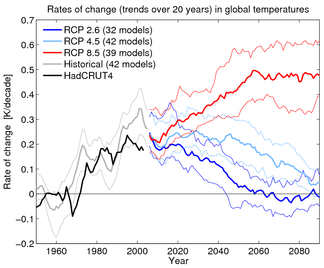
The rates of change of global temperatures in observations (black) and the CMIP5 simulations (colours) are shown below, and indicate a warming since around 1970, which generally accelerates until around 2000, with some variability and also dips around large volcanic eruptions. What is most interesting is the general deceleration from 2000 to 2010 in the simulations, and from around 1995 in the observations.
As for the future, RCP2.6 (low emissions) shows almost continuous deceleration and RCP8.5 (high emissions) resumes an acceleration around 2012 until 2050. The mid-range emissions scenario (RCP4.5) shows a flat rate of change until mid-century, followed by a deceleration.
So, the CMIP5 models simulate a deceleration at present which may continue, depending on our future emissions. This suggests that talking about rates of change is useful, but that discussion of acceleration or deceleration is potentially very confusing in communication efforts.
* Shorter periods for the linear trends show a similar picture which much higher levels of variability, and using the most recent 10-year period actually results in a negative rate of change.

In terms of communicating this information to the public about future projections ED
I find your graph of deceleration for global temps from 2000 -2060 inconsistent with what is written on met office projections linked here
http://www.metoffice.gov.uk/climate-change/policy-relevant/advance
quote
RCP 2.6
Although the mean temperature RISE??!! under RCP 2.6
is between 1.5 and 2 °C
BY THE END OF THE CENTURY,
many regions will experience much greater? (or lower?) increases in temperature.
What have l missed here in my interpretation of Ed’s graph vs the met office interpretation of the same graph?
Yes there is a communication problem
Crikey – I think you are quite confused about what acceleration means. The graph clearly shows the rate of change is generally POSITIVE = a warming climate. The rate of change is slowing, but this does not mean that temperatures are cooling.
Ed.
Hi Ed. Please can you provide me an update on the rate of change via email. While I’m working on shorter seasonal timescales, I need to be correctly estimating the rate to avoid a bias. This is troublesome, as the climate variability from season to season is large, with shorter term trends embedded within it (such as the 1998-2008 North Atlantic warm anomaly).
Your insight is much appreciated, as I’m aware that I need to get my temperature forecasts in line with international Meteorological organisations.
All the data sets that I study (RSS, UAH, Hadcrut) don’t seem to support accelerated warming. If anything, they indicate no significant change in temperature over the past decade or so. The 1910 – 1940 increase looks much the same rate as the 1970 – 2000 period, then nothing much since then. What caused the 1910 – 1940 increase? I don’t see anything that would correlate with emissions of CO2. Why does this graph start at 1950?
The 1910-1940 is a very interesting period, and not fully understood. It seems likely to be due to a combination of several factors, including: an increase in solar activity, a recovery from the previous strong volcanic activity, an increase in CO2 and some internal climate variability. Determining the relative weight of these factors is ongoing research.
cheers,
Ed.
Would you agree ED that global temperatures have been declining at a rate of 0.44 degree per century since 2005 to 2012
That is a deceleration for that short period of 7 yrs
There was a period from 1943 to1975 ( 32 yrs)when global temperatures declined or decelerated
at a rate of 0.37 deg c per century
The AMO follows these steps up and down .
Based on the past AMO pattern and global temp’ inflection point at 2005 downward one might conclude the AMO peaked at 2005 and is on a step decline for the next approx. 25 yr ish years
AMO is currently near neutral. I wonder if this downward trend will sustain.
This is what l meant by deceleration. From 2005 to 2012 . sorry about that misunderstanding
Here is a graph correlating AMO oscillation and global temp
https://picasaweb.google.com/104698633266954768357/CYCLESAndCorrelations#5895535698714271410
Would it be fair to say that based on the past 60 yrs ish oscillation that you would expect a deceleration of global temps’ from 2005 to 2037 based on the AMO alone?
What is the forcing value of the AMO? Is there one?